Monday, January 30, 2012

Work in Progress: Summer Heat, Central Valley and Winter Mirage (Master Study)

More landscape practice today... And I have to admit I am more and more hooked. I took out another piece that was started in the same Roland Lee workshop as I mentioned in my last post, and tried negative painting again in the foreground grass land... This time I was quite happy with the result. The almost monochromatic yellow-brown palette was chosen specifically for the impressions I got driving on the winding roads down central valley in the heat of June and July... Every inch in view is burnt by heat. 


Summer Heat, Central Valley,  
Watercolor on Arches #140 Cold Press Paper , 6"h x 9"w, WIP 1

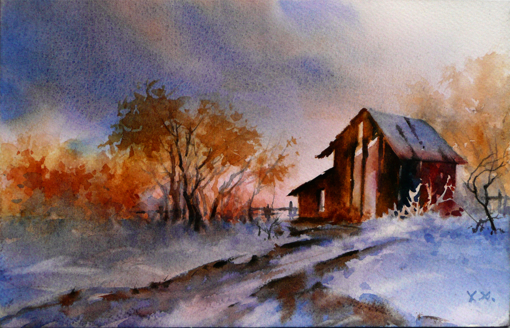
After several hours' careful painting around little shapes, I felt that I needed a change and took out a fresh piece of paper, completely soaked it with water, and laid it on a piece of plexglass, which is non-absorbent and therefore slowed down drying to the minimum. I flooded in the sky and snow colors and charged the bright orange hues when the paper gradually dried. When the paper completely lost its sheen, I dropped in the tree and shrub shapes with smaller, stiff brushes. Until this stage, everything was painted in one wet cycle. I have very little control of the process and cannot lift much without affecting the colors which had been flooded in first. It was very scary, but exciting in the same time! I love watercolor in its free-flowing state...


Winter Mirage, Watercolor on Arches #140 Cold Press Paper , 6"h x 9"w, WIP 1

Sunday, January 29, 2012

First Snow (Something Slightly Different)

This June I took a workshop with a very good landscape watercolor painter, Roland Lee, to study his methods of negative painting. It was not a difficult concept to grasp, and he was an amazing teacher who gives clear, thorough explanations of every "how"s and "why"s. However, when I was sorting through my studio mess, and came across a piece that I started at the workshop, deciding to complete it as a refreshment of what I have learned, I found out that it is really not easy to paint this way -- my mind's eye kept on switching between the positive and negative shapes, and my hands just was not able to paint around the shapes that are suppose to be lighter -- it kept on filling them in!!! I have not painted many landscapes, so this one, although simple, has been a true struggle for me. I am also feeling a bit confined by the limited palette of blues and browns... But I felt that it was needed to create the slight melancholic end of fall, beginning of winter feel. 

It was suppose to be a quick piece but it turned out to be everything but... I guess I do need to practice more landscape painting -- it deals with a whole different set of problems and corresponding solutions. Omission, simplification and suggesting with texture is much more important to landscape painting than to floral and still life paintings. A lot of times landscape painters have to be more liberal with their shape making and mark making, be more indicative than literal... It is difficult for me, but I do love it. After all, practice makes perfect! 


First Snow,  Watercolor on Arches 140# Cold Press Paper , 6"h x 9"w, 2012 #10

Sold!

Saturday, January 28, 2012

Work in Progress: Hide and Seek (Almost Done...) and a New Tulip Painting

A very busy day today... Not a lot of time available for painting, but I finally managed to squeeze in some after sun down. More work on "Hide and Seek" which I wish to finish today but finally did not manage to do. However, I did gather all the courage and attached one of the parts I considered most difficult for this one -- the out of focus leaves in front of the flower. I am quite happy about the out of focus look generated by the wet in wet brushwork and lifting. I love the color blending and mingling on paper making colorful greys. Fabriano Artistico Cold Press paper is wonderful in generating granulating and other wonderful results when being painted on wet-in-wet, however, since color lifts easily from this paper, for darker passages you mostly just get one shot for each region -- everything has to be completed before the paper dries, it is a bit nerve-wrecking... I'm just glad each time it turns out OK.


Hide and Seek,  Watercolor on Fabriano Artistico 140# Cold Press Paper , 5"h x 7"w, WIP 8

Since I have the habit of pairing the finish of a painting with the start of another one, switching between loose application of underpainting and/or background colors, and tight handling of the finishing detail works, I began another tulip painting today. Half way into whipping various blues, greens and purples onto soaking wet paper, I realized that I have the habit of painting the dark background before my subject. I stopped to contemplate the possible reason for forming this unconscious habit -- Is it because I am secretly very nervous about the wet-into-wet dark backgrounds, and worry that I might ruin a whole finished painting if not getting them in first? Is it because of my method of painting -- by painting the dark regions first, I can correct and hard edges or inaccurate shapes by lifting colors off the boundary between the darks and the unpainted white regions, which would not be possible if the subject has already been painted in? The traditional watercolor method is painting from light to dark. My habit is obviously opposite to the norm -- or is it? How do other artists approach a light subject on a dark background?... 


Dancing Tulip III,  Watercolor on Arches 140# Rough Press Paper , 7"h x 5"w, WIP 1

Friday, January 27, 2012

Work in Progress: Hide and Seek, and a Little More Work on Sun Dance

"Hide and Seek" is progressing steadily, I hope I could finish it tomorrow. At this stage, I am adding form shadows and cast shadows by first wet the pedal I want to paint with clear water, then drop in relatively dry pigments mixed with Quinacridone Magenta, Alizarin Crimson and Winsor Violet. To achieve the desired value, sometimes I would mix in a little Lamp Black or Ivory Black too. I am deliberately going very slow, not wanting to make any mistake


Hide and Seek,  Watercolor on Fabriano Artistico 140# Cold Press Paper , 5"h x 7"w, WIP 6


Hide and Seek,  Watercolor on Fabriano Artistico 140# Cold Press Paper , 5"h x 7"w, WIP 7

In between drying cycles I also managed to do a little more work on the yellow rose painting, "Sun Dance", continuing on the shadows of flower pedals. I've also started on the underpainting of the background, starting from the darkest areas, mix and mingling many pure, high intensity colors. I want the background to have a glowing, colorful look. If it turns out too garish in the end, I can always opt to paint them out with a juicy wet-in-wet dark passage.


Sun Dance,  Watercolor on Arches 140# Cold Press Paper , 8"h x 8"w, WIP 2


Thursday, January 26, 2012

Spring Breeze II (Finished!), and the Start of a New Orchid Painting

Have you ever felt that the last 10% of a painting always takes forever to finish? I literally worked on "Spring Breeze II" for the whole day today! True, there is only the flower in the center of focus to be completed, but that has taken forever... I think the outer most pedal on the right may still needs some work, but I decided to call it finished for now -- waking up with a fresh eye is generally better for evaluation of whether there is anything left to be done on a painting, and not doing so have costed me dearly before. So, here it is:


Spring Breeze II,  Watercolor on Arches 140# Rough Paper , 7"h x 5"w, 2012 #9

Sold!

I found out that colors do not appear as brilliant on rough paper, which is a problem. On the other hand, I really like the velvety look of the tulip pedals -- which is characteristic of thickly layered passages on rough paper. Pros, cons, well, maybe I will give this paper another try...

Since I was only working on a small section of this painting, I had to wait for the paper to dry each time I add a color passage. So, in between drying time I started this little painting of an orchid. I tried out some granulating pigment combinations for the shadows on the pedal -- Cerulean Blue, Cobalt Violet and Aureolin Yellow. I loved the results. The veins of pedals were pure Cobalt Violet, and the patters on the inner pedals were a mixture of Permanent Rose, Opera Rose and Cobalt Violet.

For the background, I did not do my usual wet in wet song and dance. Instead, I decided to try out a method I recently learned from a book written by the fabulous artist, Thomas Aquinas Daly -- layering alternatively warm and cool colors and watch closely to control the hue, value and temperature of each area. The layered paints has formed some interesting subtle textures that I want to keep... We'll see.


Dancing Orchid,  Watercolor on Fabriano Artistico #140 Cold Press Paper , 6"h x 6"w, WIP 1

Wednesday, January 25, 2012

Spring Breeze (Finished!)

It actually took quite some work from the stage it was in my last post to finish the painting -- first I was not so happy about the left side of the painting being significantly lighter than the right side, and added another dark passage to it wet in wet (which is a quite scary process since you can almost count on some of the darker pigments being picked up with you float water above a dried dark passage painted thickly, and move somewhere else -- somewhere you do not intend it to be...), then I have decided the flower itself looks totally washed out against an almost saturated wet background. I ended up adding at least three more layers of color glazes to most pedals (except the one on the very top), and used a fiber painting brush (a very stiff brush similar to the Cheap Joe's "Fritch Scrubber" brushes) to lift out some lost white highlights. 

I used a lot of Quinacridone colors to paint the dark shadows of the pedals. They are great for glazing and does not lift easily. Also, I found that it is easier to glaze over Arches Rough compared Arches Cold Press -- colors do not lift as easily, even the darker and thicker passages. On the other hand, correction by lifting has been proven a real struggle on the rough paper. 

I am having some trouble to mix the exact colors for matching the yellowish-brown and red-purplish-brown shadows on the pedal for this one. For some reason when the hues seem correct, the values just does not seem quite dark enough; when I add more purples to darken it, the color lost there brilliance. I used mainly Alizarin Crimson, Quinacridone Gold, Quinacridone Burnt Orange and Quinacridone Burnt Sienna, plus a small amount of Winsor Violet for my mixture. Do you have a good mixture for the yellowish and red-purplish browns that are both dark and brilliant? If so, please share with me!


Spring Breeze,  Watercolor on Arches 140# Rough Paper , 7"h x 5"w, 2012#8

Sold!

I am submitting this painting to the Daily Paintworks' "Color of the Year" challenge. I've already submitted the Californian Poppy painting I finished earlier. You can see them both here.

Tuesday, January 24, 2012

Work in Progress: Spring Breeze & Hide and Seek (Almost Done!), plus a New Rose Painting (Another One?!)

The two tulip paintings are getting close to be finished, and I'm making good progress on the rose painting "Hide and Seek" as well. In the first "Spring Breeze" painting, I have painted in the dark background with blue green, and purple blue, to contrast with the warm reddish orange of the flower. The flower itself is 70% finished. Only the big pedal in the very front still has not been overpainted. The other pedals may need some touch-up work here and there -- but I feel I'm getting there.


Spring Breeze,  Watercolor on Arches 140# Rough Paper , 7"h x 5"w, WIP 3

In "Spring Breeze II", only the flower in the center of focus is left unpainted. I finished the background foliage section by section, all wet in wet. For some reason, it is very difficult to get the color look right on the computer screen for this one -- I gave up after an hour's frustrated trial. still feeling the flowers appear too warm, while the foliage look way to blue. Maybe it is time to invest in a new camera...


Spring Breeze II,  Watercolor on Arches 140# Rough Paper , 7"h x 5"w, WIP 4

"Hide and Seek" is slowly progressing -- pedal by pedal. I like the color appearance of this painting and am thinking of painting a larger version of it. 


Hide and Seek,  Watercolor on Fabriano Artistico 140# Cold Press Paper , 5"h x 7"w, WIP 5

I am thinking about doing a rose series for the month of February, from the first of the month till Valentine's Day. So I started another one -- well, this one is yellow therefore not exactly fit the theme, but I like the pattern of shadows created bu the stamens on its pedal, so I want to give it a try -- and, painting shadows on yellow flowers is always a challenge, so I would like to have more exercises on the subject. I started this painting by painting in the shadow shapes -- the warmer ones with reddish purple, and cooler ones with bluish purple, mixed from Cobalt Blue and Winsor Violet. When overpainted with yellows, I hope they would appear to be orange brownish and greenish, respectively. We'll see how it works...


Sun Dance,  Watercolor on Arches 140# Cold Press Paper , 8"h x 8"w, WIP 1

Monday, January 23, 2012

Work in Progress: Spring Breeze & Hide and Seek

I did some work on both of the "Spring Breeze" paintings today, adding wet-into-wet overpaintings. On the first one, I finished on pedal so that I could refer to it regarding the value contrasts on all the other pedals. I love the rich red orange, but had a real hard time deciding the exact hue of the deep shadows. After some frustration, I decided to do an experiment, and opened the reference photo in photoshop. I used the pipette tool in photoshop to take sample in the shadow area of the flower -- Wowla! It's a dark reddish purple brown. I thought it could be a really good training -- look a a color in the context of all the surrounding colors, try to mix and match, then isolate the color to compare with the swatch you made to see how accurate your color perception is. Maybe I will try to spend 5-10 minutes everyday for this exercise, in order to sharpen my color sense...


Spring Breeze,  Watercolor on Arches 140# Rough Paper , 7"h x 5"w, WIP 2

For the second one, I mainly worked on the background section by section, taking care to wet larger areas than the area I intend to cover, so that the edges would appear soft between background shapes. To keep the background muted yet colorful is the challenge here, and so far I'm happy with it.


Spring Breeze II,  Watercolor on Arches 140# Rough Paper , 7"h x 5"w, WIP 3

Finally, I worked a bit more on the rose painting "Hide and Seek", mainly because it had a similar palette to the tulip paintings. For this one I just carefully worked on one pedal at a time, wetting each time before dropping in colors, and layer more after the last passage has dried. It is a very time consuming process, but allows accurate control for the shapes of any soft color passages. This is a painting with mainly saturated reds, oranges and mauves but very little true white, and I am trying to be very careful not to cover any areas that should be left white. 


Hide and Seek,  Watercolor on Fabriano Artistico 140# Cold Press Paper , 5"h x 7"w, WIP 4

Saturday, January 21, 2012

Blooming Magnolia

I finished "Blooming Magnolia" today, adding shades of pink to the flower center, and strengthen the shadow colors with a mixture of Permanent Rose, Cobalt Blue and Ivory Black. I found that the mixture of Cobalt Blue and Ivory Black gives a nice, clear cold blue-grey which works great for shadows on these magnolia flowers. Lamp Black, on the other hand, is too warm and makes a purple-grey when mixed with Cobalt Blue. The flower was painted in by first wet each pedal with clear water, then use a small brush (Jack Richeson Kolinsky Sable #6) and a very stiff mix to almost "dry brush" in. On very small areas, this method has better control of the shapes with soft edges than the traditional "wet-into-wet' applications.


Blooming Magnolia,  Watercolor on Arches 140# Rough Paper , 7"h x 5"w, 2012#7

Sold!

Friday, January 20, 2012

Work in Progress: Spring Breeze II and Blooming Magnolia

I did a little more work on the foreground tulip of "Spring Breeze II" -- adding various shades of delicate pinks and lavenders.


Spring Breeze II,  Watercolor on Arches 140# Rough Paper , 7"h x 5"w, WIP 2

I also started a magnolia painting -- my second attempt of using masking fluid and doing a dark background before the subject. It took three coats of Indigo, Ultramarine Violet and Ivory Black mixture to create the rich night sky blue in the background. I also lifted the background branches before painting in the flower. This time, I sprayed a little Winsor & Newton Workable Fixative on the pencil drawing before applying the masking fluid -- it worked! The pencil lines did not come off after peeling off the masking fluid. It also did not alter the paper surface. I am happy with the result so far...


Blooming Magnolia,  Watercolor on Arches 140# Rough Paper , 7"h x 5"w, WIP 1


Thursday, January 19, 2012

Work in Progress: Spring Breeze (More Tulip Paintings!...)

I've been sifting through reference photos and starting more and more new projects these few days -- I think it is time to finish some old ones! Contrary to the obvious "should", I have started two new tulip paintings today... (OK, I promise I will try to finish some projects in the coming days... :-P)

I did some wet-into-wet underpaintings on both of these pieces, to ensure the background is soft and out-of-focus. I also did a little underpainting on one of the Tulip flowers, which would be strengthened in value and saturation and softened by a wet-into-wet overpainting. It is a bit like painting the same image twice -- the first one providing a ghost road map for the second one.

Spring is tulip time, and I think it is really time to finish some of them up...


Spring Breeze,  Watercolor on Arches 140# Rough Paper , 7"h x 5"w, WIP 1


Spring Breeze II,  Watercolor on Arches 140# Rough Paper , 7"h x 5"w, WIP 1


Wednesday, January 18, 2012

California Poppy Study (Master Study)

Several years ago, when I just started painting in watercolor, I was rummaging through the collections of local libraries for instructional books, I came across one by artist Kathy Dunham. I studies the book and did some of the projects in it with quite embarrassing results, which I came across again when cleaning up my studio this morning. After giving it some thought, I decided to try them again, starting with the California poppy showing below:


California Sun Shine (Master Study),  
Watercolor on Arches 140# Cold Press Paper , 12"h x 9"w, 2012#6

I was quite happy with the result this time, and thought that I've learned some very valuable things by doing it again:
  • This is a painting with large area of saturated color, which commands attention. A background with complementary color helps to focus the attention, but it is of vital importance that the background is not of equal color intensity. In this case, the muted blue-green works with the bright orange flower;
  • When the subject of a painting is a single flower with few pedals, relatively simple shapes and not too many details of folds and shadows, the main struggle is to capture and maintain viewer interest across large area of the painting without specific details through subtle change of color, value and surface texture. Large, smooth, single-colored area would easily bore the viewer's eye and I struggled to avoid that in doing this painting;
  • When a watercolor painting is relatively high-keyed but without true white areas, the sense of brilliance of the painting is easily lost. Leaving the stamens as very high-key yellow close to white may be a solution for this particular painting, but when I lift the stamens out of the dark red pedal color, I lost my chance. Maybe next time?...
Doing studies of a master artist's painting or project from instructional books/DVDs can be very helpful in pulling me out of my comfort zone and and forcing me to face subjects that I would subconsciously avoid because I secretly feel there are some problems I could encounter trying to paint them, and I may not have a clue how to solve these problems  -- in design, in execution, and in everything else. But  when I take the plunge, I always feel that I have grown a bit as a painter afterwards...

Monday, January 16, 2012

Work in Progress: Yellow Rose (Continued...)

More work on the yellow rose painting today, mostly the background. I wanted to have a blue-orange brown gradation in the background to echo with the warm golden-yellow pedal colors and their purple-blue shadows. The first layer of color I put in the background area is a combination of French Ultramarine, Permanent Rose and a tad bit of Quinacridone Gold. I liked the granulation effects and the variation of colors:


Yellow Rose,  Watercolor on Lanaquarelle140# Cold Press Paper , 8"h x 8"w, WIP 4

After this is dried, I glazed over it with a combination of Quinacridone Gold, Quinacridone Burnt Sienna and Quinacridone Orange, with thicker color application near the bottom of the painting. The third layer is a mix of Lunar Blue and Indanthrene Blue, darker near the top and gradually losing strength toward the bottom. I am not entirely happy with the gradation yet, but it's getting there...


Yellow Rose,  Watercolor on Lanaquarelle140# Cold Press Paper , 8"h x 8"w, WIP 5

Sunday, January 15, 2012

Work in Progress: Yellow Rose and Petal Light #1

I worked a bit more on the yellow rose painting today, refining the shape of shadows on the pedals, and darken them as needed, and adding a glaze of yellow on a few pedals to see the overall effect:


Yellow Rose,  Watercolor on Lanaquarelle140# Cold Press Paper , 8"h x 8"w, WIP 2

At the end of the day there are 2-3 layers of color on each shadow shape, and I am happy with the shape of most of the shadow shapes. The value of shadows also looks right, but with the background white, it is hard to judge. I think the next step would be adding some proper dark colors into the background so that it is easier to judge the light and middle values in the flower against it.


Yellow Rose,  Watercolor on Lanaquarelle140# Cold Press Paper , 8"h x 8"w, WIP 3

I also worked on the bird of paradise painting a little more, mingling various shades of green to develop the underpainting of the leaves, dropping in some reds, blues and yellows here and there to indicate color inclinations of these areas. Most likely these would be painted away wet-into-wet during the overpainting process, but for now, these bright colors serve as road map for me for the next steps.


Petal Light #1,  Watercolor on Arches 140# Cold Press Paper , 10"h x 8"w, WIP 2

Saturday, January 14, 2012

Plumeria II (Version II Finished!)

It took a bit more time and many more layer of paints, but the second version of Plumeria II is finally finished! I love the glowing effects created by the body of the yellow paints, and the "happy accident" created when painting the dark background wet-into-wet. After many layers of glazing, Arches did not give in. Tough sizing on this paper... Glazing method works really well with it, which allows more control and less mixing of paints on palette. The resulted colors seem to be clean and subtle comparing to other more direct methods. I think I will try it more with more complicated projects next time...


Plumeria II (Version 2),  Watercolor on Arches 140# Cold Press Paper , 5"h x 7"w, 2012#5

Sold!


Friday, January 13, 2012

Work in Progress: Petal Light #1


Petal Light #1,  Watercolor on Arches 140# Cold Press Paper , 10"h x 8"w, WIP 1


This painting started as a larger version, about 16x20... I was painting it fanatically trying to made the deadline for this year's LWS show deadline...

It just did not look right. The more I am desperately trying to make it work, the more it does not.
Out of frustration I took February's Watercolor Artist magazine, and started surfing through the beautiful paintings there for inspirations. And I came across this wonderful painter: Marlin Rotach. Her stunning watercolors made my jaw drop. I opened one after another vivid, luscious floral paintings from her web gallery, prying into the large images (some of them have very high pixel resolutions), trying to decipher how on earth those smooth, large, wet-into-wet transitions were accomplished, and how those subtle color variations in the dark shadows were obtained. I took out scrape watercolor paper and started to imitate and experiment -- of course with little success. Even more frustrated, I went back to my own painting, only to find out I don't even know what effects I want to achieve in it and how I should obtain them any more -- the one who tries to imitate other's graceful strides ends up forgetting his own normal way of walking...

Suddenly I realized -- this is not a process that could be rushed, or accelerated by inherent of other people's tried and true method. When you are facing that beautiful reference photo, and that daunting blank sheet of paper, every decision you made belongs to you, and you only. Techniques and methods can be learned by imitating a master's painting and learn from it, but ultimately, how to apply them toward your own set of problems when you are faced with your own subject and you own vision of how it would turn out as a finished work, is something that will only be acquired by those long, lonely hours in the studio, between you and your painting -- many, many sheets of painting, one little step at a time.

So I took the big sheet off the board, and started this small study. Immediately after I started apply the first layer of underpainting, I realized I have painted some of the leaves in light too dark, and the colors were exactly forming the shapes I have intended. But I'm ok with it. There would be another study. I will learn a little by painting this one, by making many mistakes and trying to rectify them, and then apply what I have learned to the next study, then the next, until one day it comes natural to me --

It's a long and hard journey, but doing and learning is the biggest joy on it. Process, not just the product, is also the purpose of this journey. It starts here, now.


Thursday, January 12, 2012

Work in Progress: Two Rose Paintings

Today is a long day on the road driving for me, but I did manage to work a little bit on the rose painting "Hide and Seek". I have wet all the areas that are directly in sun light, and flooded some New Gamboge and Cadmium Yellow Deep there:


Hide and Seek,  Watercolor on Fabriano Artistico 140# Cold Press Paper , 5"h x 7"w, WIP 2

Then I start to develop some individual pedals here and there, using Cobalt Blue mixed with Quinacridone Magenta to underpaint shadow areas, and Permanent Rose mixed with various amount of New Gamboge for the local color of pedals. Once these are laid in, I may rewet various curved parts of pedals and drop in darker reds to indicate changed plane, and glaze the cast shadows.


Hide and Seek,  Watercolor on Fabriano Artistico 140# Cold Press Paper , 5"h x 7"w, WIP 3

I also started another small painting of a white rose. I love the soft blue-grey shadows on its pedals, and started to underpaint them with various mixture of Cobalt Blue and Cobalt Violet. I've also underpainted the reddish veins of leaves, and laid in a mid-dark background with various granulating colors. I tried different color mixtures in different parts of the background, so they look a bit jumpy from place to place right now. But I will probably glaze over them with a darker mixture to unify them -- hopefully still let some granulation showing...


Snow White,  Watercolor on Arches 140# Cold Press Paper , 10"h x 8"w, WIP 1

Wednesday, January 11, 2012

Dutch Iris Painting

I was browsing through some projects that I have started but not yet finished, and decided to finish this little painting of Dutch Iris -- one of my favorite flowers. The blue-purple palette is a nice change from the warm reds and yellows of the plumeria. I had fun doing it. 

It is painted on an Italian paper that I have never used, and I loved the soft surface texture. The handling quality is also nice -- relatively easy to lift, not so prone to damage. Must give it another try...


Dutch Iris, Watercolor on Magnani Acquerello140# Cold Press Paper, 5"h x 5"w, 2012#4

Sold!

Tuesday, January 10, 2012

Work in Progress: Plumeria II (Almost Finished!) and Hide and Seek (Another Rose Painting)

The two versions of Plumeria II are drawing close to finish. I have put in the dark background wet-into-wet, and just waiting for the center golden colors to be put in. I chose to put in the yellow last so that they would stay on top and be brilliant, and have dominance over the shadow colors. I will put in them thickly after flooding each pedal with clear water. This is a scary process, since I'm always worried that the layers of color underneath would lift, especially for the Fabriano paper. I'm going to try to be very light-handed...


Plumeria II,  Watercolor on Fabriano Artistico 140# Cold Press Paper , 5"h x 7"w, WIP 8


Plumeria II (Version 2),  Watercolor on Arches 140# Cold Press Paper , 5"h x 7"w, WIP 3

I'm also starting another small rose painting. I have named it "Hide and Seek" since part of the flower is hidden under out-of-focus leaves. I have started the painting with a soft, wet-into-wet underpainting, and trying to be careful to leave plenty of white areas for possible lights. I've added some darks made from Alizarin Crimson and Prussian Blue in the background corners to give myself some anchors about how dark the shadows on the flower should go. 


Hide and Seek,  Watercolor on Fabriano Artistico 140# Cold Press Paper , 5"h x 7"w, WIP 1

The show season is rapidly approaching and I should be painting larger pieces to meet the deadlines, but I am really procrastinating... I feel that I like the painting process much better when I don't have in mind that "I am painting this to try to submit to a show"... Well, I guess the solution should be painting many pieces well ahead of time so that I don't have to do a particular painting just to try to meet the deadlines! Something to try for this year... :-P

Monday, January 9, 2012

Work in Progress: Plumeria II (Version 1 and 2), and Yellow Rose Painting

One of those days in the studio -- long working hours yet seemingly with very limited visible progress. I worked on both versions of Plumeria II on paper, adjusting the value and color temperature in the shadow area, making the soft shadow shapes more accurate. Now that I have glazed the first version with magenta/pink local color, and went over the second version with violet-grey shadow colors, they started to look more similar to each other. However, the adjustment process seems to be going forever, and with each layer of glazing there always seem to be more little things that need tweaking: a slight warmer pink in the corner, a slight darker passage in the center... You get it. So here's what I have ended up getting:


Plumeria II,  Watercolor on Fabriano Artistico 140# Cold Press Paper , 5"h x 7"w, WIP 7


Plumeria II (Version 2),  Watercolor on Arches 140# Cold Press Paper , 5"h x 7"w, WIP 2

I did manage to start a new painting just for a change of mind -- sometimes you focus on the same little area for too long, everything starts to look wrong. This is a yellow rose, which I started underpainting the shadow area with a mix of Permanent Rose, Aureolin Yellow, Cobalt blue and Cobalt Violet. So far the value of the darker shadows are not totally right yet, but I am in love with all the wonderful granulation effects created by the Cobalt colors. I am using Lanaquarelle #140 Cold Press paper for this painting. It's a very soft paper and cannot afford much abuse, but the surface is lovely and just emphasizes the sedimentary colors so well! After the shadows are finished, I will glaze over the root of each pedal with some soft yellow hues. I'm looking forward to that...zq


Yellow Rose,  Watercolor on Lanaquarelle140# Cold Press Paper , 8"h x 8"w, WIP 1


Related Posts Plugin for WordPress, Blogger...