Saturday, June 30, 2012

Petal Light II (Finished!)

This one is finally finished and I am really happy with how it turned out -- I watched every edge very carefully when adding the background, softening where flower petals and the dark background washes meet by wetting the edge with a damp brush when the background is almost dry but not quite yet -- a really scary business but quite rewarding if it was done right. I am being shameless here... :-P


Petal Light II, 
Watercolor on Arches 140# Cold Press Paper, 8"h x 10"w, 2012 #34

Bid at My DPW Auction (Starting Bid $100)

Friday, June 29, 2012

Work in Progress: Petal Light #2 (Finishing the Flower...)

Getting back to bird of paradise paintings... I worked more on enriching the color and deepen the value of the petals, wetting adjacent areas carefully so that thick colors already laid down in these areas are not disturbed...


Petal Light #2, Watercolor on Arches 140# Cold Press Paper, 8"h x 10"w, WIP 4

To get the thick, organic feeling of the petals I try to maintain the darker shadow shapes soft and irregular in shape, and lifted small white passages at the edge of petals to indicate its thickness. The stamen is much darker in the photo, but I think I like the highly saturated purple-blue color I have right now, which makes them nice contrast to the orange petals, and serve as the center of attention, so I decide not to darken them further -- in the end, the reference photo is merely a starting point; a painting needs to stand on its own merit and will only be judged by itself, instead of being compared to the reference material for its "truthfulness"...


Petal Light #2, 
Watercolor on Arches 140# Cold Press Paper, 8"h x 10"w, WIP 5

It's so close to finish -- now the challenge is how to darken the background while integrating it with the flower. Merely wetting the background and dropping in dark colors will not do it -- it will leave a hard dark edge surround the flower, making it look flat and cut-out. I need to carefully consider my strategy here -- until then, my friends, please be patient with me...

Sunday, June 24, 2012

Work in Progress: Beauty Queen (Layering on the Rose)

I'm taking a break from Bird of Paradise today and working on the petals of this pink rose with a more leisurely pace, wetting small areas one at a time and floating various shades of pink -- warm, cool, orange or purplish -- in many many light layers, carving out light shapes by lifting. This change of pace feels really nice after some fanatic racing over large areas (according to my standards) of wet washes in the last few days. I also did some more underpainting on the background leaves, mingling limited palette of red, yellow and blue to achieve different variations on green (with some pink and purple accents). Pink is not my favorite color, but I am gradually falling in love with this one... Fingers crossed that I don't mess it up by jumping ahead and dash in colors too strong or saturated, thus destroying that delicate feeling of fragile petals...


Beauty Queen, 
Watercolor on Arches 140# Cold Press Paper, 7"h x 5"w, WIP 5

Saturday, June 23, 2012

High Summer Dreams II (Finished!)

This painting is finished and I have to drag my own hands from it -- no more further fiddling!!! I have to learn when to stop before fuzzing over unnecessary details and destroy that freshness so precious to a good watercolor painting.. No one wants to look at a flower painting that seems tired and beaten up! It does not matter the orange on the left most petal looks a bit too warm and the shape of the stamen is not exactly correct -- those are not the most important things to worry about at this stage of painting. The most important thing is that the finished painting works well as a whole and has a clear focus. I am stopping now. Right now. I am happy with it and will try not to ruin it from this point on... :-P


High Summer Dreams II, 
Watercolor on Arches 140# Cold Press Paper, 10"h x 14"w, 2012 #33

Bid at My DPW Auction (Starting Bid $150)


Friday, June 22, 2012

Work in Progress: Petal Light III (and the Grand Struggle)

One of the greatest struggles of watercolor is the balance between modelling the color and value of your subject accurately, and maintain that precious freshness that is best obtained by go over the same area with as few passages as possible. I have living this grand struggle through every single second of this painting, which has since formed a very intense love-hate relationship with me. In one passage the colors seem to glow with exuberance, and with the next wetting it inevitably lifts, leaving a mess, reminding me of the ruthlessness of Fabriano paper. On the other hand, when I tried to do all the modelling, all the color and value variations in one go, it seldom ends up with any level of satisfaction -- wet colors have a will of their own, they move and blend in wonderful, mysterious ways, however, very rarely resembling anything that looks remotely like the objects I am trying to portray in the end. This is further complicated by the fact that the soft surface of Fabriano paper does not contain much sizing, and therefore absorbs water much quicker than harder surfaces paper such as Arches -- which means you have even less time to try to move and manipulate color wet-in-wet. Well, for all these frustrations, erasing everything and start over is not too hard on this paper -- almost everything lifts right back to white with a soft synthetic brush (not the abusive bristle brush that actually bruise the paper surface!). But then again, a three-times erased passage is almost certainly bound to be a tired passage with not a great amount of energy and freshness to it. I am agonizing over the challenges, not willing to give up just yet -- like any hopelessly foolish lover, barely hanging on to the hope of that glorious ending...


Petal Light III, 
Watercolor on Fabriano Artistico140# Cold Press Press Paper , 10"h x 14"w, WIP 4

Sunday, June 17, 2012

Work in Progress: High Summer Dreams II (Almost Finished!...)

The process of putting overpainting layers wet-in-wet is both exuberant and nerve-wrecking -- to created a truly integrated look, and avoid a hard-edged line between each petal and every leaf blade, it is important to wet as large an area of varied objects and backgrounds between time as possible, and drop in dense passages of color to create soft but recognizable boundaries between them. Since it is much harder to maintain wetness in a larger surface area, and manipulate different colors across them, sometimes it is vital to find inconspicuous "stopping points" -- small areas that do not draw the eye directly and therefore ideal for one wet passages to stop and another to begin. Since you are painting thickly, there is not too much chance to fiddle around or modify with further glazes after one passage has dried and the color or value do not turn out to be the correct one, which is the nerve-wrecking part...

It took about five wet-in-wet passages to arrive at the stage shown in WIP 6 from WIP 5. I have chosen areas separated by relatively light areas and contained by hard edges -- usually reserved for the center of focus in my paintings -- as areas to be wet at once.


High Summer Dreams II, Watercolor on Arches 140# Cold Press Paper, 10"h x 14"w, WIP 6

Here in WIP 7, I'm only one wetting away from WIP 6 -- I've painted the upper left side of leaves and backgrounds between the leaf blades. My stopping point on the right is the area directly above the top left side petals of the flower. It/s a lighter area with relatively complicated shapes, complicated enough that the "line of boundary" between two wettings can be hidden quite easily without catching the viewer's eye. My other stopping point, at the bottom of this shape, is a darker passage which would border another dark passage beneath it. I've found that painting two dark area side by side usually can hide the boundary line quite well, although care needs to be taken not to wet into the previously painted darker passages too much to induce color lifting.


High Summer Dreams II, Watercolor on Arches 140# Cold Press Paper, 10"h x 14"w, WIP 7

It's really close to finish now. I'm quite excited to see how it would turn out!

Saturday, June 16, 2012

Work in Progress: Petal Light #1 & High Summer Dreams II (Finishing the Center Flowers)

I've started to group my painting efforts and work on parallel projects with similar palette simultaneously, so today I worked on the center flowers of Petal Light #1 and High Summer Dreams II. I hope this switching back and forth would allow me to look at these parallel projects with a fresh eye, and avoid getting caught into and fuss over unnecessary details.

It is really interesting to me that every painting has this moment of coming into "existence" -- before that I just have a vague idea of how it might come out looking like, and despite of the ugly (or sometimes relatively pleasant) early stages, march on until that  point, at which everything suddenly seems to fall into place and make sense, and the whole painting just come together, and after which the painting process becomes much easier. Sometimes this point comes much earlier, after the first couple layers of underpainting, but in most cases it does not arrive until I get the center of attention in place and key it properly with its surrounding element. Of course sometimes it does not arrive until the very final passages, in which case it would be a painting of true struggles. For these two painting though, the turning point did arrive once I put in the center flowers in full color intensity and keyed a few darker passages surrounding it. I think now I have a very good idea of how the final painting would look like in terms of value relationship, and the rest should be much less of a struggle...


Petal Light #1, Watercolor on Arches 140# Cold Press Paper, 10"h x 8"w, WIP 6


High Summer Dreams II, Watercolor on Arches 140# Cold Press Paper, 10"h x 14"w, WIP 5

Friday, June 15, 2012

Work in Progress: High Summer Dreams II (Finishing the Underpainting)

The background underpainting of leaves and shaded grounds is finished at this stage -- oh boy, did it take more time than I had initially planned! It probably contained way more information than what would show through in the final painting -- the details, the local color temperature and value relationships, the structural information... I am still trying to find out how much is enough as far as underpainting is concerned -- I can always put more in and later paint them away with thicker paints of the overpainting in dark areas, so I tend to put much more than what I think would be necessary. When I just started painting in watercolor, I read in instructional books that with each subsequent glaze, you put in more and more information and add more and more details. It's funny that my current method is exact reverse of that -- I put in lots of details at the beginning and paint them away in the wet-in-wet final underpaintings.

I am not entirely happy with the underpainting of this one, however. Time aside, the value structure is not shown very clearly in the underpainting, which might create some confusion when the paper is soaking wet, and I'm counting seconds to drop in dense, juicy colors in the wet-in-wet process. Underpainting to me should be all about clarity of structure, but in this one I got carried away trying to replicate good soft blending of colors, and create nice surface effects. As a result, the colors on the surface are probably too dense, which means some would lift when being rewet in the overpainting stage. Also, the edges are kept too soft, which may make them hard to see when several layers of dense pigments are dropped in on top of them, which is no good -- I need to see them for the overpainting, and any confusion would cause hesitation, resulting the lost of precious time while the paper is drying a bit more with every passing second. Next time, I will try to keep the edges on underpainting shapes a bit harder to make them loud and clear, and focus on big color passages and clear value structures. We'll see how this one turns out in the end...


High Summer Dreams II, Watercolor on Arches 140# Cold Press Paper, 10"h x 14"w, WIP 4

Sunday, June 10, 2012

Work in Progress: High Summer Dreams II & Petal Light III (Creeping Forward...), and News from A Small Work Show

A very busy day outside studio running around to shop for framing materials and replenish paints, unfortunately without a lot of time dedicated to the two bird of paradise paintings... I did manage to squeeze out a few minutes here and there to (almost!) complete the foliage on both of them. "Petal Light III", which is painted on Fabriano, looks so much darker than "High Summer Dreams II" (on Arches) right now, since I did go for that final dark value on shadow shapes of the leaves for this one, while "High Summer Dreams II" still needs a final wet-in-wet application of juicy darks over it underpaintings of leaves. I really can't wait to put in the flowers of complementary bright orange, but next week is the final week of the trimester at the Golden Gate Atelier where I am studying, I don't think I would be able to squeeze out much time during the weekdays to paint... :-(


High Summer Dreams II, Watercolor on Arches 140# Cold Press Paper, 10"h x 14"w, WIP 3


Petal Light III, 
Watercolor on Fabriano Artistico140# Cold Press Press Paper , 10"h x 14"w, WIP 3

I did get some exciting news in the email today to cheer me on -- two of my small paintings, "Hide and Seek" and "Dancing Tulip IV" are juried into Santa Clara Watercolor Society's Small Work Show, "Think Large, Paint Small" to be held at the Norton Gallery of Pacific Art League in July! The opening reception is during the First Friday Art Walk of Palo Alto, I am really excited to attend it and chat with all of the fabulous artists juried into the show... Well, time for more framing...


Hide and Seek,  
Watercolor on Fabriano Artistico 140# Cold Press Paper , 5"h x 7"w, 2012 #17

Sold!


Dancing Tulip IV,  
Watercolor on Jack Richeson Zoltan Szabo 140# Cold Press Paper , 9"h x 6"w, 2012 #18


Saturday, June 9, 2012

Work in Progress: High Summer Dreams II & Petal Light III (Continued)

Working on two bird of paradise paintings simultaneously... It's interesting to me that the two paper have such drastically different handling qualities, which dictates how I need to work on them... I am glazing patiently on the Arches but try to get both of my color and value relationships correct in any shapes I painted in one go on the Fabriano, and I an intrigued to see if the final results have only slightly different looks, or actually look quite similar with only subtle differences...


High Summer Dreams II, Watercolor on Arches 140# Cold Press Paper, 10"h x 14"w, WIP 2


Petal Light III, 
Watercolor on Fabriano Artistico140# Cold Press Press Paper , 10"h x 14"w, WIP 2

Friday, June 8, 2012

Work in Progress: High Summer Dreams II, and More Good News

I am really excited to find out that I am juried into the show "Handcrafted and Through the Lens: Nature Interpreted" hosted by Filoli Garden, where I have gone numerous times taking wonderful flower and foliage reference photos. This is an exhibition that artists juried in are allowed to bring extra work to show and sell besides the pieces that they have already in the show in two weekends of "Meet the Artists" days, I am setting out to complete a couple of larger (quarter sheets) pieces especially for it. "High Summer Dreams II" is the first one I set out to do:


High Summer Dreams II, Watercolor on Arches 140# Cold Press Paper, 10"h x 14"w, WIP 1

This is the first stage of the painting, where I am trying to put in the basic color temperature and value relationships of background leaves. I am trying to be more free and fuss less about the realistic details of these leaves this time. Painting images in a series would often allow me to loosen up and be more and more free in the later variations of the same theme, I hope it would be the case for this one...


Tuesday, June 5, 2012

Edge of Summer II (Finished!)

Quite a few more hours' work later... Here's the finished quarter sheet version of "Edge of Summer"! I'm really happy with the different level of emphasis I was able to give the center flower and the left flower behind it, and I'm happy with how the background integrated with the upper right corner flower. Working on a smaller study definitely helps to work out the process and the procedures when tackling larger paintings like this for me! 


Edge of Summer II, Watercolor on Arches 140# Cold Press Paper, 10"h x 14"w, 2012 #32


Monday, June 4, 2012

Work in Progress: Edge of Summer II (Inching Forward...), and More Good News from the Shows!

I spend the better half of yesterday and most of this morning working on the background, wetting each area and floating in dark, staining pigments -- Alizarin Crimson, Prussian Blue, Quinacridone Burnt Orange and Winsor Green, letting each pigment dominating one section of the background, but making the influence of other colors in this group visible as well. The goal is to use semi-abstract shapes to hint more flowers and foliage in the background without really painting them one by one...


Edge of Summer II, Watercolor on Arches 140# Cold Press Paper, 10"h x 14"w, WIP 3

After all of the sections dried, I reassessed the image and decided that most of the sections needs at least one more pass of even darker colors. This is a bit scary since wetting areas with already quick thick pigments is a truly risky business. The colors that are laid down thickly tend to move with the slightest addition of water... I used squirrel hair brush with very light touch to do this. The contrast looks much better with this additional passage of dark color mixtures. Now I can start to add definition to the flower centers, which are to be the center of focus.They are the only warm-colored areas in a predominantly cool image with the most amount of detail, I hope this would help them to stand out...


Edge of Summer II, Watercolor on Arches 140# Cold Press Paper, 10"h x 14"w, WIP 4

Aside from painting, I've received more good news from juried shows... Today in the mail I've got my acceptance letter from Haggin Museum -- "High Summer Dream" has been accepted into Stockton Art League's Annual National Juried Exhibition to be held at the museum! This year's Juror of Selection is Mr. Craig Nelson, director of the fine art, drawing and painting program at San Francisco Academy of Art. I am really honored to be included in this high quality show...


High Summer Dream, Watercolor on Arches 140# Cold Press Paper, 10"h x 14"w, 2012 #1

Even more excitingly, I've also got acceptance letter from San Diego Watercolor Society that "Hide and Seek II" has been juried into their 32nd Annual International Exhibition by Nicolas Simmons! I am excited beyond any words now... Since I'm such a big fan of Mr. Simmons' work! To be selected by an artist you admire is very encouraging. When I opened the acceptance letter, it feels as if the whole day's tiredness has been washed away by it...


Hide and Seek II, 
Watercolor on Jack Richeson Zoltan Szabo140# Cold Press Paper, 10"h x 14"w, 2012 #28

Saturday, June 2, 2012

Work in Progress: Edge of Summer II & Beauty Queen

The effort on the quarter sheet orchid painting continues... I have added another layer of paint on most petals. They look awfully dark right now, but when the darker background is added these petal colors should pale by comparison -- they are now light to medium range in value. I have introduced Alizarin Crimson and Quinacridone Gold in the darker shadow areas of the flower on the left, which should be more integrated into the background when the painting is finished (hopefully...). When painting multiple flowers, I try to keep in my mind that only one of them should be in the center of stage and therefore painted with greater focus, harder edges and more dramatic value contrasts. The other blossoms should play successively receding role of support elements, with respect to their distance to the flower at the center of attention. These "supporting characters" should be painted with increasingly softer, more blurred edges and diminishing value contrast as well as chromatic intensity, so that they do not draw the viewer's eye as much and compete with the center-stage flower. I try very hard not to paint everything with the same degree of sharpness -- not always successfully, I should say, but that's the goal I'm striving for.


Edge of Summer II, Watercolor on Arches 140# Cold Press Paper, 10"h x 14"w, WIP 2

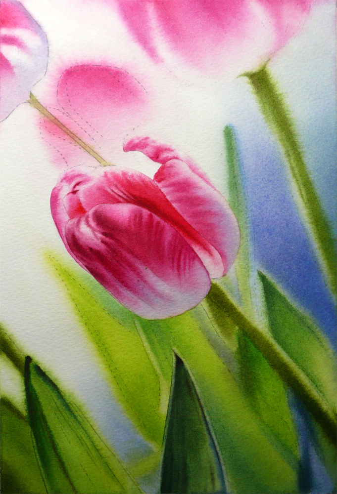
I also worked on the smaller rose painting, "Beauty Queen", a little more, glazing over background areas with mixtures of Quinacridone Gold, Peacock Blue, Winsor Green and Permanent Rose to make the darker shadow areas on leaves. They look a bit too hard-edged and unnatural right now, but the entire background area will be painted over wet-in-wet later to create a softer-focus effect, so I'm not worried about it right now. My goal of the underpainting stage is to put in the right color temperature indication with higher chroma, and create the right shapes of different value groups (light, medium and dark). When in doubt, I always put in more information with harder edges and brighter colors in the underpainting, because I know they can be "painted away" in the much more thickly applied overpainting stage. It's easier to dull down a color that is too bright by painting over it, but in watercolor, trying to brighten a color has has become too dull or muddy is almost impossible...

I also started to mingle pinks and lavenders on the rose petal to create its lovely blush. I am wetting larger areas than the ones I intend for the paint to cover so that there wouldn't be a harsh hard edge forming between each petal. When such hard line forms by accident, I am trying my best to catch it when the area it surrounds is still damp, and soften it using a damp brush. This takes a lot of time and patience and I am progressing very slowly on this painting. But it's totally worth the effort! I am in love with the lovely pink which evokes the joy of summer days...


Beauty Queen, Watercolor on Arches 140# Cold Press Paper, 7"h x 5"w, WIP 4

Friday, June 1, 2012

Edge of Summer II (Larger Version), Peppermint Rose (Still in Progress... It's Taking Forever!), and Some Exciting News from Juried Shows...

As my first trimester's study in the Golden Gate Atelier is drawing close to a finish, things start to get more hectic here, with me spending most of weekday evenings in studio trying to finish my current master copy drawing project, and working on the backgrounds of my figure drawing (I will post those at the end of the semester with a detailed summary of the valuable information I have learned from the classes, I promise). This means, sadly, a little less time to work on my watercolor paintings, which is really really really hard for me since the summer gardens here in the city is booming with inspirations! Also, I really need to work on some quarter sheets paintings in preparation for submissions to various juried shows. Here's my attempt for a larger version of the orchid painting, "Edge of Summer". I have washed in the first passage of layers on the flowers, starting from the lightest areas, using only Permanent Rose and Antwerp Blue -- I have to admit I am more and more taken by the harmonious results that can be achieved by using a limited palette...


Edge of Summer II, Watercolor on Arches 140# Cold Press Paper, 10"h x 14"w, WIP 1

I am also trying to put finishing touches and make adjustments on some paintings that has lingered in the studio for much too long! "Peppermint Rose" is so close to finish now, with most of the backgrounds being darkened wet-in-wet, and only a few shadow areas on some petals to be put in. I think the upper right corner shapes are too much like a Chinese 'Yin-Yang" sign and start to be distracting. It may need to be downplayed or even eliminated. I will look at it for a day or two before making the final decision...


Peppermint Rose, 
Watercolor on Fabriano Artistico 140# Cold Press Paper, 8"h x 8"w, WIP 7

Finally, some exciting news! "Hide and Seek II" has won an honorable mention in Illinois Watercolor Society's 28th National Exhibition! When I saw all the quality of work of the award winners shown on their webpage, I feel extremely honored to be chosen for this award. It has certainly made my day! 


Hide and Seek II, 
Watercolor on Jack Richeson Zoltan Szabo140# Cold Press Paper, 10"h x 14"w, 2012 #28


Related Posts Plugin for WordPress, Blogger...