Wednesday, March 21, 2012

Work in Progress: Last Light

After painting the the estuary and fog scenes with a muted cool palette, I was itching to splash some warm, saturated colors on paper, and a sunset is always enticing to paint... Think about all the bright reds, oranges and golden hues! The inspiration of this painting comes from a business trip several years ago when I was working as an application scientist (glorified term for after-sale customer support engineer...) in upstate Maine. I remember it was the last evening I stayed there, on the way to the hotel, after a three-day snow storm, the sun finally broke through thick clouds, and back-lighting all the pine and fir woods along the road... Some dead reeds across the snow field were glowing in the setting sun as if they were lid by fire. It was such a breath-taking moment... I pulled over the country road and snapped as many photos as I could while the sun is sinking fast toward the horizon.


Last Light, Watercolor on Arches 140# Cold Press Paper , 5"h x 6"w, WIP 1

Since this is a very small painting (I may do a larger version of it after trying out the composition on this scale), I tried to keep the background woods very simple, just using upright strokes of dark and light colors to hint the trees gradually receding into distance. I have used strong dark cool colors -- blues, greens and purples mingled together for the foreground shadows, and charged thick pigments of reddish-orange for the reed heads reflecting the setting sun. I am not sure about how I should deal with the middle-ground snow field. I'd like to keep it light to indicate sun-lid snow, but I'd also want to integrate it into the dark shapes of foreground and background. Some carefully pondering...

Tuesday, March 20, 2012

Work in Progress: Morning Fog, Tamalpais

More landscape paintings... I have to admit that they are extremely addictive once you get into the "zone"... This one is about the fog over Mount Tamalpais again. I am experimenting with painting with thicker and thicker pigments from background forward on saturated wet paper -- as the paper dries gradually during the painting process, the pigment would diffuse less and less and therefore give more definite forms to objects in the foreground. I've intentionally left some white passages unpainted to hint the veil of the fog around the hills, and trying to keep the far-away mountains cooler in color to be consistent with aerial perspective. It is challenging to paint the conifer in consistent but non-repetitive shapes to maintain interest in the foreground area, and I was trying hard to just use one or two strokes of a flat bristle brush on its edge to hint a tree... The foggy mornings in the redwood forest of California are truly beautiful and other-worldly. I just wish I have enough skills to do them justice on paper...


Morning Fog, Tamalpais,  
Watercolor on Arches 140# Cold Press Paper , 6"h x 9"w, WIP 1


Monday, March 19, 2012

Ebbing Tide, Spring Estuary

I did a long hike on the wetlands near Palo Alto today, and came back with tons of bad reference photos of the pattern of sand bars, reeds, sage bushes and water reflections -- it's very hard to capture the scenes outdoors on the clear day using a point-and-shoot camera, since the value contrast is so huge, the dynamic range of the camera is really far from adequate. Even with two exposure settings for every scene -- a low exposure for objects in bright sunlight and an over-exposed setting for everything in shadow, the reference photos just don't contain enough color information to do these beautiful scenes justice. I tried to do a small study from them nonetheless, and since the scene is really complicated with details of vegetation and reflections, I intentionally blurred the reference photo, and made a gray-scaled version of it to paint from. I also tried a limited palette of Viridian Green, Antwerp Blue and Burnt Sienna in the attempt to capture the tranquil mood of the muted colors I remembered seeing early in the morning there.


Ebbing Tide, Spring Estuary,  
Watercolor on Winsor Newton #140 Cold Press Paper , 5"h x 6"w, 2012 #27


My main interest here is to capture the abstract patterns formed by the sand when the tide water is gradually coming in. To make this work, I intentionally down-played the complicated background foliage, using only decorative shapes of light and dark to represent different cluster of bushes, with some branch patterns painted both positively and negatively to add to the impression of vegetation. The reflection in water is also greatly down-played and only hinted with wet-in-wet dropped-in passages of darker colors , so that the eye of the viewer would be lead smoothly into the foreground. I'm quite happy with the thought process, and wanted to try it for a larger piece some day, to further play with the abstract patterns. It was a fun, searching process overall, with lots and lots of stopping time to think what to do next... A great learning experience!

Sunday, March 18, 2012

More Big Sky Paintings...

More sky-centered paintings on the go... I've become braver and switched to quarter-sheet paper now, and using my 2" and 1" flats for the majority of this stage. What I found out is that sable flats have so much more characteristics while doing the initial wet-in-wet washes -- they release water with a more even rate, and deposit pigments slowly, giving the painter more control when the paper is soaking wet. However, the synthetic flats tend to leave interesting color "streaks" when carrying a denser mixture of pigments, which can create some nice effects when painting water or texturize foreground areas. 


South Wind, Watercolor on Arches #140 Cold Press Paper , 11"h x 15"w, WIP 1

I used mostly sable flats for the rainy clouds in the sky, but switched to synthetic flats and rounds for the foreground areas. I also tilted the paper to make color run down in diagonal directions to hint storm coming...


Stormy Weather, Watercolor on Arches #140 Cold Press Paper , 11"h x 15"w, WIP 1

Saturday, March 17, 2012

Winter Mirage (Version 2, Finished) and Mad Dash for Big Sky Paintings!

After assessing the color and value balance of Winter Mirage (the second version), I decided that I like it slightly better than the first version -- the paper was less wet when I painted the background foliage, hence the shapes were more define and less diffused, making better contrasts with the expanse of soft field of snow. I added details here and there to finish it -- tracks on the snow filed, fence posts, ledges and windows on the snow-covered house, branches on the pine tree and bushes... And here it is:


Winter Mirage (Version 2),  
Watercolor on Arches #140 Rough Paper , 5"h x 7"w, 2012 #26

Sold!

I've also started a couple of "big sky" paintings to further exercise painting on saturated wet paper, this time slightly bigger. I floated Cobalt Blue in a graded wash from top down, then a mixture of Aureolin Yellow and Permanent Rose in a second graded wash from bottom up. When it's still very wet, I added thicker pigments of the mixture of all the three colors plus some Prussian Blue and Burnt Sienna at the snow fields in foreground. As the paper gradually dries, I switched to smaller brushes and added the cloud shapes using denser and denser pigment, sometimes going back and put even stronger pigments on cloud shapes that has diffused a bit too much. I added the dark hill shapes in the background last, when the paper is almost dry. It's both exciting and terrifying to try to get most of the picture down on the paper in one drying cycle, and I can't say I've done a great job here, but it's such a great exercise to learn about "control" the watercolor medium...


Northern Exposure, 
Watercolor on Winsor Newton #140 Cold Press Paper , 8"h x 10"w, WIP 1

Friday, March 16, 2012

Two Small Landscapes: Season Change (Finished), & Tamalpais Meadow (WIP)

I've felt a bit experimental lately and ventured out to paint more wet-in-wet landscapes, some successful, others disastrous. To manage the drying time and achieve the soft, wet, flowing look that I love about watercolor landscapes, I've shrunk my paper size significantly for some trial-runs before to attack the larger sheets -- quarter sheet for me is large at my current skill level of managing wild wet washes, I'm not greedy in my expectations :-P. And I do fall in love with some of these small jewels from time to time -- sometimes a trial run has the kind of freedom and freshness that a well-planned, well-executed larger piece lacks. There is a delicate balance between spontaneity and careful planning that I am still struggling to grasp...

This is a card-sized "experiment" I did trying to figure out how to create those fluffy white clouds   I've so often seen when travelling in the high country of Colorado and Utah. I did it in two wet cycles in this piece -- first wetting the who image with clear water, and drop in Ultramarine and Cobalt Blues to indicate the sky behind the white clouds; while this is totally dry, I rewetted the white area and dropped in a very light mixture of grey made by Cobalt Blue and Burnt Sienna. The most important and difficult thing here is to try to not let this grey flow to the edge of the white space , so that you still have some white left between the blue of the sky and the grey of the cloud that's facing away from the sun. I played with calligraphic strokes while creating the spruce tress, paying attention to increase the value and saturation of color gradually from the background trees to the ones which are in the foreground. I liked the slight melancholy and sober mood of the resulted piece, and may do a slight larger piece of a different format of it in the future.


Season Change (High Country Snapshot I),  
Watercolor on Arches 140# Cold Press Paper , 5"h x 3"w, 2012 #25


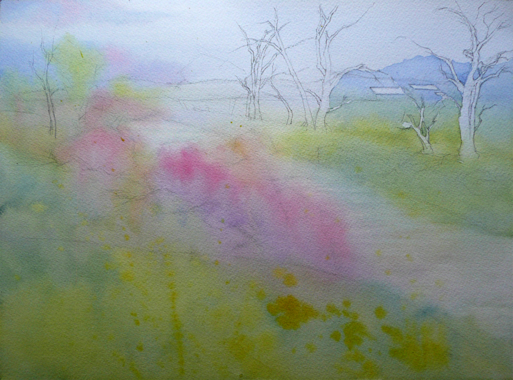
This is another piece I've started in the same fashion, trying to find out how to find fog-covered coastal hills. It's a view I so often see and marvel at while hiking in the Mount Tamalpais State Park in winter and spring mornings -- while the entire view ahead is veiled by beautiful silver fog, there would sometimes be a patch of meadow cleared of fog because it is not covered by oak and redwood trees (the respiratory action of these trees actually create huge amount of vapor in the air, and therefore make the fog denser). I'm struggling to recreate the quiet, moist, fresh air in my memory on paper in this one, and so far I've only done one wet cycle on the paper, painting from background forward as the paper gradually dries, leaving more and more obvious brush marks on the paper, ending with the dry-brush mark of muted brown underneath the tree shape near the center of the picture. At this stage I am more concerned with color temperature relationship and the abstract aesthetics of  brush marks -- the variation of shape, size, edge quality among these marks. Glazing over dry paper and tidy up these marks can be done without much difficulty later, as they are all quite soft and diffused. I love this stage of watercolor painting -- it's both exciting and nerve-wrecking, demanding 120% of the painter's attention. I'm feeling like walking on a tight rope while doing these wet-in-wet piece, which is a good change of pace from the more carefully planned floral paintings. Time to go back to the studio. Ciao!...


Spring Meadow, Tamalpais,  
Watercolor on Winsor Newton 140# Cold Press Paper , 6"h x 10"w, WIP 1


Thursday, March 15, 2012

Work in Progress: Petal Light II

I've started a new painting of Bird of Paradise, experimenting with orange-blue complementary color scheme. So far, the underpainting stage is going smoothly, and I really like the wonderful granulations formed by French Ultramarine mingled with Burnt Sienna and Burnt Umber.


Petal Light II,  Watercolor on Arches 140# Cold Press Paper , 8"h x 10"w, WIP 1


Wednesday, March 14, 2012

Edge of Summer (Finished!)

Finished this small study today... It's a good experiment with a painting method that was new to me. I have learned a great deal and had a whole new level of appreciation of the working methods of Ann Pember -- it's really hard to work this way!!! I did cheat a little and did not finish every section in one wet-in-wet session -- some background sections are rewet and repainted completely, the center of both the front and left orchids are glazed several times to achieve the right value transitions. Comparing to the last stage, I felt that the freshness of applying painting in one go has somewhat lost in these reworked sessions, but I do like the painting as a whole better after the reworking -- the values relates to the form of the flowers better, and the orange area in the top left section of the background was distracting to the eye -- therefore has to go. Now that I have worked out the colors and tried out a couple of things on this small study, I will repaint it in 10"h x 14"w format to submit to Red River Watercolor Society (RRWS)'s 19th National Exhibition. Time to be back to the painting table!...


Edge of Summer, Watercolor on Arches 140# Cold Press Paper, 5"h x 7"w, 2012 #24

Sold!


Sunday, March 11, 2012

Work in Progress: Summer Wakening (Another Layer...)

I am continuing to experiment with the limited color glazing technique I'm learning from Jeannie Vodden's class... On one hand, it really test one's patience since the pale colored glazes seem to take forever to reach the usual color intensity and value depth my usual wet-into-wet approach can achieve in one or two passes; on the other hand, it really works wonders in bringing subtle color interest and harmony into a painting, especially a flower with relatively little local color variations like this. With multiple glazes, even the dull shadow area seems to glow, and the subtle color identities in warm and cool parts of the pedal keeps viewer's eyes entertained. I never would have thought one red, one yellow and one blue can bring this rainbow of color onto the paper! -- Yes, I've heard about it, but doing it with my own hands really made me think that maybe I should explore the potential of using only a few colors in a painting more in my future exercises... 


Summer Wakening, 
Watercolor on Lanaquarelle 140# Cold Press Press Paper , 10"h x 8"w, WIP 5

I'm nearly done with the mid-valued area of the rose now. Next steps are to put in the case shadows and form shadows. Darker values are more challenging with this particular palette, as Permanent Rose only goes to mid-value range, and Winsor Yellow is a very light color. I may have to introduce Alizarin Crimson here to extend the value range in the shadows. We'll see...

Repeated glazing is easier on the Lanaquarelle paper this piece is painted on compared with Fabriano papers, but Lanaquarelle is not as tolerant to abuse as Arches, so I'm trying to not get to crazy with repeated lifting and reglazing for any given area. However, wet-lifting does work beautifully on this paper comparing to Arches, and I was able to get the delicate value changes describing the roundness and folds of pedals using this method.

Saturday, March 10, 2012

Star Gazer

I've worked on this small painting of plumeria on and off for a while on the loose thought that I want to do a series of 6" x 6" sized plumerias for the annual 50-50 show in the Sanchez Art Center of Pacifica, CA, during which the artists juried in would do 50 6" x 6" sized paintings in the theme and media of their choice during a period of 50 days, and the paintings would be mounted in a 7 x 7 (+ 1) grid format and shown as a group when finished. I really want to try to submit to this show, as it would push me to paint faster and more consistently, as well as trying various looser styles. Well... I wouldn't really call this one a loose piece and it certainly was not finished in a day, but I really like the suggestive backgrounds between leaves, which I basically invented the color and let the wet-in-wet process taken over to create interesting organic shapes. Next one would be looser, I promise...


Edge of Summer,  Watercolor on Arches 140# Cold Press Paper , 5"h x 7"w, 2012 #23

Sold!


Friday, March 9, 2012

Work in Progress: Peppermint Rose (Slowly...)

A busy day running in and out of studio for me, and unfortunately not a lot of painting time. Peppermint rose and Summer Wakening are both progressing ever so slowly, mainly because I am experimenting with new techniques that I have learned in Jeannie Vodden's very informative watercolor class. I have used a very limited palette of Permanent Rose, Winsor Yellow, Cobalt Blue and Winsor Blue to mix and mingle various shades of reds, pinks and lavenders, using the change of color temperatures to hint the turning of pedals and the cool morning light. Since the reference photo for Peppermint Rose was taken on a clear morning, the light is very cool, and the light-strike area is significantly bluer than the cast shadows and the inside of pedals that are hidden from the light. I am trying very hard to convey that using this limited palette. It's all very new and interesting to me -- I just can't wait to get it finished! 


Peppermint Rose,  
Watercolor on Fabriano Artistico 140# Cold Press Paper , 8"h x 8"w, WIP 3


Thursday, March 8, 2012

Work in Progress: Winter Mirage (Version 2), & Spring Breeze IV Shipped for WAS-H 35th International Show

This is my second take on the little landscape painting, "Winter Mirage", that I started a while ago. I was not entirely happy about how the colors turned out, and decided to try it again -- this time with the paper taped down on a Gator Board surface to keep it flat. I also used rough instead of cold press paper to facilitate possible granulation of the large amount of Cobalt and Ultramarine Blues used. Rough paper also makes color blending wet-in-wet relatively easy to control. I am much happier with this one compared to the last -- I love how the red and blue fused into each other in the background bushes and tress, yet still kept their own color identities. I also really liked the soft gradation of the foreground. Since this is painted on a smaller sized paper, I may elect not too add any more detail in the foreground, so that viewer's eyes can slide smoothly across it and into the middle ground, which is my center of focus.


Winter Mirage (Version 2),  
Watercolor on Arches #140 Rough Paper , 5"h x 7"w, WIP 1

I've also received confirmation today that "Spring Breeze IV" has safely arrived at Watercolor Art Society - Huston (WAS-H)'s gallery and will be hang tomorrow for viewing. WAS-H's 35th International Exhibition opens March 13th and will remain open until April 20th in their gallery. If you are in the Greater Huston Area, it's a beautiful show to drop by -- lots of amazing work from the catalog I received! The address of the gallery is 1601 West Alabama Street in Huston, and the gallery opens between 10am and 4pm every Tuesday through Saturday. This painting is for sale at the show but you can also buy it from my Daily Paintworks Gallery at a discounted price of $250, and it will be shipped (with mats but not frames) after the show comes down in April.


Spring Breeze IV 
(Juried into Watercolor Art Society - Huston's 35th International Exhibition)
Watercolor on Arches 140# Cold Press Paper , 14"h x 10"w, 2012 #16

Wednesday, March 7, 2012

Dancing Tulip (Finished, Finally!)

I am very happy with the end results of this painting -- I think the dark, colorful backgrounds painted wet-in-wet added the drama to the painting, and the value on the flower pedals, although on the darker side, still appear luminous against the background. I toned down the yellow-green foliage to make the light on the pedals shine and catch maximum attention, and I think it worked!

One thing I learned when painting this little study is how to use natural stopping points as boundaries for wet application, and only wet part of the background area at a time during paint application. Any light shape, such as the green area to the right of the left bud, can be such a stopping point. I painted the left side of it first, using the edge of the long leaf at the bottom left corner as another stopping point when wetting the paper. When this dried, I simply re-wet over the green area and the adjacent areas on the right, and floated in more colors to create a seamless connection. The trick of not forming a hard line is to start and stop at an area with relatively thin pigment density, so that pigments already on the paper would not lift and form a dark line along the edge of the wet area.


Dancing Tulip, 
 
Watercolor on Fabriano Artistico 140# Cold Press Paper , 5"h x 7"w, 2012 #21 

Sold!


Tuesday, March 6, 2012

Work in Progress: Dancing Tulip (Almost Finished, Really...), & Class with Jeanne Vooden

I'm still painting away for the upcoming tulip art festival in Oakland, adding denser pigment wet-in-wet on the leaves to create a glow of spring yellow-green. When finished, the leaves would be the only true light-colored shapes and contrasting with the deep burgundy-purple flower. I am a little worried that they would attract the eye too much and draw the attention away from the main flower, but I do like the reddish purple vs. yellow green color scheme. We'll see how it goes. I also added more of the same color on the upper left corner of background to hint foliage in the distance, and to balance the movement of color throughout the image.

Most work I did was on the flower pedals. I found Fabriano Artistico Cold Press paper very very hard to glaze on -- even the staining colors seem to lift easily. And when the pigment density is too high, it seems that they don't get absorbed into the paper at all, just floating on the surface and being pushed around by the next brush load of pigments. I'm a bit annoyed at this stage, but decided to carry on -- after all, almost all mistakes made on this paper can be corrected easily with lifting! I guess I just have to learn the art of dancing with the devil...


Dancing Tulip,  Watercolor on Fabriano Artistico 140# Cold Press Paper , 5"h x 7"w, WIP 4

What made me super excited today was I got to start my six-week class with the amazing artist Jeannie Vodden! She paints with beautiful, delicate mingled fluid washes of very limited palette -- most often just one red, one yellow and one blue, letting the pigments mixing both on palette and on paper to create a rainbow of hues. Her method involves very patient glazing and our class project this time was a landscape. I am showing my humble efforts here -- it looks so pale and subtle, but it's already three washes on wet paper! -- The first one going down from the sky region and covered almost all paper, changing color from the Cobalt Blue Sky to the light yellow-green of meadows, then to the pink flowering bush, all finished by applying a combination of Permanent Rose, Lemon Yellow and Cobalt Blue on pre-wetted paper. The second wash strengthened colors on the left bank wet-on-dry, and the third partially covered the right bank in the same manner, carefully painted around the tree trunks and distant rooftops. It's very different from my usual painting method, and I can't wait to see how it would turn out... 


Spring Run,  Watercolor on Arches140# Cold Press Paper , 9"h x 12"w, WIP 1


Monday, March 5, 2012

Work in Progress: Summer Wakening (Slowly...)

The rose painting "Summer Wakening" is progressing ever so slowly. I want to keep the warm and cool pinks on the pedals light and delicate, but not too washed out. In the mean time, I am struggling to make the shadows look dark and rich, yet not totally out of place. I do not think I've accomplished the latter successfully so far in this painting, and may have to lift the parts that has gone too dark and not in concert with the surrounding pedal colors... It's a good thing that Lanaquarelle paper allows lifting easily! However, this paper is also very soft and delicate, so I have to be really careful when doing the lifting to avoid hurting the paper surface... 


Summer Wakening, 
Watercolor on Lanaquarelle 140# Cold Press Press Paper , 10"h x 8"w, WIP 4

Sunday, March 4, 2012

Work in Progress: Edge of Summer (Almost Finished)

After finishing all the background sections (maybe?) it feels like the center flower appears a little washed out by comparison. I am thinking about darkening its center and right pedals, as well as giving more definition to the stamens... I think this painting is 80% finished, but requires being set aside for a little bit and careful consideration to avoid overworking...


Edge of Summer,  Watercolor on Arches 140# Cold Press Paper , 5"h x 7"w, WIP 3


Saturday, March 3, 2012

A Blush of Spring (Finished), and Continuation of Sun Dance

Most part of the day today was spent on finishing the small tulip painting I started a couple of days ago, but did not get a chance to work on more until today. The annual tulip art festival in Oakland is coming up, so I want to have several tulip paintings ready for it -- it's not exactly an art festival, but I'm looking forward to meet many local florists there, and want to see if there is an opportunity to develop collaboration with them, and maybe show some of my art in local floral shops... We'll see how that goes in a couple of weeks.

This one has taken quite a while for me to finish, since colors seem to sink in on rough paper surfaces, and just appear to be less bright. It took me many glazes to reach the color intensity and value depth on this one -- luckily, rough paper also takes glazes very well and the colors put down on it does not lift easily!


A Blush of Spring,  Watercolor on Arches 140# Rough Paper , 7"h x 5"w, 2012 #20

Sold!

I also did a little more work on Sun Dance, finishing the overpainting of the background wet-in-wet. There are parts that I am more happy with than others, but that is just the nature of painting wet-in-wet -- there are times that you just have to bind your hands behind your back and say to yourself : "I'm just going to accept what happens on the paper and respect watercolor for doing what it always does..." And maybe, trying to learn from the less perfect parts and make improvements next round up! 


Sun Dance,  Watercolor on Arches 140# Cold Press Paper , 8"h x 8"w, WIP 5

Friday, March 2, 2012

Work in Progress: Sun Dance (Continued...)

I worked a little bit more on Sun Dance today, filling in the leaves behind the flower. I got a little carried away and spent probably too much time to model the leaves and stems of the rose on the upper left corner... It's time to quit procrastinating and put some bold yellow washes over the flower...


Sun Dance,  Watercolor on Arches 140# Cold Press Paper , 8"h x 8"w, WIP 4

Thursday, March 1, 2012

Work in Progress: Edge of Summer (Continued...)

A little more work on the orchid painting, "Edge of Summer" today, continuing to experiment with color mingling, this time using more transparent colors with a long value range: Alizarin Crimson, Winsor Blue, Winsor Green and Winsor Violet. It is hard to control the exact shape using this method, but wet, juicy dark colors do have a life of their own, and time and time again forming beautiful fluid shapes...


Edge of Summer,  Watercolor on Arches 140# Cold Press Paper , 5"h x 7"w, WIP 2

 
Related Posts Plugin for WordPress, Blogger...