Showing posts with label 10x14. Show all posts

Wednesday, February 27, 2013

Petal Light IV (Finished!)


Petal Light IV, Watercolor on Arches #140 Cold Press Paper, 14"h x 10"w, 2013 #34


Finished this one just in time for the submission to Illinois Watercolor Society's National Juried Exhibition this year -- we will see how that turns out! Compared to the 10" x 8" version, this one has more sober and muted colors which are closer to nature. I also experimented with painting larger area wet in wet in one go, and combining several leaf shapes as a group to be painted together. I'm happy with the result, now it's time to put it aside for a little bit and see in a couple of days whether any final adjustment is needed...  


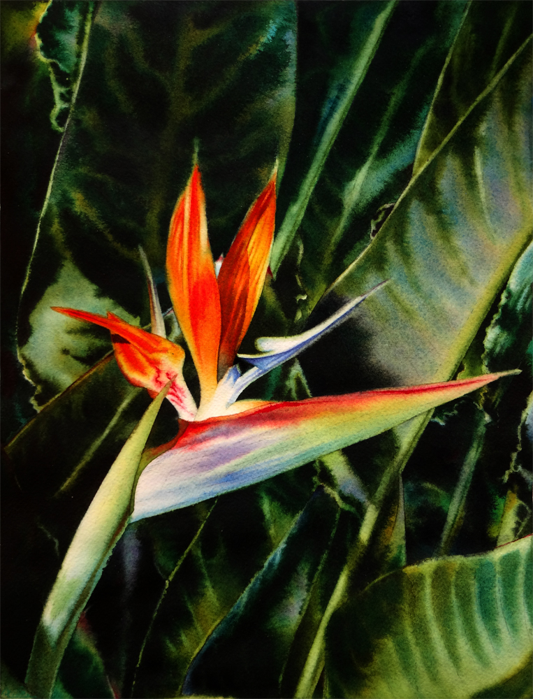
Fire Bird, Watercolor on Arches #140 Cold Press Paper, 5"h x 7"w, WIP 2

This one is coming very close to its finish. I will need to put some darker blues on the stamen to make it really pop, and maybe add another pass on the background to make it darker -- I am not sure at the point yet, but I don't want to go all the way to black to lose the color interaction between the yellow orange flower and the blue of the background -- this set of complementary works well, but I do feel the value of the background is a bit too light and therefore distract the viewer's eye from the center flower. What do you think? Please let me know -- I think I do need a pair of more objective eyes than mine at this point...

You can purchase my 2013 wall and desk calendars here:

Monday, December 31, 2012

A Look Back at Year 2012...

As the clock ticking close to midnight, I am turning my eyes to the year passed and all that has happened in my art journey along the way. As I mentioned in my last blog post, it has been an amazing ride, thanks to all of you, my dear friends and collectors! When I set off at the beginning of the year, I did set some modest goals for myself: creating some artwork every week, posting them online for sale, documenting the process in this blog, and trying to enter some juried shows. In the end, I have accomplished so much more, -- something that would not be possible without your kind encouragements and support along the way!

In this year, I have managed to finish a total of 54 paintings -- including studies and plein air work. This may be a modest number for many, but to me it is a real accomplishment, as I am a very slow painter and the work I have managed to actually finish in all the years before do not even add up to this number. I would definitely like to do at least as much in the coming year, but I will leave goal-setting to my post tomorrow. ;-) Now is the time to enjoy the bubbly drinks and pat myself on the back! 

I've managed to overcome my fear of losing control of what happened on paper and tackled some unfamiliar surfaces, the most difficult of which being Ampersand Aquabord, and with the kind encouragements of Kara and Crystal, got some success in the end. I would love to keep at this effort in the coming year -- and maybe try some portraits on it too!

This year I have also tried a few different sales venues -- both online and offline, some more successful than others. I've set up my Daily Paintworks Gallery, where I auction off my smaller original works; I've stocked my Etsy Shop, where I sell both originals and Giclee prints, as well as products such as calendars and note cards; I've uploaded my work to the print-on-demand site, Fine Art America, so that anyone can purchase Giclee prints of my paintings to the size and surface they desire, as well as my works as note cards. I've kept up on this blog (although updating regularly did remain a challenge when school work got busy) and maintained regular update of my facebook page, through both of which I have met many wonderful friends! I've attempted my hands at three local art fairs and managed to break even at all of them, and received several leads which resulted in sales afterwards from these events. I've also become a member of the wonderful Main Gallery in Redwood City -- the amazing talent and creativity of the artists I've met there made me very proud to be one of them!

I've tried my hands on a couple of local, regional and national juried shows this year, and was fortunate enough to be juried in 20 of them, getting a couple of awards and selling some of my larger works through these shows. I am extremely honored to enlist among the wonderful artists -- many of whom are my teachers through their books and instructional dvds -- in these shows, and consider the juries decisions a gentle nudge of encouragement for an artist at her starting point like me. For all the ones that I did not get in, I can only say I will definitely try harder the coming year!

What I did not manage to do, in the year past, is to keep a sketchbook and draw freehand everyday, to go outdoors more often and do more plein air studies, and to keep finishing two small paintings a week. With four days a week in the Golden Gate Atelier learning classical drawing methods, it has proven quite a challenge to keep at these goals. But I will not give them up in the new year, -- I've just signed up for an impossible crazy task today, which I will reveal in tomorrow's post. So stay tuned...

Ok, before I bore you with more self-bragging, I just want to share with you my seven favorite paintings that I have created this year. Some of them are award winners and already happily settled in their new homes, others I love not because of the final results, but also the challenges I have taken and difficulties overcome during their creation...


High Summer Dreams II, Watercolor on Arches 140# Cold Press Paper, 10"h x 14"w, Sold

This one has won me a gold medal in Stockton Art League's National Juried Show at Haggin Musuem -- the first red-carpet moment in my art career! 


April's Passing,  Watercolor on Ampersand Aquaboard, 6"h x 6"w
Available through Randy Higbee Gallery ($300 with Frame)

My first successful attempt on Aquabord after much suffering. I feel that after this one, I started to have some understanding of how this difficult surface works, and I was also able to let go of a bit of control to accept what's happening on paper (or, in this case, on board ;-)


Petal Light #2,  Watercolor on Arches 140# Cold Press Paper, 7"h x 10"w
Available through Daily Paintworks Online Gallery ($125 with Mat)

I feel that I have truly captured the warmth and vivacity in this bird without fiddling too much. Love the wet-in-wet process from start to finish...


Beauty Queen, Watercolor on Arches 140# Cold Press Paper, 7"h x 5"w, Sold

I tried out the multi-colored glazing method of the amazing Jeannie Vodden and combined it with my own wet-in-wet approach in the background. I was very worried the flower and the background would look like completely separate entities, but somehow the painting feels coherent as a whole when finished. Yay! Sometimes risk-taking does pay off...


Edge of Summer, Watercolor on Arches 140# Cold Press Paper, 5"h x 7"w, Sold

I tried to paint from a black-and-white photo and just imagine the colors of this one, and lovedswhat became of it. An attempt to correct my tendency to paint colors too literally from reference materials and see them only as a starting point. 


Petal Light #1,  Watercolor on Arches 140# Cold Press Paper, 10"h x 8"w
Available through Daily Paintworks Online Gallery ($150 with Mat)

Starting from an under-exposed, uninspiring reference photo of large area of dead dark shadow shapes on the leaves, I let the wet-in-wet process lead me and created interesting dark shapes. I felt a real sense of freedom after pulling this one off!


Winter Light, Watercolor on Arches 140# Rough Paper, 5"h x 7"w, Sold

The first landscape painting I am proud of -- I feel this one did capture more with less. 

Thanks again my friends -- as I have mentioned, I could not have done this without your support! Happy New Year Everyone!!!

You can purchase my 2013 wall and desk calendars here:


Sunday, September 30, 2012

Petal Light III (Finished!)

I stayed up late for three consecutive nights and finally managed to finish this one for the Santa Clara Valley Watercolor Society's Annual Member Show! I am quite happy with the wet-in-wet passage of the big tree stump behind the flower -- but it was absolutely scary when that whole area is wet, and thick pigments of French Ultramarine and Quinacridone Burnt Sienna oozing in amorphous shaped puddles, and I was frenetically trying to lift out some brighter passages within the whole mess of darkness... I did struggle back and forth about whether I should even leave the stump where it is before starting to paint this image -- or whether I should simply remove it and put in more foliage behind the flower. I finally decided the image has enough areas of foliage and the stump could potentially break the monotony of blues and greens, add a little muted warmth to the imagery, and decide to leave it in the picture. To contrast with the detailed flower, I decide to paint the whole area wet-in-wet, using only brushwork to hint the wood grains and rough textures on the bark. I'm really glad that I did it this way -- and on this difficult paper, because it did force me to totally loosen up and break away from my reference photo, and only concentrate on WHAT IS HAPPENING ON MY PAPER to make interesting shapes using light, medium and dark value patterns and warm-cool color contrasts. It is so liberating and I really need to do this many, many, many more times!!!  


Petal Light III, 
Watercolor on Fabriano Artistico 140# Cold Press Paper,10"h x 14"w, 2012 #50


I choose a dark copper-bronze colored frame to echo the warm rusty hue of the tree stump, and deposited the painting at the Rose Shenson Gallery of Triton Art Museum in Santa Clara. The show runs from October 4th to November 3rd, and the opening reception is next Saturday, October 7th from 1:00 pm to 3:30 pm. I will be at the reception. If you are in the area, stop by and say hi! 


Petal Light III, Framed (Frame Size 16"h x 20"w)

Thursday, September 27, 2012

Work in Progress: Snow White (and the Huntsman?...) (Conflict of Styles?...)

Have you ever experienced this -- you are looking at a beautiful reference photo, and you have a clear vision of how the painting will turn out. You sit down, start to work on it with a specific technique that you know will work with the imagery and bring out that special "zing" of it. You work more -- and then suddenly you realize a different technique, a different way to deal with the imagery, a completely different vision is taking over and you are torn between the old and the new? What do you do in this situation, my friend? Do you let your initial idea persist and work out the later inspiration in a second attempt of the same reference, or do you let the painting take a life of its own and dictate how it wants to present itself?...

I started this painting of a white rose back lid against a field of dark foliage as an experiment of blending colorful grey on the shadow areas of the petal -- using Permanent Rose, Aureolin Yellow and Cobalt Blue to mix greys with subtle color temperature shifts. I was quite happy about the results of the first few petals on the upper left side, but when I proceed on to the lower right side, I suddenly realize that I am practicing the painting technique I learned in the Amazing Jeannie Vooden's class and directly blending the three primaries on paper and layering them on as glazes instead of finishing each shadow area in one go. Suddenly realizing this could be one of the images of "colorful whites" that I love so much about Jeannie's work, I am eager to try out the technique. Yet as I was taking a break (while waiting the paint to dry, haha, I'm sure I am not the only one who is guilty of doing this) and surfing through the web, I came across one of the amazing images of Ann Pember, one of my favorite flower painters of all times, I was reminded of the beautiful way she paints white flowers -- wetting each shadow shapes separately and use wet-in-wet brush to hint the folds and turns of the petals, finishing each area in one go using high-saturation colors and let them blend on paper. I realized that I've wanted to try this method on for a long time -- and this imagery presents a find opportunity for doing that! Now I am really torn about how to proceed forward... 


Snow White, Watercolor on Arches 140# Cold Press Paper, 8"h x 10"w, WIP 1

As a result, I put the white rose aside and resumed working on this bird of paradise painting (another one!). It has been a real challenge to work on this Fabriano #140 Cold Press paper -- I like to put on color a bit more thickly than people who does a lot of glazing to build up the color intensity, and as a result, whenever I try to rewet an area to do some detailed work wet-in wet, the underlying layers just lift like crazy. But, the color brilliance that can be obtained on Fabriano paper is just hard to match using Arches. So I am pressing on... (Speaking of enjoying the process versus results, well, while painting on the Fabriano paper I am clearly aiming at the latter instead of fully enjoying the former. Am I bad?...)


Petal Light III, 
Watercolor on Fabriano Artistico 140# Cold Press Paper, 10"h x 14"w, WIP 4

Speaking of results -- the jurying results were in for the Fremont Art Association's 47th Annual Open Juried Exhibition, and my work, "Peppermint Rose" has won the silver medal of honor in Watermedia! I am so excited... The awards ceremony is this coming Sunday at 1pm. If you are in the bay area and not busy, come by and say hi!...


Peppermint Rose, 
Watercolor on Fabriano Artistico 140# Cold Press Paper, 8"h x 8"w, 2012 #36

Buy It Now from My DPW Gallery ($125)


Here's how this painting looks in its frame -- I chose a simple black frame a little wider than 1" and 2" white mat all around, nothing too fancy to direct viewer's eyes away from the painting...


Peppermint Rose, Framed (Frame Size 12"h x 12"w)


Friday, September 21, 2012

High Summer Dreams III (Deadlines Here I Come...)

I finally manage to finish this and send it off before the deadline today... It was literally painting against the clock. Two down, one to go! I am really hoping to finish another Bird of Paradise painting by next Friday for the Santa Clara Valley Watercolor Society's Annual Member Show...


High Summer Dreams III, 
Watercolor on Arches 140# Cold Press Paper, 10"h x 14"w, 2012 #49

Bid at My DPW Auction (Starting Bid $150)

Regarding shows -- it is old news now but my painting "Beauty Queen" is awarded an honorable mention in the Watercolor Artists of Sacramento Horizons' open juried show this year. "Petal Light II" and "Spring Breeze IV" are also juried into this exhibition, which runs through next Saturday, September 29th in Sacramento Fine Arts Center. If you happen to be in the area, stop by and take a look! :-)


Beauty Queen, Watercolor on Arches 140# Cold Press Paper, 7"h x 5"w, 2012 #41

Wednesday, September 19, 2012

Hide and Seek III (I'm Back!!!......)

Hi everyone! I am finally back from China... It's been a long absence and I've done a bunch of landscape sketches that I am going to share on this blog in the coming days, but for now, I am stressed over two coming deadlines -- one for this Friday and the other one for the coming Saturday, both 11" x 14" bird of paradise paintings (large ones for me). I will post the progress shots along the way, I promise.

I have not been able to manage to paint much during my absence, and when I tried to get back at it -- it's almost like learning everything from start again! (The deadlines surely did not help either...) I found that I am having problems gauging the wetness of the brush, the exact mixture to use for a glaze, and the timing for large, wet-in-wet applications... I've messed up a couple of starts and finally decided to get back into my grooves by redoing "Hide and Seek" as an exercise -- and I do need some pieces for some art fairs and a gallery jurying process coming up in October (again, more details later). I made numerous mistakes painting this one, and was fortunate to be able to catch and correct most of them, and end up with the result that I am quite happy with:


Hide and Seek III
Watercolor on Winsor Netwon140# Cold Press Paper, 10"h x 14"w, 2012 #48

Sold!

I did this version on Winsor & Newton #140 Cold Press Watercolor Paper, and it is a good test for unfamiliar paper as well. I've found the Winsor & Newton paper has a handling quality close to that of the Arches', but slightly easier for lifting, although repeated glazing for too many times may cause paint to bleed on the edge of wet area more easily than Arches as well. The final resulted color on this paper seem to dull down quite a bit, even for high saturation transparent colors like Permanent Rose, which may present a challenge for flower paintings in particular. I will experiment with it more and report it here.

From the juried exhibition front, my painting, "Petal Light #1" was accepted into the Hawaii Watercolor Society's 2012 Open Exhibition. A Fellow DPW painter and blogger, Colleen Sanchez, has selflessly contributed her time and effort helping organizing this fabulous exhibition. Colleen paints amazing watercolor flowers and lately has taken the adventure of oil painting. If you haven't already, be sure to stop by her blog, and I promise you won't be disappointed!


Petal Light #1, Watercolor on Arches 140# Cold Press Paper, 10"h x 8"w, 2012 #40

I am trying to paint as fast as I can to catch up, and in the same time -- trying to catch up with all the fabulous works you have done during the time I have no access to blogger or facebook. Everyone seems to be really productive -- lots to catch up with...

Saturday, August 11, 2012

Green Orchids - Sold, and Some Good News from Juried Shows!

I have divided my time between this one and the Purple Hibiscus painting, which is also close to finish at this point. After doing several layers of glazes on the flower petals on this one, I realized that the value between my subject and the background is getting very close, therefore the flowers no longer stand out again the background. So -- up goes more darks! I mixed in Brown Madder Alizarin and Alizarin Crimson with Holbein's Undersea Green to create a very thick, creamy mixture and painted it over the left side background, varying the density and color dominations a little to create subtle value changes instead just a monotonous layer of black -- it's hard to see such subtle effects in photos because the value range of CCD cells on most digital cameras are far inferior than the human eye, but when viewed in person, the subtle variations are evident. I was happy with the results and decided not to finesse it any more. So here it is!


Green Orchids, Watercolor on Arches 140# Cold Press Paper, 6"h x 6"w, 2012 #43

Bid at My DPW Auction (Starting Bid $40)

I've also received some more exciting news from juried shows -- my painting, "High Summer Dream", was accepted into Kentucky Watercolor Society's Aqueous USA 2012 National Juried Exhibition! The Jury this year is Ted Nuttall, an artist I greatly admire. It's a great honor to be selected into a national competition, and it's even more exciting that someone whose art you have looked up to actually awarded you such honor. I am really thrilled...


High Summer Dream, Watercolor on Arches 140# Cold Press Paper, 10"h x 14"w, 2012 #1

Sold!

Thursday, July 5, 2012

Work in Progress: Beauty Queen (Finishing Underpainting of Leaves), and Great News from Juried Shows

It may not seem that a lot has been done since its last WIP, but believe me, many hours of loving labor has gone into this little painting between then and now, carefully strengthening the intensity and value of the shadow shapes of the background leaves, and modifying the colors of the light-strike areas. More than once have I completely lost in the middle of this big puzzle of light and dark shapes, wondering where the shape I am currently delineating is located in the reference photo. (I even cut out inch-sized square shapes on white paper to isolate the area I am looking at on the reference photo so that I can get back to the same area every time I leave the painting table... That really helped) I think the underpainting of the leaves in the background is almost finished at this stage. Right now the entire background seem very hard-edged but to me there is a easy-to-identify structure of color temperature and clear structure of light-middle value-dark shapes, which would allow me to do a wet-into-wet overpainting easily -- at least I hope so :-P


Beauty Queen, Watercolor on Arches 140# Cold Press Paper, 7"h x 5"w, WIP 6

And I got great news when attending the reception in the Haggin Museum for Stockton Art League's 57th National Juried Exhibition yesterday -- my painting, High Summer Dream II, was awarded the Iona Hepper Memorial 1st Place Award for Water Media! What an honor! Adding to my joy of the day, I was approached by the client who just purchased this piece from the show... It is just like a big happy dream...


High Summer Dreams II, 
Watercolor on Arches 140# Cold Press Paper, 10"h x 14"w, 2012 #33

Sold!

Sunday, July 1, 2012

A New Series (Sanchez Art Center 50-50 Show)

I was quite busy since the end of June on this new project -- I was juried into the "50-50 Show" hosted by the Sanchez Art Center in Pacifica, which requires each participating artist to create 50 small pieces of art -- 6"h x 6"w to be exact -- and exhibit them as a body of work, installed in 7 rows and 7 columns, plus one title piece together. There would be a theme chosen by each participating artist, and mine was "Rainbow Colored Flowers". I had planed to create 7 rows of flowers, each taking a spectrum of the rainbow, plus a white title piece flower. Now that I am trying my best to paint one 6"h x 6"w sized image in one day, I have some new ideas, which I will talk about when I show more images in my later posts. But this is one piece, almost finished but not quite yet in the lightest parts, created for the show. It would be in center of the red row.


Crimsonscape - Red Poinsettia
Watercolor on Arches 140# Cold Press Paper, 6"h x 6"w, WIP 1

I've also got some good news in the mail today -- my painting, "Edge of Summer II" was awarded the Golden Acrylics Merchandise Award in the Red River Watercolor Society's 19th National Juried Watermedia Exhibition. This piece is currently on view at Hjemkomst Center Gallery, 202 1st Avenue North, Moorhead, MN. I am looking forward to receive some beautiful juicy Golden Liquid Acrylics... ^___^


Edge of Summer II, Watercolor on Arches 140# Cold Press Paper, 10"h x 14"w, 2012 #32


Saturday, June 23, 2012

High Summer Dreams II (Finished!)

This painting is finished and I have to drag my own hands from it -- no more further fiddling!!! I have to learn when to stop before fuzzing over unnecessary details and destroy that freshness so precious to a good watercolor painting.. No one wants to look at a flower painting that seems tired and beaten up! It does not matter the orange on the left most petal looks a bit too warm and the shape of the stamen is not exactly correct -- those are not the most important things to worry about at this stage of painting. The most important thing is that the finished painting works well as a whole and has a clear focus. I am stopping now. Right now. I am happy with it and will try not to ruin it from this point on... :-P


High Summer Dreams II, 
Watercolor on Arches 140# Cold Press Paper, 10"h x 14"w, 2012 #33

Bid at My DPW Auction (Starting Bid $150)


Friday, June 22, 2012

Work in Progress: Petal Light III (and the Grand Struggle)

One of the greatest struggles of watercolor is the balance between modelling the color and value of your subject accurately, and maintain that precious freshness that is best obtained by go over the same area with as few passages as possible. I have living this grand struggle through every single second of this painting, which has since formed a very intense love-hate relationship with me. In one passage the colors seem to glow with exuberance, and with the next wetting it inevitably lifts, leaving a mess, reminding me of the ruthlessness of Fabriano paper. On the other hand, when I tried to do all the modelling, all the color and value variations in one go, it seldom ends up with any level of satisfaction -- wet colors have a will of their own, they move and blend in wonderful, mysterious ways, however, very rarely resembling anything that looks remotely like the objects I am trying to portray in the end. This is further complicated by the fact that the soft surface of Fabriano paper does not contain much sizing, and therefore absorbs water much quicker than harder surfaces paper such as Arches -- which means you have even less time to try to move and manipulate color wet-in-wet. Well, for all these frustrations, erasing everything and start over is not too hard on this paper -- almost everything lifts right back to white with a soft synthetic brush (not the abusive bristle brush that actually bruise the paper surface!). But then again, a three-times erased passage is almost certainly bound to be a tired passage with not a great amount of energy and freshness to it. I am agonizing over the challenges, not willing to give up just yet -- like any hopelessly foolish lover, barely hanging on to the hope of that glorious ending...


Petal Light III, 
Watercolor on Fabriano Artistico140# Cold Press Press Paper , 10"h x 14"w, WIP 4

Sunday, June 17, 2012

Work in Progress: High Summer Dreams II (Almost Finished!...)

The process of putting overpainting layers wet-in-wet is both exuberant and nerve-wrecking -- to created a truly integrated look, and avoid a hard-edged line between each petal and every leaf blade, it is important to wet as large an area of varied objects and backgrounds between time as possible, and drop in dense passages of color to create soft but recognizable boundaries between them. Since it is much harder to maintain wetness in a larger surface area, and manipulate different colors across them, sometimes it is vital to find inconspicuous "stopping points" -- small areas that do not draw the eye directly and therefore ideal for one wet passages to stop and another to begin. Since you are painting thickly, there is not too much chance to fiddle around or modify with further glazes after one passage has dried and the color or value do not turn out to be the correct one, which is the nerve-wrecking part...

It took about five wet-in-wet passages to arrive at the stage shown in WIP 6 from WIP 5. I have chosen areas separated by relatively light areas and contained by hard edges -- usually reserved for the center of focus in my paintings -- as areas to be wet at once.


High Summer Dreams II, Watercolor on Arches 140# Cold Press Paper, 10"h x 14"w, WIP 6

Here in WIP 7, I'm only one wetting away from WIP 6 -- I've painted the upper left side of leaves and backgrounds between the leaf blades. My stopping point on the right is the area directly above the top left side petals of the flower. It/s a lighter area with relatively complicated shapes, complicated enough that the "line of boundary" between two wettings can be hidden quite easily without catching the viewer's eye. My other stopping point, at the bottom of this shape, is a darker passage which would border another dark passage beneath it. I've found that painting two dark area side by side usually can hide the boundary line quite well, although care needs to be taken not to wet into the previously painted darker passages too much to induce color lifting.


High Summer Dreams II, Watercolor on Arches 140# Cold Press Paper, 10"h x 14"w, WIP 7

It's really close to finish now. I'm quite excited to see how it would turn out!

Saturday, June 16, 2012

Work in Progress: Petal Light #1 & High Summer Dreams II (Finishing the Center Flowers)

I've started to group my painting efforts and work on parallel projects with similar palette simultaneously, so today I worked on the center flowers of Petal Light #1 and High Summer Dreams II. I hope this switching back and forth would allow me to look at these parallel projects with a fresh eye, and avoid getting caught into and fuss over unnecessary details.

It is really interesting to me that every painting has this moment of coming into "existence" -- before that I just have a vague idea of how it might come out looking like, and despite of the ugly (or sometimes relatively pleasant) early stages, march on until that  point, at which everything suddenly seems to fall into place and make sense, and the whole painting just come together, and after which the painting process becomes much easier. Sometimes this point comes much earlier, after the first couple layers of underpainting, but in most cases it does not arrive until I get the center of attention in place and key it properly with its surrounding element. Of course sometimes it does not arrive until the very final passages, in which case it would be a painting of true struggles. For these two painting though, the turning point did arrive once I put in the center flowers in full color intensity and keyed a few darker passages surrounding it. I think now I have a very good idea of how the final painting would look like in terms of value relationship, and the rest should be much less of a struggle...


Petal Light #1, Watercolor on Arches 140# Cold Press Paper, 10"h x 8"w, WIP 6


High Summer Dreams II, Watercolor on Arches 140# Cold Press Paper, 10"h x 14"w, WIP 5

Friday, June 15, 2012

Work in Progress: High Summer Dreams II (Finishing the Underpainting)

The background underpainting of leaves and shaded grounds is finished at this stage -- oh boy, did it take more time than I had initially planned! It probably contained way more information than what would show through in the final painting -- the details, the local color temperature and value relationships, the structural information... I am still trying to find out how much is enough as far as underpainting is concerned -- I can always put more in and later paint them away with thicker paints of the overpainting in dark areas, so I tend to put much more than what I think would be necessary. When I just started painting in watercolor, I read in instructional books that with each subsequent glaze, you put in more and more information and add more and more details. It's funny that my current method is exact reverse of that -- I put in lots of details at the beginning and paint them away in the wet-in-wet final underpaintings.

I am not entirely happy with the underpainting of this one, however. Time aside, the value structure is not shown very clearly in the underpainting, which might create some confusion when the paper is soaking wet, and I'm counting seconds to drop in dense, juicy colors in the wet-in-wet process. Underpainting to me should be all about clarity of structure, but in this one I got carried away trying to replicate good soft blending of colors, and create nice surface effects. As a result, the colors on the surface are probably too dense, which means some would lift when being rewet in the overpainting stage. Also, the edges are kept too soft, which may make them hard to see when several layers of dense pigments are dropped in on top of them, which is no good -- I need to see them for the overpainting, and any confusion would cause hesitation, resulting the lost of precious time while the paper is drying a bit more with every passing second. Next time, I will try to keep the edges on underpainting shapes a bit harder to make them loud and clear, and focus on big color passages and clear value structures. We'll see how this one turns out in the end...


High Summer Dreams II, Watercolor on Arches 140# Cold Press Paper, 10"h x 14"w, WIP 4

Sunday, June 10, 2012

Work in Progress: High Summer Dreams II & Petal Light III (Creeping Forward...), and News from A Small Work Show

A very busy day outside studio running around to shop for framing materials and replenish paints, unfortunately without a lot of time dedicated to the two bird of paradise paintings... I did manage to squeeze out a few minutes here and there to (almost!) complete the foliage on both of them. "Petal Light III", which is painted on Fabriano, looks so much darker than "High Summer Dreams II" (on Arches) right now, since I did go for that final dark value on shadow shapes of the leaves for this one, while "High Summer Dreams II" still needs a final wet-in-wet application of juicy darks over it underpaintings of leaves. I really can't wait to put in the flowers of complementary bright orange, but next week is the final week of the trimester at the Golden Gate Atelier where I am studying, I don't think I would be able to squeeze out much time during the weekdays to paint... :-(


High Summer Dreams II, Watercolor on Arches 140# Cold Press Paper, 10"h x 14"w, WIP 3


Petal Light III, 
Watercolor on Fabriano Artistico140# Cold Press Press Paper , 10"h x 14"w, WIP 3

I did get some exciting news in the email today to cheer me on -- two of my small paintings, "Hide and Seek" and "Dancing Tulip IV" are juried into Santa Clara Watercolor Society's Small Work Show, "Think Large, Paint Small" to be held at the Norton Gallery of Pacific Art League in July! The opening reception is during the First Friday Art Walk of Palo Alto, I am really excited to attend it and chat with all of the fabulous artists juried into the show... Well, time for more framing...


Hide and Seek,  
Watercolor on Fabriano Artistico 140# Cold Press Paper , 5"h x 7"w, 2012 #17

Sold!


Dancing Tulip IV,  
Watercolor on Jack Richeson Zoltan Szabo 140# Cold Press Paper , 9"h x 6"w, 2012 #18


Related Posts Plugin for WordPress, Blogger...