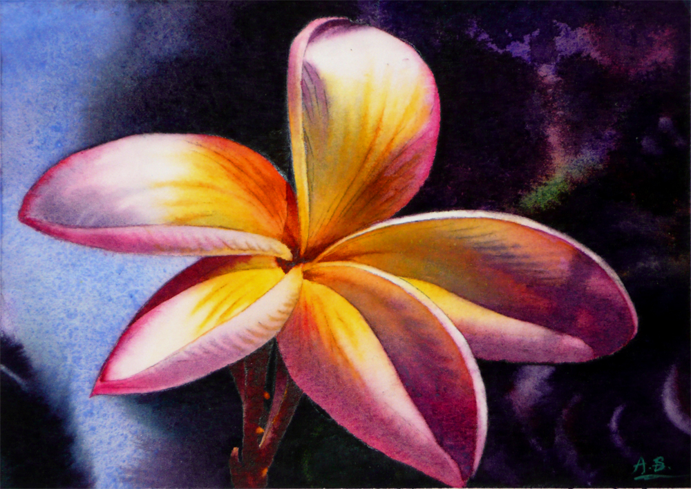
Showing posts with label Plumeria. Show all posts

Tuesday, September 1, 2015

Tropical Greetings - It's That Time of the Year Again!


Tropical Greetings, 
Watercolor on Fabriano Artistico #140 Cold Press Paper, 6"h x 6"w, 2015 #3

Bid in My DPW Auction (Starting Bid $50)

OK, call me crazy but I am doing it again! Leslie Saeta's "September 30 Painting in 30 Days" Challenge -- here is the first one! I will be travelling abroad part of September due to family matters, so we will see how this goes, and I may not be able to post everyday... But, it never hurts to push yourself and try! I really hoped to define a theme this year and create a more consistent body of work, but decided to back off it until next time I do the challenge -- so that I am not overly ambitious and ending up wanting to kill myself on the 20th day of the 30 day theme and really feel tapped out to paint the same series throughout... (If you are familiar with my painting habits, you know that I like to jump between multiple paintings of different subjects and styles... :-P A born ADD indeed!) So, here we are at the starting line. Happy painting everyone!

Saturday, May 4, 2013

Celebration (Finished!), and Silicon Valley Open Studio Events!


Celebration,  Watercolor on Arches Cold Press Board, 6.5"h x 10"w, 2013 #41

Bid at My DPW Auction (Starting Bid $75) 

or, Buy It Now from My Website ($135)

Silicon Valley Open Studio is here! From this weekend on there would be Free Self-Guided Art Studio Tours all through the South Bay area, from Los Gato all the way up to Burlingame. If you are in Palo Alto any of the next three weekends (including this one), come by Great American Framing Company & Gallery at 229 Hamilton Ave. to say hi! I will be there showing my watercolors with 5 other talented painters, mosaic artists and jewelers, including one that cast natural leaves and flower petals into silver jewels! The schedules for each weekend is:

Saturday, May 4, 2013 from 10am to 4pm and
Sunday, May 5, 2013 from 11am to 4pm

Daily art demonstrations will take place throughout the weekend. You can view the complete schedule of days, times and subject matter in the brochure or on the website. Or you can pickup a directory with map at any open studio site, including ours! If you happen to see a big "Silicon Valley Open Studios" yellow poster when strolling down the streets of any bay area cities this weekend, feel free to follow the arrow signs and enjoy a free are show!

You can now buy high quality Giclee prints of many of my sold paintings, both on paper and canvas, as well as some note cards with my paintings here:


Wednesday, March 6, 2013

Island Beauty - White Plumeria - Framed - Available at $125


Island Beauty - White Plumeria 
Watercolor on Fabriano #140 Cold Press Paper, 6"h x 6"w Framed to 10" x 10", Front View

Sold!


Island Beauty - White Plumeria 
Watercolor on Fabriano #140 Cold Press Paper, 6"h x 6"w Framed to 10" x 10", Back View

Back in December I entered two paintings in the Randy Higbee Gallery's 6" Squared Show and I have just received this one back in the mail today -- I have to say that I am very very impressed with how beautiful they framed and presented the painting. It is framed with their signature Catalina Black Wood Frame with Gold Lips, which beautifully showcases the golden center of this white plumeria flower. I am offering it for sale with the fame at a lower price of $125 for anyone interested, so that it will find a permanent loving home...

Here's the image of the painting without frame:


Island Beauty - White Plumeria 
Watercolor on Fabriano #140 Cold Press Paper, 6"h x 6"w, 2012 #12

Sold!

You can purchase my 2013 wall and desk calendars here:

Tuesday, January 22, 2013

In Full Sunshine (30 Paintings in 30 Days Challenge: Day 21)


In Full Sunshine,
 Watercolor on Fabriano Artistico #140 Cold Press Paper, 6"h x 6"w, 2012 #23

Bid at My DPW Auction (Starting Bid $35)

Continuing with my 6" x 6" plumeria series today... These projects are manageable after a full day of class, and the possibility of watching granulating pigments gradually settling into the groves of the paper just brings me such joy after a long day of focus-intense drawing. This aspect of watercolor is almost meditative... At stressful times it allows my mind to slowly quiet down. 

You can purchase my 2013 wall and desk calendars here:


Thursday, January 17, 2013

Aloha (30 Paintings in 30 Days Challenge: Day 16)


Aloha, Watercolor on Ampersand Aquabord, 6"h x 6"w, 2012 #18

Bid at My DPW Auction (Starting Bid $45)

I had quite a bit of difficulties with this painting -- the reference photo has these juicy dark leaves surrounding the center flower, which is ideal to be treated with wet-into-wet applications to create the movement and out-of-focus effect; the center flower itself is radiant with saturated colors -- reds, oranges and radiant magentas, with beautiful Cobalt Blue shadows. I have painted the image multiple times in my brain before executing it on Aquabord, and came to the realization that getting smooth, saturated soft edge shapes of the flower is not easy, and its almost impossible to create specific soft-edged dark shapes of the background leaves -- to make them very recognizable shapes of leaves, yet not so hard-edged that they are competing for focus with the center flower. I ended up experimenting with dry-brush hatching on the background, which is painstakingly slow, but it did give me the rich, dark, and slightly blurred shapes. I am not sure this is the way I want to go for my next painting on Aquabord -- the adventure and discovery continues and the learning process is the most intriguing... But for now, I think I am ready for a change to paint on my beloved Arches paper again!

You can purchase my 2013 wall and desk calendars here:


Saturday, March 10, 2012

Star Gazer

I've worked on this small painting of plumeria on and off for a while on the loose thought that I want to do a series of 6" x 6" sized plumerias for the annual 50-50 show in the Sanchez Art Center of Pacifica, CA, during which the artists juried in would do 50 6" x 6" sized paintings in the theme and media of their choice during a period of 50 days, and the paintings would be mounted in a 7 x 7 (+ 1) grid format and shown as a group when finished. I really want to try to submit to this show, as it would push me to paint faster and more consistently, as well as trying various looser styles. Well... I wouldn't really call this one a loose piece and it certainly was not finished in a day, but I really like the suggestive backgrounds between leaves, which I basically invented the color and let the wet-in-wet process taken over to create interesting organic shapes. Next one would be looser, I promise...


Edge of Summer,  Watercolor on Arches 140# Cold Press Paper , 5"h x 7"w, 2012 #23

Sold!


Saturday, February 4, 2012

Island Beauty - White Plumeria (Finished!)

Here it is -- finished and signed! This painting has been a prolonged struggle despite of its small size, and I have to constantly battle the urge to tear it up and burn it -- I had to keep on reminding myself this is a deliberate choice and challenge because I want to paint from an imperfect photo and see if I can translate it into a painting that satisfies me in the design aspect. It has served me as a good exercise, and I liked how it turned out at last.


Island Beauty - White Plumeria,  
Watercolor on Fabriano Artistico 140# Cold Press Paper, 6"h x 6"w, 2012 #12

Bid at My DPW Auction (Starting Bid $125)

Friday, February 3, 2012

Work in Progress: Island Beauty - White Plumeria (Continued)

Here's how it looks after another day's work -- most of the leaves are done, with rich greens created by floating transparent tube greens such as Sap Green and Hooker's Green on top of a very colorful underpainting of reds, blues and browns. I've also added another layer of shadow mixed from three transparent primaries -- Permanent Rose, Cobalt Blue and Aureolin Yellow -- on flower pedals, trying hard to make it still light, comparable to the lighter areas on leaves. I used my red acetate to check value scales often. It's getting close to be done, and I'm crossing my fingers...


Island Beauty - White Plumeria,  
Watercolor on Fabriano Artistico 140# Cold Press Paper , 6"h x 6"w, WIP 2

Thursday, February 2, 2012

Work in Progress: Island Beauty - White Plumeria

...I know, I know, the plan was to paint roses for the days in February before the important Valentines... But life never quite go as how it was planned, was it? ;-P...

What happened was this reference photo caught my eyes when I was flipping through a deck of white rose photos and could not decide which one to pick and paint. The photo of the white plumeria poses an interesting challenge in the following aspects:

To vividly capture the value contrast of light and shadow on a white flower on a sunny day, I have deliberately decreased the exposure time, which made the dark green foliage way to dark to resolve on the photo. However, I really love the beautiful blue-grey shadow patterns on the flower pedals. As a partially solution, I end up adjust the brightness and contrast of the photo to make the leaves in shade more interesting to paint;

After adjust photo brightness, the foliages still look way too grey and it was very hard to tell the hues and temperatures between one leaf and another. I had to increase the saturation of the reference photo in photoshop to make the nuances in color differences more distinguishable;

Since the entire foliage shape is in shadow and their local colors are also much darker than the flower, in the reference photo the entire flower appears as a light shape while the background foliage appears as a dark shape, which makes the flower look slightly cut-and-paste and out of place. I had to try very hard to exaggerate the value difference between different leaf shapes, to make the value patterns in this image more interesting.

I liked these challenges from an interesting but not perfect photo, and decided to give it a try. Since I had to think through many things and do quite a few adjustment of the reference material before putting the brush to paper, I did not get very far in the actual painting:


Island Beauty - White Plumeria,  
Watercolor on Fabriano Artistico 140# Cold Press Paper , 6"h x 6"w, WIP 1

I did the first layer of shadows on the flower with mainly Cobalt Blue, and started to block in the foliages with very exaggerated intense colors -- Peacock Blue, Alizarin Crimson -- to indicate the color temperature difference to myself. Then I washed various greens -- mixed from blue, yellow and some tube greens -- over the underpainting, which created interesting, more muted leaf colors. I am also constantly looking through a piece of red plastic to check to value pattern of the painting, to make sure it's interesting enough, and there are enough value gradations in the foliage. It's really a challenge to paint from a reference photo but not so literally, but I am enjoying the process!

Saturday, January 14, 2012

Plumeria II (Version II Finished!)

It took a bit more time and many more layer of paints, but the second version of Plumeria II is finally finished! I love the glowing effects created by the body of the yellow paints, and the "happy accident" created when painting the dark background wet-into-wet. After many layers of glazing, Arches did not give in. Tough sizing on this paper... Glazing method works really well with it, which allows more control and less mixing of paints on palette. The resulted colors seem to be clean and subtle comparing to other more direct methods. I think I will try it more with more complicated projects next time...


Plumeria II (Version 2),  Watercolor on Arches 140# Cold Press Paper , 5"h x 7"w, 2012#5

Sold!


Tuesday, January 10, 2012

Work in Progress: Plumeria II (Almost Finished!) and Hide and Seek (Another Rose Painting)

The two versions of Plumeria II are drawing close to finish. I have put in the dark background wet-into-wet, and just waiting for the center golden colors to be put in. I chose to put in the yellow last so that they would stay on top and be brilliant, and have dominance over the shadow colors. I will put in them thickly after flooding each pedal with clear water. This is a scary process, since I'm always worried that the layers of color underneath would lift, especially for the Fabriano paper. I'm going to try to be very light-handed...


Plumeria II,  Watercolor on Fabriano Artistico 140# Cold Press Paper , 5"h x 7"w, WIP 8


Plumeria II (Version 2),  Watercolor on Arches 140# Cold Press Paper , 5"h x 7"w, WIP 3

I'm also starting another small rose painting. I have named it "Hide and Seek" since part of the flower is hidden under out-of-focus leaves. I have started the painting with a soft, wet-into-wet underpainting, and trying to be careful to leave plenty of white areas for possible lights. I've added some darks made from Alizarin Crimson and Prussian Blue in the background corners to give myself some anchors about how dark the shadows on the flower should go. 


Hide and Seek,  Watercolor on Fabriano Artistico 140# Cold Press Paper , 5"h x 7"w, WIP 1

The show season is rapidly approaching and I should be painting larger pieces to meet the deadlines, but I am really procrastinating... I feel that I like the painting process much better when I don't have in mind that "I am painting this to try to submit to a show"... Well, I guess the solution should be painting many pieces well ahead of time so that I don't have to do a particular painting just to try to meet the deadlines! Something to try for this year... :-P

Monday, January 9, 2012

Work in Progress: Plumeria II (Version 1 and 2), and Yellow Rose Painting

One of those days in the studio -- long working hours yet seemingly with very limited visible progress. I worked on both versions of Plumeria II on paper, adjusting the value and color temperature in the shadow area, making the soft shadow shapes more accurate. Now that I have glazed the first version with magenta/pink local color, and went over the second version with violet-grey shadow colors, they started to look more similar to each other. However, the adjustment process seems to be going forever, and with each layer of glazing there always seem to be more little things that need tweaking: a slight warmer pink in the corner, a slight darker passage in the center... You get it. So here's what I have ended up getting:


Plumeria II,  Watercolor on Fabriano Artistico 140# Cold Press Paper , 5"h x 7"w, WIP 7


Plumeria II (Version 2),  Watercolor on Arches 140# Cold Press Paper , 5"h x 7"w, WIP 2

I did manage to start a new painting just for a change of mind -- sometimes you focus on the same little area for too long, everything starts to look wrong. This is a yellow rose, which I started underpainting the shadow area with a mix of Permanent Rose, Aureolin Yellow, Cobalt blue and Cobalt Violet. So far the value of the darker shadows are not totally right yet, but I am in love with all the wonderful granulation effects created by the Cobalt colors. I am using Lanaquarelle #140 Cold Press paper for this painting. It's a very soft paper and cannot afford much abuse, but the surface is lovely and just emphasizes the sedimentary colors so well! After the shadows are finished, I will glaze over the root of each pedal with some soft yellow hues. I'm looking forward to that...zq


Yellow Rose,  Watercolor on Lanaquarelle140# Cold Press Paper , 8"h x 8"w, WIP 1


Sunday, January 8, 2012

Work in Progress: Plumeria II (Three Versions)

I've been working on some drawings for new paintings today, and looking through photos for some new painting ideas, but I still managed to work on the second plumeria paintings for a little bit more. Since I am not sure about which technique and surface would work best for it, I decided to develop three version of it on different supports: Fabriano Artistico #140 Cold Press paper, Arches #140 Cold Press paper, and Ampersand Aquaboard.

The first one is painted on the Fabriano Artistico #140 Cold Press paper, which I have just started to experiment with recently, and did the last plumeria painting on. It has a soft, delicate surface, great for lifting, not so easy for glazing. For this painting, I have underpainted the shadow areas with Winsor Violet (in areas which will be overpainted with yellow) and Cobalt Blue ( in areas which will be overpainted with pink and magenta), then with some triad grey to further darken parts that needs to be darkened. I am done with the underpainting, now trying to glaze over them with the local colors of each pedal.


Plumeria II,  Watercolor on Fabriano Artistico 140# Cold Press Paper , 5"h x 7"w, WIP 6

The second version is painted on Arches #140 Cold Press paper. Arches are famous for being touch and can really withstand an abuse, but unless you use transparent non-staining colors, lifting is really difficult on it. I decide to glaze from light to dark on this one, starting from the local colors -- all the pink hues near the edge of the pedals in this case. I will build up the glazes using Permanent Rose and Cobalt Blue to develop the shadow areas, then glaze various yellow-orange hues near the center to complete the flower in the end. So far, I've been happy with this version -- it's also my most familiar surface to work on, and the method I've most comfortable working with. So my goal here is to use less layer of glazes and try to nail both the color and value in as few layers as possible to retain the freshness.


Plumeria II (Version 2),  Watercolor on Arches 140# Cold Press Paper , 5"h x 7"w, WIP 1

The last version is painted on Ampersand Aquaboard, a surface I am completely unfamiliar with. I've taken a two-hour workshop with artist Karen Vernon, who has painted exclusively on this surface for years, and have done some really beautiful work with it, so I thought I'd give it a try. The workshop was several years ago when I just started painting in watercolor, so I did not remember many things from it, except that you should wet the whole surface at least once thoroughly before start painting to release some air bubbles from the surface. It seems to dry really fast, but actually the surface stays cold and damp for much longer than ordinary #140 paper. However, when the sheen leaves surface after applying clear water (which is really fast!), the applied strokes of color stays pretty much where you put them, with the exception of some irregular, creeping edges developing, so doing soft, wet-into-wet painting are almost impossible  -- unless I am not doing it the right way. I did manage to get some soft passages by first wetting a local area, then add a stroke of color quickly, followed immediately by a stroke of clear water at the edge you want to lose. The timing is so critical it's almost acrobatic. But I like the how brilliant color stays on this surface after drying -- it does not sink in at all! And you can do some spectacular granulating effects on it due to the surface texture -- I really liked the purple passage in the background formed by dropping Cobalt Violet on shining wet surface! Also, you can glaze on it without lifting the underneath colors if you use a soft brush and apply the strokes lightly, and you can use a stiff brush to lift any painted area to a very light, off-white tint. 

I did the background on this painting first to get familiar with the handling quality of paints on the unfamiliar surface, then moved onto the flower using glazing. Since the surface does not stay wet for very long for soft color transition effect to develop in each area, I had to wet a small section each time, paint one or two strokes of color, and then move to the next area and wait for the painted ones to dry -- which actually takes quite some time, since the surfaces stays cold and damp for much longer than ordinary #140 paper, so it is going to be a very length process to complete this little painting... (I'm trying not to rush it and take it as a learning experience...)


Plumeria II (Version 3),  Watercolor on Ampersand Aquaboard, 5"h x 7"w, WIP 1

Saturday, January 7, 2012

Blushing Plumeria (Finished!)

After quite some struggle I was able to finish the Blushing Plumeria painting today. Overall, I'm not unhappy about how it turned out. I managed to unify the color scheme on the pedals a bit, putting some really warm hues (New Gamboge, Winsor Orange, Quinacridone Gold and Quinacridone Burnt Sienna) near the flower center to draw attentions there, and using some Cadmium Red / Permanent Rose mix to glaze over the edges of pedals to make the pinkish tones more vivid.


Blushing Plumeria,  
Watercolor on Fabriano Artistico 140# Cold Press Paper, 6"h x 6"w, 2012 #3

Sold!

I've learned quite a bit about Fabriano paper by doing this painting -- I've really pushed the paper to its limits by repeatedly glazing on certain areas, and lifting color off other areas. At a certain point, the surface sizing of the paper would be gone, and the paper just does not hold moisture very long on its surface any more. After that, painting on these areas would become tremendously difficult. And that happens after you have wet the same area with either paint or water for about 6-7 times. It's an interesting point to keep in mind next time I use the same type of paper. But I love its handling quality, the fantastic granulation effect on it, and the fact that I was able to lift almost any color back to white. It is very different from Arches which I usually use, but I'd definitely like to try it some more. But next time, I will plan the glazing steps a little more carefully to avoid unnecessary wetting of any areas. In other words, each time I wet the paper, I better get as many paint passages going into it as the drying time allows! This is both exciting and a bit scary...

Friday, January 6, 2012

Work in Progress: Two Plumeria Paintings, Continued

I painted the upper right pedal of the first plumeria flower -- it looked very dark compared to the reference photo, but I have decided not to let it bother me. However, I am not so happy with how chalky and muddy the blue in the shadow looks, and the yellow near flower center also lacks brilliance. So I paused to set it aside and think about whether I want to continue in the same direction for the rest of the pedals, or completely lift this pedal out to repaint it. I did like all the lifted whites on this pedal and kind of want to keep it...


Blushing Plumeria,  
Watercolor on Fabriano Artistico 140# Cold Press Paper , 6"h x 6"w, WIP 4

For the second plumeria, I tried to wet the shadow shapes on each pedal, and mingle colors in one go to finish it, adding New Gamboge, Winsor Orange, Quinacridone Gold and Quinacridone Burnt Sienna near the flower center, dropping in the triad grey in the shadow part, and finally using Permanent Rose and Quinacridone Magenta near the pedal's edge. However, in the process, somehow I have lost the identity of each color, and everything seemed to have mixed together on the paper to make mud... I really did not like how it looks after painting the second shadow area, and decided that I shouldn't try to rush things this way.


Plumeria II,  Watercolor on Fabriano Artistico 140# Cold Press Paper , 5"h x 7"w, WIP 2

Luckily, Fabriano paper is really great for lifting. So, off they goes -- with a Robert Simmons Sapphire Round brush (synthetic fibers, softer than bristle and does not harm the softer papers such as Fabriano or Lanaquarelle, but still very effective in lifting colors off the paper), I "magically" erased the two dirty-looking shadow areas:


Plumeria II,  Watercolor on Fabriano Artistico 140# Cold Press Paper , 5"h x 7"w, WIP 3

I repainted each of the shadow areas in two passes -- one with Winsor Violet and Cobalt blue, setting the tone; the other with the triad grey, getting the details of the shadow shapes:


Plumeria II,  Watercolor on Fabriano Artistico 140# Cold Press Paper , 5"h x 7"w, WIP 4

Finally, I started the over painting of the local colors of each pedal -- Permanent Rose and Quinacridone Magenta for the outer edges, New Gamboge, Winsor Orange and Quinacridone Gold / Burnt Sienna near the center to add brilliance and depth. This time taking it slow, wetting each section first, adding colors only when the paper surface is still wet enough to avoid the chalky look, and put down my brush firmly when it starts to dry -- after all I can always rewet an area after it has thoroughly dried, and float in more colors...


Plumeria II,  Watercolor on Fabriano Artistico 140# Cold Press Paper , 5"h x 7"w, WIP 5

This is how far I've got today, and I'm relatively happy with how it looks at this stage. I'll cross my fingers to hope I don't mess it up in more layers of paints. I have also drawn this image again on an Arches #140 Cold Press paper so that I try a different method of painting -- more glazing, less lifting and trying to put down the local colors first, then adding the shadow colors to see if it gives a different look. I love these little experiments and exercises. Only if I would not get so mad when they do not turn out right!...

Thursday, January 5, 2012

Work in Progress: Two Plumeria Paintings

Here's what I got so far on the Plumeria painting...


Blushing Plumeria,  
Watercolor on Fabriano Artistico 140# Cold Press Paper , 6"h x 6"w, WIP 3

I've done another layer of Cobalt Blue and Winsor Violet underpainting on all the shadow areas of the flower, and they look a bit too saturated to me, so I might adjust that by glazing over them a light layer of triad grey mix (Permanent Rose, Aurelion Yellow and Cobalt Blue) to dull down the color a bit. Compared to my reference photos, these shadow areas are already looking too dark, which might create some problems later, since the flower has to read as off-white, which should not have shadows of >6-7 values (in a 1-10 scale with 1 as the lightest, and 10 as the darkest). But I am not too thrilled at the overall washed-out look of the flower in the reference photo, and this might just give me an opportunity to spice things up a bit. The problem at this stage is that pink, blue and purple area right now are almost equal in value, saturation and surface area on the flower, which does not emphasize any area as the focal point. I know the center of the flower would be golden-yellow, and the edge should reads a little magenta-rosy. How I could accomplish that needs careful consideration. So I'm putting this one aside for a little bit to give it some thought -- sleep over it, as one may say. 


Plumeria II,  Watercolor on Fabriano Artistico 140# Cold Press Paper , 5"h x 7"w, WIP 1

This is another plumeria painting I'm starting today. I think they are good little projects to practice different color schemes and get familiar with the handling quality of different paper. So far I've learned that Fabriano Artistico 140# Cold Press is a wonderful paper for lifting and corrections -- you can life any color almost back to white! However, this creates some problem for glazing over an area, and the surface is somewhat quick to saturate and congest with pigments, creating a chalky, granulating look. Therefore, I am trying to not glaze over another for too many times (I will reserve that for paintings done on the good old Arches ;-), and painting the purple-blue underpainting and the triad grey layer in one go. This requires doing more paint maneuvering in one wet session of the paper, let's see how it goes... Well, more practice definitely helps!

I am hoping to finish the first plumeria painting tomorrow, and if needed, I will paint it again incorporating everything I've learned painting it the first time -- thinking this way gives me more courage to experiment and not to treat what's already on the paper too preciously. I'd cross my fingers and pray...


Related Posts Plugin for WordPress, Blogger...