Showing posts with label Art Tips and Techniques. Show all posts

Saturday, April 18, 2015

Pink Ladies in Progress, and Thoughts on How to Use Reference Materials


Pink Ladies, Watercolor on Arches #140 Cold Press Paper, 8"h x 8"w, WIP 2

I am trying to ignore the fact that I have not posted here (or on my facebook page, or on my Daily Paintworks gallery... =_=b.....) I used to beat myself up for these artistic "dormancy" periods, and feel like I am being lazy and irresponsible to not turn up one painting after another, or worse still -- not even working on any paintings for an extended period of time. When I am in school doing oil paintings, I feel at least there is a reason (or excuse to forgive myself?...) that I am not producing more watercolor paintings, since I am learning something new and not turning out finished products that can be shown to the world (without shame...) is allowed; but doing the breaks between semesters, I often go through these extensive periods feeling so guilty that I am not working more on my watercolor painting, or painting bigger, more substantial works that I've promised myself so many times I would do...

But, guilt aside, I do start to realize (after fighting with myself so many times) that these dormant periods are essential to my growth as an artist. I almost always come out of them learning something new, and paint a little differently. So, this time I am trying to not feel too guilty about it when it happened, and embrace the time I feel needed to study other artists' wonderful works (both on the amazing web and in museums), watch tutorial videos, read instructional books, and most important of all, think about my own approach to each potential projects that comes my way, trying very hard to analyze what is missing in my paintings at this stage of my artistic development.

Gradually it becomes more and more clear: I am too much of a slave of beautiful reference photos -- for the colors used, for the shapes presented, for the myriad amount of information presented in the photograph. The more time I spent setting up a still life/floral, or walk around trying to find that "perfect view" to take my reference photos, and the more photos I take "just in case" none of the ones I took previously turn out to be just "right", the more I seem to be unwilling to let go of it during my painting process. But can one really learn to run without finally casting away the walking stick that he/she has held on so tight for dear life?... Especially as an artist working in the realistic tradition, how much should one be bound by the information (shapes, colors, values, edges, etc.) provided in the reference material and how much artistic liberty can (or should) one take?

Obviously every artist (even the most photo-realistic painters) takes some liberty editing their reference material to create their art -- without this editing painting simply becomes a mechanical "pixel-by-pixel" copying of the reference photo, and cease to become a window into the artist's soul, therefore cannot hold its own. However, not all alterations from a reference material automatically improves the art piece -- nature often provides us with much more interesting shapes and subtle value shifts, for example, than most of us could come up with if we are given a blank piece of paper and no reference to work from. The hardest thing is how to make all the editing actually add onto, instead of detract from, the final resulted artwork. It's a true test of the aesthetic taste as well as technical skill of the artist, and it's scary as hell.

But maybe, it is time for me to start...

Saturday, October 4, 2014

Crystal Springs Sunset -- Color as Value Exercise


Crystal Springs Sunset, 
Watercolor on Aches #140 Cold Press Paper, 10"h x 6"w, 2014 #20

Bid in My DPW Auction ( Starting Bid $40)

"Crystal Springs Sunset" started out as an exercise in Stan Miller's workshop. Using a black-and-white photograph as reference, Stan asked us to use any colors -- arbitrary colors even, like green for the clouds -- to paint each shape, mostly wet on dry, soften edges as we go. The only requirement is to get the shapes painted in color as close in value as the black-and-white reference photo. It was a very valuable exercise, teaching me the importance of value to create a believable illusion of three-dimensions on a two-dimensional surface. As long as the value relationships are right, almost any color can be used to create a believable image. That is such a freeing exercise! 

In the end, the resulted image reminded me of the the evening drives I used to take along Hightway 280, when the glorious last rays of sunlight reflects from the water of the reservoir, the golden shimmers of light are breathtakingly beautiful. Against the setting sun, the silhouettes of the evergreen-and-oak-covered coastal range mountains are in a somber blue-grey color that is hard to describe with language. Not being able to resist the view, I have always pulled over to the roadside to observe and take it by heart. Cameras just don't do it justice -- high-contrast, low luminosity scenes like this are hard to photograph unless you are a pro with all the right gears (which I am certainly not). But today, when finished with this little painting, I am filled with joy that all those roadside stoppings did not go to waste. They have carved the magic hour, the majestic light into my heart...

Enough rambling for now! I should really get back to my watercolor table... In the mean time, if you have an image of a beautiful landscape, or a flower you like, or anything you might want to see painted, please email them to me at arena.shawn@gmail.com. I will paint them and post them here. From every 10 paintings I make from them, there would be a random drawing, and the lucky winner get to take a original back home for free! Interested? Then send me your photo!

You can now buy high quality Giclee prints of many of my sold paintings, both on paper and canvas, as well as some note cards with my paintings here:

Thursday, October 2, 2014

Water's Edge -- Continue with the 30 Paintings in 30 Days Challenge...


Water's EdgeWatercolor on Aches #140 Cold Press Paper, 5"h x 7"w, 2014 #19


Leslie Saeta's "30 Paintings in 30 Days" Challenge for this September is officially closing, and I sort of fell off the wagon again in the past few days due to preparation for the start of my atelier's new semester. I will be starting to paint in oil this coming semester! I am so excited and terrified at the same time... Luckily, I have you guys -- my wonderful artist friends who are veteran oil painters! Well, be prepared... I will be bugging you guys with tons of questions (many of which very silly I'm sure... :-P)

I experimented with this water lily painting on how to most effectively paint shapes that has only very subtle color variations and next to each other -- I tried to paint some petals one at a time, carefully model the roundness of them by adding deeper and deeper reds when I was painting each petal; some other petals are painted as one shape with slight warm/cool variations of reds, then crevice darks are added between petals after the underlying colors are dry. I tried both and wanted to find out how to avoid leaving a very harsh, dark edge at the border between two petals, which is the result of wetting an area then adding dark colors wet-in-wet. I find when I paint one petal at a time, it is easier to clean the edge of each petal buy running a damp stiff nylon brush along where the dark pigment accumulates, then blog the area slightly with tissue. When painting multiple petals at once, the petals painted at the same time have better connections and looks more natural, yet the edge between sections painted at one time and another always looks quite harsh. I am still struggling to find a good method and make the connection of areas painted sequentially more natural... If you have some good tips, please share with me, my friends!

Enough rambling for now! I should really get back to my watercolor table... In the mean time, if you have an image of a beautiful landscape, or a flower you like, or anything you might want to see painted, please email them to me at arena.shawn@gmail.com. I will paint them and post them here. From every 10 paintings I make from them, there would be a random drawing, and the lucky winner get to take a original back home for free! Interested? Then send me your photo!

You can now buy high quality Giclee prints of many of my sold paintings, both on paper and canvas, as well as some note cards with my paintings here:

Saturday, September 27, 2014

Morning Light II -- Continue with the 30 Paintings in 30 Days Challenge...


Morning Light IIWatercolor on Ampersand Aquabord, 6"h x 6"w, 2014 #18

Bid in My DPW Auction ( Starting Bid $75)

Another of my early entries for Leslie Saeta's "30 Paintings in 30 Days" Challenge for this September... I named it "Morning Light II" since I have finished "Morning Light I" a bit earlier -- the first one of my 6" x 6" rose series on Ampersand Aquabord, but haven't got a chance to share it here with you guys yet... (Promise I will do so in the next few days -- I am gradually catching up with my long-lagged-behind blog posts! But since I haven't posted the entire summer, there is so much catching up to do... :-P)

I have really struggled through this one to get the soft transitions in the background where colors are rich, saturated or dark - which according to my opinion is the hardest thing to do on Aquabord. I think it may still benefit from a few changes here and there to model the volume and turn of each petal, but for now I am stopping, as I have worked on it for two days continuously, and losing insight on the subtleties. The great thing about this challenge -- putting a time limit on each project and force me to work more directly, boldly and fearlessly -- also makes it hard for me to do the last 10% of work that I consider makes the difference between a good piece and a mediocre one -- there is no chance to put a piece away and come back to it with a fresh eye with such a tight time frame for completion... Nevertheless, I think I may come back to this one in a few days to do some fine tweaking... :-)

Despite of all its difficulties, I still think my adventures into Ampersand Aquabord is well worth its while, because it is something "new" and "foreign" to me. Personally, I believe that it is very hard for someone who has painted for a while to avoid getting into an "inertia" of painting simply be deliberately trying to change his or her technique, and one surefire way to push yourself out of such painting rut is to try a new subject, or try a new surface. Different painting surfaces have different absorbency for water, different drying time and subtle variation in the same stage of the drying cycle, different surface texture, different resistance to paint application (which determines how easily the same stroke will spread or different surfaces with approximately the same wetness). Hence, painting on an unfamiliar surface would force you to open your eyes, and really observe the behavior the paint you put down on paper again, instead of just blindly going from one painting stage to the next. All of these afore-mentioned characteristics also determines the different visual effect one is able to achieve on various painting surfaces -- on a smooth, non-absorbent surface like hot-press paper or Aquabord, one can utilize the drying edge of a stroke that is laid down and different "water-mark"s to suggest shapes (wet-on-dry); on a very absorbent surface, it is hard (and often not necessary) to maintain the edge of one individual brush-stroke, yet one can rely on the movement of color laid-down across a large area of wet or moist paper to achieve interesting edge effects and soft shapes (wet-in-wet). The final visual effect is often drastically different, creating different signature styles. 

Of course, it is not impossible to use one technique to imitate the other by softening edges with clear water, or wet small areas when painting wet-in-wet to simulate brush strokes, and create similar looks on different painting surfaces using very different techniques -- which is another great exercise. It has taught me that no matter what road is taken, a painting is ultimately judged not first by the techniques used, but by the final visual effects one is able to achieve. A good painting is first and foremost about "what" is being painted, then by "how" it's painted. Technique is an important means to the end, but for me not by itself an end. The image in one's vision and how it is translated onto the painted surface is the uttermost important thing. 

Enough rambling for now! I should really get back to my watercolor table... In the mean time, if you have an image of a beautiful landscape, or a flower you like, or anything you might want to see painted, please email them to me at arena.shawn@gmail.com. I will paint them and post them here. From every 10 paintings I make from them, there would be a random drawing, and the lucky winner get to take a original back home for free! Interested? Then send me your photo!

You can now buy high quality Giclee prints of many of my sold paintings, both on paper and canvas, as well as some note cards with my paintings here:

Friday, February 14, 2014

Tranquility, and Thoughts on "Virtual Painting"


Tranquility,  Watercolor on Arches #140 Cold Press Paper, 9"h x 12"w, 2014 #12

Bid in My DPW Auction ( Starting Bid $70)

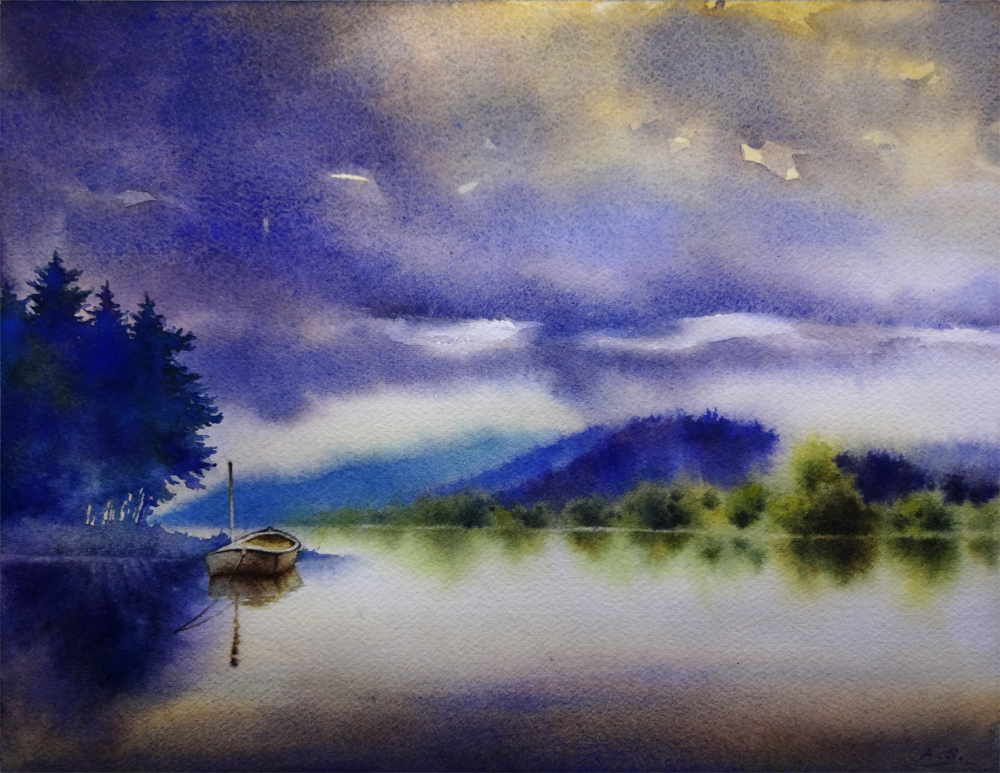
Busy with drawing projects at the atelier for the past two weeks, but I managed to sneak in a few painting hours here and there, and finished "Tranquility". It has started in the "30 Paintings in 30 Days" challenge that I took this January, but had to drop due to health issues of a dear family member. It was part of the "water" themed set of paintings. Now that things are back to normal in my household, I am slowly going back to these unfinished projects and trying to tackle them one by one...

I want to convey the sense of utter stillness and quietude in the early morning hours of an overcast day in this painting, and kept on feeling that the shapes of the cloud and distant trees near the foothills needs to be tweaked more, so I have wet and rewet these areas, dried them, wet them again... It's been a lengthy process. When painting landscapes I often find it's not enough to directly copy the shapes present in your reference materials; instead, conscious, deliberate design choices has to be made to makes tree/mountain/rock/cloud shapes interesting. On the other hand, it is so important to imitate the randomness presented in the natural shapes in your design, and take great care to not make them look too "designed", mechanical or symmetric! It's a delicate dance of balance...


Tranquility,  Watercolor on Arches #140 Cold Press Paper, 9"h x 12"w, WIP 1

When posting the work in progress shot of this painting in January I was really very happy with how the various purple/blue/green colors has blended freely on the left side group of trees, as well as the shape of the silhouette of them. However, after finishing the distant hills and woods I realize the value of this group of trees do not quite work -- they are way too light and therefore does not balance the image. After agonizing over it for a few days, I have finally gathered enough courage to lay another layer of wash to darken them, taking care to change the color every time I reload the brush to maintain the interest generated by the color variation in the initial version. I did it wet on dry using a small squirrel quill brush, whose soft hair would not disturb the underlying wash. I am really happy with the decision, as well as the result -- with the darker, more intense blues and purples, the shape of this group of trees in the final image gives enough weight to balance with the middle-ground shapes on the right side, and blocks the viewer's eye from wandering off the right side of the picture, therefore emphasizes the moored boat. 

Often in landscape paintings like this, I find myself spending much more time staring at the painting than actually "painting" on it toward the end stage. It is not uncommon that every one minute of painting time is accompanied by ten or more minutes of looking and thinking. Sometimes after a long period of repeated starting, pondering and evaluation, I would finally decide to not add anything more and just call it done. However, I don't consider this as time wasted -- time spent evaluating the work to be done with a painting so often saves me much heartaches from taking that "one stroke too much". As painters even when we do not have brush in hand, we may still be mentally "painting" a picture on that virtual sheet of paper. And that, I believe, is a vital exercise for my growth as a painter, and time well spent.

In the mean time, if you have an image of a beautiful landscape, or a flower you like, or anything you might want to see painted, please email them to me at arena.shawn@gmail.com. I will paint them and post them here. From every 10 paintings I make from them, there would be a random drawing, and the lucky winner get to take a original back home for free! Interested? Then send me your photo!

You can now buy high quality Giclee prints of many of my sold paintings, both on paper and canvas, as well as some note cards with my paintings here:


Thursday, February 6, 2014

Featured in the Art Room!


Fields of Gold, Watercolor on Arches #140 Cold Press Paper, 8"h x 8"w, 2013 #36

Private Commission

My friend, wonderful oil painter Taryn Day organizes this wonderful blog: The Art Room, about artists she likes and the amazing paintings they do. Currently she is running a mini-series of painters who blog, and their favorite paintings of 2013. I am really honored to be included... If you have time, stop by the blog or its facebook page -- I promise you won't be disappointed!


Summer Glow II, Watercolor on Arches #140 Cold Press Paper, 5"h x 7"w, 2013 #81

Sold!

So, my choice of my favorite paintings done in 2013 are "Field of Gold" and "Summer Glow II". The reason for choosing the former is I feel really happy to have captured the sense of glowing light when painting primarily in the color yellow, which I continue to find to be a very challenging color. It was also a commission done under a tight time schedule when my school was in session. But the wonderful customer -- a gentleman who wanted to purchase a painting of bulbed flowers for his wife of dutch origin for their wedding anniversary -- gave me a lot of freedom to choose my composition and work out a small color study, and it ended up to be a piece of work I am very happy with. (I feel so lucky to have met so many wonderful, appreciating and supportive collectors in my short adventure into the art world!) The reason to choose the latter is that I have deliberated selected a very "black and white" reference photo -- white flower, dark foliage, without much color variations -- to challenge myself to not to copy so literally from reference materials, but to see and push more vibrant colors whenever possible. I have also tried out the largely wet-on-dry working method that I have learned from my wonderful teacher, master artist Jeannie Vodden. I really loved the resulted paintings and felt I have suffered through as well as grown from this project as the best artist I could be at the time. Pushing boundaries, working with new and unfamiliar methods, developing a vision -- for me, these are what being an artist is truly about...

In the mean time, if you have an image of a beautiful landscape, or a flower you like, or anything you might want to see painted, please email them to me at arena.shawn@gmail.com. I will paint them and post them here. From every 10 paintings I make from them, there would be a random drawing, and the lucky winner get to take a original back home for free! Interested? Then send me your photo!

You can now buy high quality Giclee prints of many of my sold paintings, both on paper and canvas, as well as some note cards with my paintings here:


Sunday, September 8, 2013

Sea Stacks, Ruby Beach -- 30 Paintings in 30 Days Challenge (Round Two), Day 7 (And I Did Finish This One!...)


Sea Stacks, Ruby Beach,
 Watercolor on Arches #140 Rough paper, 7"h x 10"w, 2013 #58

Sold!

I've always loved Travel. A journey to somewhere always seem to give an aim of some sort to me: I have to get on with the trip every day when waking up, and the road is right there in front of me;  accommodations and dinning options are often frugally simple, far from extravagant to say the least, but just because of this, I believe journeys are addictive, at least to me. In between a long journey's quiet loneliness and busy clamor, there is often a clear river of thoughts extending until infinity. Thoughts about past. Thoughts about future. Thoughts about people I have met and people I have missed. Whenever I have a little bit time, anytime, I often would rather spend it on the road. This one has started as a plein-air sketch on the Ruby Beach of Washington coast. Time was late. The sky is always cloudy there. It almost seemed like it was going to rain, but finally didn't. Last light of the day has gradually seeped though the bottom of the meandering clouds, back-lighting all the sea stacks. The sky was a strange deep, saturated blue-purple, with a tinge of warmth along the horizon. Then it started to drizzle. My paper got damp. I got back into the car.

But I've never forgotten that moment, just like I've not forgotten another ten thousand random moments on my journeys.

Then recently, I have thought about how ancient Chinese Sumi Paintings are taught, and started to do another type of study -- I realized that landscape painting is largely about creating your own symbol of different landscape items (trees, rocks, clouds, grass, water, etc.) and express them with abstract brush-stroke-created-shapes. Dots and Dashes. Lines and Curves. The next question is: how do you translate the landscape in front of you into an image basically composed of these dots, dashes and various shapes? I believe this is like learning a language: you have to learn the vocabulary before being able to make a prose. Then, can brushwork be learned? Some say not -- they say it is part of you and has to come from within yourself, but I believe otherwise: one's "self" is constantly being shaped by what we take in from others -- by that I mean from other artists as well as the nature. You can collect the silhouette of a real tree by sketching it on paper, and you can collect a beautiful tree shape created by another artist by practicing making it on a scrap piece of paper as well. Guaranteed, it will probably not be identical as the original, but by this practice you can learn how the individual brush strokes creating that shape is made -- their direction, strength and timing, as well as just practicing making a pleasant abstract shape. 

That is exactly what I do every morning nowadays: just like the morning workout routines for some people. I would take a random piece of image from an artist I like for his/her ability to create beautiful shapes of landscape elements, and isolate one shape -- a tree, a rock, a cloud shadow, you name it -- and try to analyze how he/she has made that shape with their brush marks, and try to recreate it on my practice paper. By isolating the shapes the task does not seem as daunting: I am not asking myself to recreate an often seemingly "fast and loose" master landscape painting entirely, but just a tiny section of it -- one shape. By doing this again and again, I've already realized that I've started to incorporate these learned shapes into my own paintings out of memory. Again, they won't be exact copies, but my hand seems to have gained some muscle memory of the dots and dashes it has been making again and again!

So finally I've taken out this piece and decided to give it another try. This time I felt much more smooth and confident, more at ease with it, and much less mechanical when making the cloud and rocks of this painting compared to my first attempt of it (which I did not dare to share with you guys), and I think I have to thank such exercise for it. Maybe I should also thank time -- it is time that has made the scene simmer in my heart until it was ready to flow out.

You can now buy high quality Giclee prints of many of my sold paintings, both on paper and canvas, as well as some note cards with my paintings here:


Saturday, September 7, 2013

Summer Glow -- 30 Paintings in 30 Days Challenge (Round Two), Day 6 (Not Quite Finished -- Again?!...)


Summer Glow, Watercolor on Arches #140 Cold Press paper, 5"h x 7"w, WIP 2

OK... I wouldn't exactly call this one "finished" -- but it is not because I am slacking off! I have struggled over this little piece more than anything I have ever painted... You know that "ugly stage" that every painting seems to have to go through, when you tell yourself that you don't exactly know where this is going? For this painting, that awkward stage has lasted almost from its beginning to this point. 

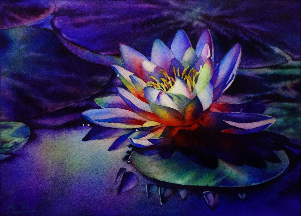
The reference photo of this painting shows a lovely white water lily glowing against several large, mid-dark valued leaves, with no obvious value variations within each leaf shape, or between different leaves. In other words, it's an image of very contrasting small light shapes of the flower petal, and large, uniformly-dark shapes of leaves, with no actual mid-value shapes in between. It seems I have found this problem not challenging enough, and decided that I don't want to just paint the white flower "as is", with mostly neutral grey shadows. Instead, I have decided to try out the multi-color blending and glazing method from Jeannie Vodden, and make the white petals and shadow areas on them "more colorful".

The problem is, when I had the best intentions starting out, I did not exactly have a clear vision of how the finished painting would look like. "Colorful" itself is a very guideline to say the best... As a result, I ran into different problems almost right from the start with colors, and struggled with it for several months. After putting it away and taking it out, staring at it and thinking really hard, I have realized that my first mistake with this painting: I did not decide a dominant hue (or family of hues) for the white petals from the starting point. Since white flowers do not have an apparent hue to their shadows in most lighting conditions, my water lily almost had the entire rainbow of colors evenly spread in its shadow areas. No dominance leads to a cacophony of colors, not a symphony, and it never looked right.

The second problem is the value of the shadow areas on the flower -- I have initially made them almost as dark as the reference photo (which had no mid-value shapes to start with), and they just looked wrong, as if somebody poked a black hole in the center of the flowers. After squinting a lot and again thinking really hard, I have realized this (which an initial value sketch could easily point out, but, alas, I wanted to "get down to the fun of painting" too fast when starting... :-P). After some scrubbing and lifting out, glazing back, lifting again -- finally I have ended up with the value of the flower center in a mid value range, between the lightest petal area and the really dark leaves behind the flower. Now there seems to be a bit depth and the flower center seems to recede a bit back in space, and everything just looks more "right"... Well, the color of the center petals became a bit dull and less saturated because of the repeated lifting and glazing back, but the correct value relationship is more important than all the other aspects of painting, and made this version just looks more believable. 

I am quite proud that I have stuck with the suffering and figured out what the problem is, and what I need to do to make it work. Due to the limitation of the paper -- you just cannot keep on putting on colors and taking them off, even when working on the tough Arches -- I may not be able to totally realize my vision for this one from its current stage, but next time, when facing with a similar problem -- white flower with very dark backgrounds, without much intermediate value shapes in the reference image, and when I want to again try to make the white "colorful" and not just straightly paint the grey shadows I see in the reference material, I will have a more clear vision of what to achieve, what to avoid, what has to be tackled first, from the starting point. Now for this one, I just have to finish a few darkest shadows and crevice darks on the flower, and the reflections of the petals. There is a bit of work, but not anything conceptually hard, so with a couple more hours here and there, it should fall into place... 

In the mean time, I have again spent five hours sitting in the art fair, which gave me ample time to some other watercolor sketches and studies. This time I want to just use texture - brushed on, spattered, imprinted with various textured materials, sprayed by clear water... you name it -- to create a sense of ground and growth (i.e., grass and bushes) without actually outlining any tree shapes with pencil. Again, it was great fun, and very different from what I usually do.... I am seriously thinking that I need to do this more in the future.


Wild GrowthWatercolor on Arches #140 Cold Press paper, 6"h x 10"w, 2013 #57

Bid at My DPW Auction (Starting Bid $20) 

OK, I think I've had quite a few days with flowers... (Ok, I did not quite finish the flower pieces I was working on for the past few days, but I will in the coming days! And I did spend a solid day on each of them, trying very hard to finish... But sometimes paintings have a will of their own! :-P) Starting tomorrow I will begin a new theme for the challenge -- landscape with the element "water" in it. I think it will be quite exciting... Stay tuned!

You can now buy high quality Giclee prints of many of my sold paintings, both on paper and canvas, as well as some note cards with my paintings here:


Wednesday, September 4, 2013

Awaken -- 30 Paintings in 30 Days Challenge (Round Two), Day 3, Some Thoughts on Why I Took the Challenge, and Show Updates


Dancing Tulip V
Watercolor on Richeson Zoltan Szabo #140 Cold Press paper, 9"h x 6"w, 2013 #54

Bid at My DPW Auction (Starting Bid $ 65) 

Day 3 of the challenge! I am still alive! When taking on this daunting challenge (again!) I was hoping that it could help me wrap up some difficult projects that has been lingering in my studio for way too long. So far it has been good -- I've managed to make paced progress on a few of such projects. In the mean time, I have also realized that the reason these project have been lingering without much progress is that I have been more or less stuck on one point of them or another. In other words, I've been having difficulties doing "finishes".

Finishes are hard... Starts are hard in a different way: that mental pressure of facing a blank piece of paper... But there would be a stage after overcoming the initial fear, that we (as artists) gradually let the piece sink in our mind, feeling really "at one" with it, and this middle stage is comfortable. Often, we (ok, at least I...) let this stage extend too long, subconsciously procrastinating on the difficult work of "finishing it up".

Why? Because finishing means you have to seriously look at the work in progress with critical eyes, and ask yourself: does this piece look like a coherent unit? Is there anything that stands out like a sour thumb? Can I adjust anything to add to it? If I add a stroke here, would it make the whole piece better, or is it just fiddling? You may have to stand back and try to evaluate from ten feet away, to see if the larger value pattern makes sense. You may have to look at it right under your nose, and decide whether any area is too empty therefore in need of a mark, a textural interest, a subtle color change... You may have to go back and fourth several times, until losing fresh sight of the entire process and cannot go on any more... Yet you are still not sure whether it is done finally!

It is mentally tiring. It is a lot of work. But learning how to finish is also a critical lesson of learning to be an artist. And I'm glad that I am now forced to do it every day because of this challenge. 

Maybe this is one of the real reasons why I took on this challenge again... How about you? What attracted you to it, my artist friend?

On a different note... I almost forgot to mention: I have an art fair coming up this weekend! It is organized by Silicon Valley Open Studio and as an artist participating in the open studio events, I was juried into this exhibition at Jennings Pavilion of Holbrook-Palmer Park, located at 150 Watkins Avenue, Atherton, CA. The show runs on Friday September 6, from 5 pm until 8 pm, and on Saturday September 7, from 11 am to 4 pm. Admission is Free! Painters, sculptures, watercolorists, and photographers, along with others will display and sell their latest (and finest) work. I will have two 6'x 4' panels to hang my framed watercolor paintings, as well as a 4' table to display smaller pieces. If you have time, please also join me on Friday evening for a reception and a chance to meet the artists participating in the exhibit and discuss their work. You can enjoy the refreshments and cast your ballot for the "People's Choice Award". When you are there, please do pay a visit both to the main exhibit in the Jennings Pavilion as well as to the Highlight Gallery Exhibit in adjacent Palmer House -- the print of "High Summer Dreams II" will be showing there as a selected piece by the juror, Claire Verbiest. Looking forward to see you at the exhibition, my friends!

You can now buy high quality Giclee prints of many of my sold paintings, both on paper and canvas, as well as some note cards with my paintings here:


Saturday, August 31, 2013

Sunkissed (in Progress), and Some Thoughts about Glazing


SunkissedWatercolor on Fabriano Artistico #140 Cold Press paper, 5"h x 7"w, WIP 2

As I gradually glaze the deeper, richer tones on this one (another one getting ready for the Filoli "Meet the Artists" event!), and add a few blue/purple here and there to indicate shadows, I recall that I was such a stickler about the rules of glazing when I just started painting in watercolor -- no opaques over transparents, using staining colors only as underpaintings and avoid glazing with them... 

Now, after practicing wet-on-dry glazing and mixing a rainbow of colors using only three randomly picked primaries, following Jeannie Vodden's instructions, I have finally reached a point that I've started to discard many rules about glazing, no long caring whether transparent or opaque paints were applied underneath or on top. I have realized that problems often occur when too many layers of paint are applied too thickly, resulting in not enough transparent areas being left to set off adjacent layered areas; and all opaques would look transparent when thinned enough -- they are watercolor paints after all!

I've gradually come to an understanding that rules can be used as a guide when needed, but following them rigidly without carefully thinking about the "why"s each time would only hamper, not help your painting in the end.

You can now buy high quality Giclee prints of many of my sold paintings, both on paper and canvas, as well as some note cards with my paintings here:


Thursday, August 29, 2013

Some Old Progress, Some New Starts, and Thoughts about the (Layering) Process...

Still working on finishing some older projects for the "Meet the Artists" event in the Filoli Show. I'm a bit stuck on this one (I realized that I have posted some of its earlier progresses on my facebook page, but not yet here on my blog) -- I feel the shadows on the water-lily need to be a bit darker to give dimension to the flower, but worry if I darken it, the entire painting would be way too dark -- it seems the leaves on the background are already getting to dark. What do you think?...


Summer Glow, Watercolor on Arches #140 Cold Press paper, 5"h x 7"w, WIP 1

When not sure how to "conclude" a certain project, I usually turn to a new one and making a fresh start -- nothing liberates the mind more and gives it more energy/stimulation than beginning to create and solve a complete new set of problems! I've started a couple of portrait and figure master study projects this way, which have led me to reconsider carefully the "paint by layers" process of watercolor (which I realize that I have actually never mastered). I am trying to do these paintings more consciously, and more structured, trying to block each of the major shapes (face, hair, clothes, etc.) with its lightest tone first before adding any middle-value forms later and applying any darks, and trying my best to resist the urge to put a second layer anywhere until I've put the first layer everywhere. Of course, the first layer does not have to be a flat wash -- I mingled a couple of analogous colors on the boy's face, and his jacket has quite a bit of color and value changes painted wet-into-wet when doing the first layer of wash...


Out Fishing (Study of Jan Kunz)
Watercolor on Lanaquarell #140 Cold Press paper, 15"h x 11"w, WIP 1

When painting the initial underlying wash, how careful should the application of color be? I think it depends on the following factors: 1. Is your style casual or painstaking? 2. Is your subject even, smooth or rough in its texture? Does it contain quite a bit of color and value variations? 3. How much of the first layer would be visible after the application of the second, third, and the rest of subsequent layers? Is a "bloom" or uneven spot really going to be visible after all the other layers are applied? 4. Is there anything that needs to be painted around, and if so, how complex is the shape that needs to be painted around when applying the first wash? And most importantly, immediately after the first layer is painted (or better yet, before doing this first wash), I try to ask myself -- is there anything I should do while this layer is still wet? Any variation of the color (subtle color shifts), touching in a pattern of soft-edged marks and so on are best done while the first wash is still wet, which leaves the window of application very narrow. It's both nerve wrecking and exhilarating!...

You can now buy high quality Giclee prints of many of my sold paintings, both on paper and canvas, as well as some note cards with my paintings here:


Wednesday, November 14, 2012

The "Love" Part of a Perfect Love/Hate Relationship: Me and Aquabord


I Admit at times this all look like slow motion (to all the incredible fast painters out there who makes me feel like a snail...), but, a love relationship just cannot be rushed, especially when it's facing some significant difficulties... Ok, ok, before your thoughts go astray, I am actually talking about this new surface I have been continuously trying (and tucking away out of frustration) for about a year -- the Ampersand Aquabord. And I think I am finally making real progress in understanding how it works...

You see, the problem of painting on Aquabord mostly come from the fact that it seems to have a will of its own -- washes laid down on it does not seem to go to places you want them to go, smooth washes are next to impossible for large areas, surface dries in a heartbeat and wet-in-wet applications almost always fail -- despite all of which, once you have tried it, it's hard to put down: colors do not sink into the surface and the brilliance of hue you can achieve on this surface is almost unsurpassed as far as watercolors go. Just like a perfect lover, it's wild, hard to tame, but your heart always goes back to it after every painful fight and every separation.


Remembering June,  Watercolor on Ampersand Aquaboard, 6"h x 6"w, WIP 2

Like any other love affairs, it only start to become better and the two parties involved have "broken in" with each other. After much trial and frustration, the beauty of handling quality of this difficult surface start to reveal itself little by little:

-- Glazes of color merge seamlessly without revealing where the rewetting starts and where it ends. On paper, when applying a glaze to an area, despite out best effort to fade color back to clear water on the edge of shapes that requires a soft transition, often than not a "watermark" show up at the edge of the area that has been wet if the glaze is applied on areas that already have heavy pigment applications on them. This is because water would almost always loosen the pigment lying underneath and redeposit them on the edge of the wet area, no matter how light your touch is. I've tried soft squirrel hair brush, it helps but still does not totally eliminate the problem. On this surface, though, the surface texture of clay seem to break the obvious "ring" appearance of the rewetted areas, and glazes merge without a trace into existing color passages if you apply them lightly and avoid to disturb the existing pigments too much.


April's Passing,  Watercolor on Ampersand Aquaboard, 6"h x 6"w, WIP 2

-- Delicate layering of colors truly "GLOWS" on this surface. If I apply washes that are so faint only a trace of color can be detected when applied directly on white paper, the color seem to stand out with more integrity and shows up more. So, if you are patient, the colors on this surface can almost be infinitely modified by applying a very thin, watery glaze over any existing passages, like the shadow areas on the petal in the details shown below -- the Cobalt Blue glaze I applied would totally disappear had I try to do this glaze on paper, but here, a very lovely subtle purple tinge shows clearly on the glazed areas.

-- Lifting from very dark to near white can be easily done with a synthetic brush, while lifting from pale passages would result a pearl-like glowing stain that hints the original color. The lovely surface texture also gets emphasized and adds surface interest with these near-white liftings and thin glazes, as shown in the lifted white shapes in the detail below.


Details of April's Passing,  Watercolor on Ampersand Aquaboard, 6"h x 6"w, WIP 2

-- Very interesting diffused edges where a dark area meets a light area can be achieved by laying the dark pigment thickly (almost like cream or paste consistency), then immediately teasing out the edge with a wet (not just damp) brush. I used a small (size 4) brush with synthetic hair to do this, laying water droplets next to juicy dark passages, then push and pull color with the brush and water on surface, lifting if necessary, to create all the interesting shadow shapes on the leaves shown in the detail below. Since lifting back from near black to near white is not hard on this surface, once I let go of the fear and allow water to push and pull pigments with its own will to areas I have not expected, some very interesting edge effects and texture appears miraculously...


Details of April's Passing,  Watercolor on Ampersand Aquaboard, 6"h x 6"w, WIP 2

In the end, what did I learn from this very difficult yet extremely rewarding relationship? I discovered that once you stop the dire effort of trying to control every aspect of it -- making every shape, every edge, every color passage to go exactly as you imagined -- and let go a little bit to observe what happens on surface as you lay down the colors, half in panic (always), half in expectation, beautiful surprises lies in every corner. A partner with character may be hard to handle, but never will there be a dull moment or boredom in the relationship that comes along...

Related Posts Plugin for WordPress, Blogger...