Showing posts with label 8x10. Show all posts

Tuesday, June 10, 2014

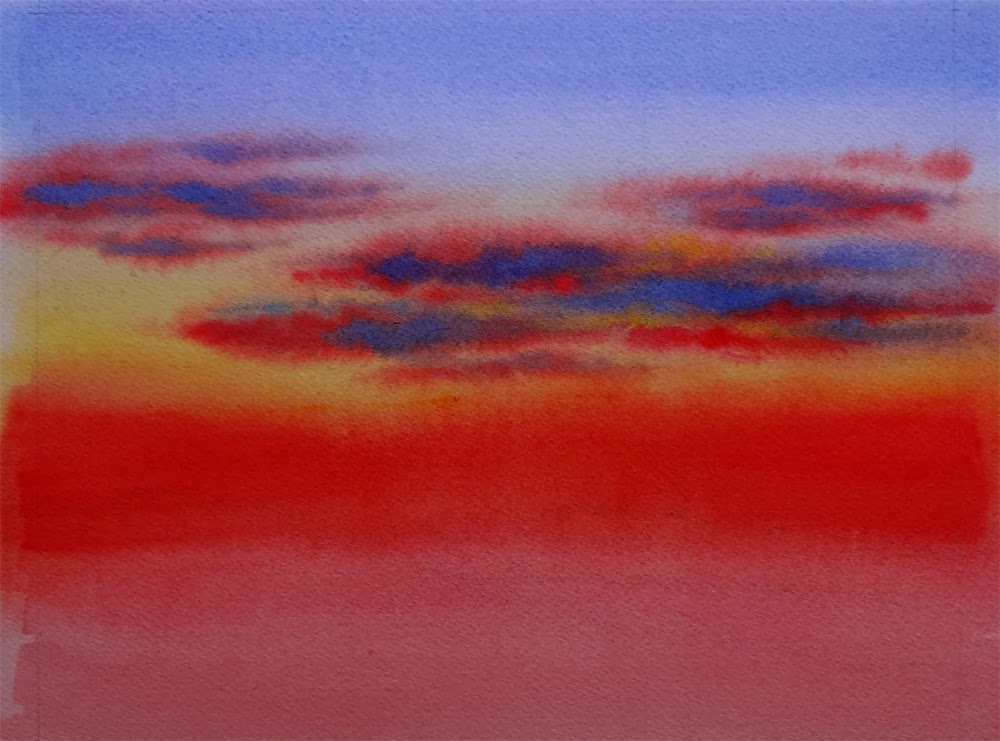
Marsh Sunset -- A Little Plein Air Painting at Elkhorn Slough


Marsh Sunset, Watercolor on Fabriano #140 Cold Press Paper, 8"h x 10"w, 2014 #13

Bid in My DPW Auction ( Starting Bid $70)

The weather was great and I went out to do some plein air on Friday, and completely "Marsh Sunset" near Elkhorn Slough. Unfortunately, it was very cold once the sun started to set, and the coastal fog came in swiftly. As a result, I was not feeling well over the weekend  and did not get much of painting done... Still, I was happy to finally get back there and paint in nature! It's been too long since I have done that...

In the mean time, if you have an image of a beautiful landscape, or a flower you like, or anything you might want to see painted, please email them to me at arena.shawn@gmail.com. I will paint them and post them here. From every 10 paintings I make from them, there would be a random drawing, and the lucky winner get to take a original back home for free! Interested? Then send me your photo!

You can now buy high quality Giclee prints of many of my sold paintings, both on paper and canvas, as well as some note cards with my paintings here:

Sunday, January 12, 2014

Sky in Progress -- 30 Paintings in 30 Days Challenge, Round 3, Day 8, 9, 10, 11


Tranquility,  Watercolor on Arches #140 Cold Press Paper, 9"h x 12"w, WIP 1

With a progressing cold I fell significantly behind on my "Sky" paintings the past few days. I have been painting but since painting sky requires some serious wetting of the paper, I tend to work on several of them at the same time, so that I can continue working on one when others are in various stages of drying. So, here they are, some very close to finish, just waiting for me to put on the details; others just starting, with one or two wet-in-wet layers of clouds and nothing else yet... 


Amber Glow,  Watercolor on Arches #140 Rough Paper, 7"h x 10"w, WIP 1


Shades of Dusk,  Watercolor on Arches #140 Cold Press Paper, 8"h x 10"w, WIP 1


Night Sail,  
Watercolor on Lanaquarelle #140 Cold Press Paper, 3"h x 7"w, 2014 #8

In the mean time, if you have an image of a beautiful landscape, or a flower you like, or anything you might want to see painted, please email them to me at arena.shawn@gmail.com. I will paint them and post them here. From every 10 paintings I make from them, there would be a random drawing, and the lucky winner get to take a original back home for free! Interested? Then send me your photo!

You can now buy high quality Giclee prints of many of my sold paintings, both on paper and canvas, as well as some note cards with my paintings here:


Tuesday, January 7, 2014

Fiery Sky -- WIPs (Again!), 30 Paintings in 30 Days Challenge, Round 3, Day 5


Fiery Sky,  Watercolor on Fabriano Artistico #140 Cold Press Paper, 8"h x 10"w, WIP 1

Classes at the atelier resumed on Monday, which means I only have 3-4 hours at most to paint now on weekdays. Combining that with my recent sickness due to the cold (although we do not have a frigid temperature compared to most part of the country...), I did not complete this painting yesterday. It is very close to a finish and I am working on it, playing with my new favorite brush -- the slanted bristle 1" to put in shapes suggesting of foliage with minimum strokes. Theme for this week: "Sky".


In the mean time, if you have an image of a beautiful landscape, or a flower you like, or anything you might want to see painted, please email them to me at arena.shawn@gmail.com. I will paint them and post them here. From every 10 paintings I make from them, there would be a random drawing, and the lucky winner get to take a original back home for free! Interested? Then send me your photo!

You can now buy high quality Giclee prints of many of my sold paintings, both on paper and canvas, as well as some note cards with my paintings here:


Tuesday, April 30, 2013

Jungle Fire (Finished!)


Jungle Fire,  Watercolor on Arches 140# Cold Press Paper, 8"h x 10"w, 2013 #40

Sold!

Just a very quick update on this piece which I have dragged along for almost a year, and finally finished during this weekend. No, I have actually not procrastinated on it -- some pieces come easier than the others, but this is not one of them. I would layer another wash on it every now and then, and look at it after a couple of days, feeling it still needed something -- slight adjustment of color temperatures, a little detail to modify the jagged edges left by masking fluid, etc. And finally, when I am looking at it today, I realized IT IS DONE. 

When I first started painting I never thought finish a piece is this much work and involves this much pondering -- I would select a good reference photo and when the painting looks quite like the photo I know it is done. But the more I paint, the more I realize it is the artist's aesthetics instead of the snap of a camera should dictate when and how a particular painting is finished. It can be as sketch or realistically detailed as you, the artist, is happy for it to be. The line between a finished painting and one not quite yet suddenly becomes much more blurred.

Sometimes I only realized a painting has passed its finishing point after I have put a couple more strokes and realized I just overworked it. ("An artist knows an awful lot -- but he only knows it afterwards", says the all-wise Paul Klee.) Sometimes I think it is done and frame the painting, only to take it out later for further adjustments. There is not an iron-cast standard, but more of a feeling that different layers and strokes are finally coming together into a beautiful, coherent whole, a melody instead of a collection of music notes.

Hopefully, as I continue working, one day the blurred line would become clear again...

How do you, my artist friends, decide that a painting you have labored over is done?

You can now buy high quality Giclee prints of many of my sold paintings, both on paper and canvas, as well as some note cards with my paintings here:


Sunday, March 3, 2013

Fire Bird Completed!


Fire Bird, Watercolor on Arches #140 Cold Press Paper, 5"h x 7"w, 2013 #35

Bid at My DPW Auction (Starting Bid $50)

After taking the good advice I got on facebook regarding this one, I gathered my courage and put in a near black mixture of French Ultramarine and Hematite to darken the background value, and put in the shadow shapes on the leaf behind the flower in approximately the same value. Now the yellow of the flower is really popping out! Thank you all who gave the much needed feedback, my artists friends!....


Jungle Fire, Watercolor on Arches #140 Cold Press Paper, 8"h x 10"w, WIP 7

After a couple more glazes I have now taken the masking fluid off this one -- as usual the resulted white shapes appear to be quite harsh. Now for the finishing touches the challenge is to tone down and refine the edge of these masked shapes using thin glazes which does not disturb the thick, saturated pigments which are already on the paper... I started with the petal on the right most side, using squirrel quill brush to gently lay in a warm yellow glaze on the right side of the petal, then changing to a No. 2 Kolinsky Sable brush to put in all the thin red lines suggesting the reflective pattern on this very shiny petal with a very stiff mixture of pigments. The previous washes for most part stayed unmoved -- which is great. Now I just need to repeat it for the left side petals... Fingers crossed!

You can purchase my 2013 wall and desk calendars here:

Sunday, February 24, 2013

More Birds on Fire...


Jungle Fire, Watercolor on Arches #140 Cold Press Paper, 8"h x 10"w, WIP 6

I can't believe I have put this one off for so long! Sometimes you know a painting is just lacking that final touch but you like what has been put down on paper so far and worry you will screw it up, so you just keep on putting off those final strokes indefinitely... No more! I am resuming this one and laying down the juicy saturated reds and oranges on this bird. Hopefully it will be completed within the week... 


Fire Bird, Watercolor on Arches #140 Cold Press Paper, 5"h x 7"w, WIP 1

I've also started this little one in the hopes that it will be completed with a day or two's work so that I can post it for auction on Daily Paintworks. I have realized that I like to have several paintings utilizing the same color palette going on in the same time -- hence all the greens in my last blog post and all the firey reds and oranges in this one! Yes, I've started both of these birds when I was painting the center flower of "Petal Light #4"... By doing this I can switch back and forth while waiting for the paintings to dry, and do not have to clean my palette too often and lose some lovely mixtures that has formed on it! ;-) See, I'm a conservationist at heart... lol...

You can purchase my 2013 wall and desk calendars here:


Thursday, January 3, 2013

Northern Exposure (30 Paintings in 30 Days Challenge: Day 2)


Northern Exposure, 
Watercolor on Winsor Newton #140 Cold Press Paper, 8"h x 10"w, 2013 #2

Sold!

Day 2 for the "30 Paintings in 30 Days" challenge -- so far, I am still hanging on there (ok, barely)... This painting has been putting aside for a while since I started it last year, and worked on it off and on for a couple of months. It looks a very simple scene of sunset in the big sky country of eastern Texas at the beginning of winter. In the reference photo I took, there is almost nothing in the foreground, but the intense color near the horizon just kept me coming back to it. I could not think of a center of attention that would add interest to the foreground and link it to the sky, yet does not detract from and compete with the beautiful sunset colors that first drew me into painting this picture. I did a couple of smaller (5" x 7") studies to work out the problem, but none of them come out to my like. So it went into the drawer of unfinished works for a while.

Today I took it out and decide to give it a go. I strengthened the foreground shadow colors, leaving only one rim of light separating foreground and background mountains. Then I took out my rigger and had some fun with groups of branches, adding dark shapes with dry brush work on top of them to make them read as "trees". They added some linear elements to this big-wash painting yet because of their dark values, merge well with background mountains and clouds and do not attract the eyes directly to themselves from the bright sunset colors of the sky. Is this the best solution to the problem? I do not know. But I think it is one of the possible solutions and worth trying out. It is definitely better than being halted by fear of ruin a half-finished work and never attempt to work it out!

This experience has taught me something indeed -- one of the most important values of these fast paced daily painting sessions is to free a painter from his/her attachment with his/her work, and encourage him/her to experiment more, working out problems, knowing if a piece of work did not turn out as well as he/she has wished, it is only a day's work wasted, and tomorrow is a new start.

...Certainly a valuable enough lesson for me and worth all the time I am spending carrying it out!

You can purchase my 2013 wall and desk calendars here:


Monday, December 31, 2012

A Look Back at Year 2012...

As the clock ticking close to midnight, I am turning my eyes to the year passed and all that has happened in my art journey along the way. As I mentioned in my last blog post, it has been an amazing ride, thanks to all of you, my dear friends and collectors! When I set off at the beginning of the year, I did set some modest goals for myself: creating some artwork every week, posting them online for sale, documenting the process in this blog, and trying to enter some juried shows. In the end, I have accomplished so much more, -- something that would not be possible without your kind encouragements and support along the way!

In this year, I have managed to finish a total of 54 paintings -- including studies and plein air work. This may be a modest number for many, but to me it is a real accomplishment, as I am a very slow painter and the work I have managed to actually finish in all the years before do not even add up to this number. I would definitely like to do at least as much in the coming year, but I will leave goal-setting to my post tomorrow. ;-) Now is the time to enjoy the bubbly drinks and pat myself on the back! 

I've managed to overcome my fear of losing control of what happened on paper and tackled some unfamiliar surfaces, the most difficult of which being Ampersand Aquabord, and with the kind encouragements of Kara and Crystal, got some success in the end. I would love to keep at this effort in the coming year -- and maybe try some portraits on it too!

This year I have also tried a few different sales venues -- both online and offline, some more successful than others. I've set up my Daily Paintworks Gallery, where I auction off my smaller original works; I've stocked my Etsy Shop, where I sell both originals and Giclee prints, as well as products such as calendars and note cards; I've uploaded my work to the print-on-demand site, Fine Art America, so that anyone can purchase Giclee prints of my paintings to the size and surface they desire, as well as my works as note cards. I've kept up on this blog (although updating regularly did remain a challenge when school work got busy) and maintained regular update of my facebook page, through both of which I have met many wonderful friends! I've attempted my hands at three local art fairs and managed to break even at all of them, and received several leads which resulted in sales afterwards from these events. I've also become a member of the wonderful Main Gallery in Redwood City -- the amazing talent and creativity of the artists I've met there made me very proud to be one of them!

I've tried my hands on a couple of local, regional and national juried shows this year, and was fortunate enough to be juried in 20 of them, getting a couple of awards and selling some of my larger works through these shows. I am extremely honored to enlist among the wonderful artists -- many of whom are my teachers through their books and instructional dvds -- in these shows, and consider the juries decisions a gentle nudge of encouragement for an artist at her starting point like me. For all the ones that I did not get in, I can only say I will definitely try harder the coming year!

What I did not manage to do, in the year past, is to keep a sketchbook and draw freehand everyday, to go outdoors more often and do more plein air studies, and to keep finishing two small paintings a week. With four days a week in the Golden Gate Atelier learning classical drawing methods, it has proven quite a challenge to keep at these goals. But I will not give them up in the new year, -- I've just signed up for an impossible crazy task today, which I will reveal in tomorrow's post. So stay tuned...

Ok, before I bore you with more self-bragging, I just want to share with you my seven favorite paintings that I have created this year. Some of them are award winners and already happily settled in their new homes, others I love not because of the final results, but also the challenges I have taken and difficulties overcome during their creation...


High Summer Dreams II, Watercolor on Arches 140# Cold Press Paper, 10"h x 14"w, Sold

This one has won me a gold medal in Stockton Art League's National Juried Show at Haggin Musuem -- the first red-carpet moment in my art career! 


April's Passing,  Watercolor on Ampersand Aquaboard, 6"h x 6"w
Available through Randy Higbee Gallery ($300 with Frame)

My first successful attempt on Aquabord after much suffering. I feel that after this one, I started to have some understanding of how this difficult surface works, and I was also able to let go of a bit of control to accept what's happening on paper (or, in this case, on board ;-)


Petal Light #2,  Watercolor on Arches 140# Cold Press Paper, 7"h x 10"w
Available through Daily Paintworks Online Gallery ($125 with Mat)

I feel that I have truly captured the warmth and vivacity in this bird without fiddling too much. Love the wet-in-wet process from start to finish...


Beauty Queen, Watercolor on Arches 140# Cold Press Paper, 7"h x 5"w, Sold

I tried out the multi-colored glazing method of the amazing Jeannie Vodden and combined it with my own wet-in-wet approach in the background. I was very worried the flower and the background would look like completely separate entities, but somehow the painting feels coherent as a whole when finished. Yay! Sometimes risk-taking does pay off...


Edge of Summer, Watercolor on Arches 140# Cold Press Paper, 5"h x 7"w, Sold

I tried to paint from a black-and-white photo and just imagine the colors of this one, and lovedswhat became of it. An attempt to correct my tendency to paint colors too literally from reference materials and see them only as a starting point. 


Petal Light #1,  Watercolor on Arches 140# Cold Press Paper, 10"h x 8"w
Available through Daily Paintworks Online Gallery ($150 with Mat)

Starting from an under-exposed, uninspiring reference photo of large area of dead dark shadow shapes on the leaves, I let the wet-in-wet process lead me and created interesting dark shapes. I felt a real sense of freedom after pulling this one off!


Winter Light, Watercolor on Arches 140# Rough Paper, 5"h x 7"w, Sold

The first landscape painting I am proud of -- I feel this one did capture more with less. 

Thanks again my friends -- as I have mentioned, I could not have done this without your support! Happy New Year Everyone!!!

You can purchase my 2013 wall and desk calendars here:


Thursday, October 25, 2012

Work in Progress: Tropical Flowers Continued

Just a quick update of some of the tropical flower paintings I am still working on -- it's been a long time! October is flying by with almost an art fair every weekend, together with school it has surely bitten into my painting time! It's time to get them finished and posted!


Jungle Fire,  Watercolor on Arches 140# Cold Press Paper, 8"h x 10"w, WIP 5

"Jungle Fire" is almost done and only a few glazes on the petals to make the red-orange really sing and glow! "Heliconia Dance", on the other hand, still has a long way to go, and I am enjoying playing with wet-into-wet in the background and all the subtle muted colors created by letting a limited palette of Cobalt Blue, Aureolin Yellow and Permanent Rose blending on wet paper...


Heliconia Dance,  Watercolor on Arches 140# Cold Press Paper, 7"h x 5"w, WIP 3

Wednesday, October 10, 2012

Work in Progress: More Tropical Flowers

Time flies -- my post here has been sporadic lately, although I have not been slacking off! For one, the study at the Golden Gate Atelier has resumed on October 1st after the summer break, and boy was I rusty! I am struggling Monday through Thursday trying to regain the skills of seeing shapes, comparing values, measuring angle and length by drawing from live models and copying master drawings, which leaves only the weekends to paint. Even those are hard to come by, however, since I have a couple of art fair events coming up every weekend of October (I will talk about my experiences in tomorrow's post, since I've learned quite a bit in my first art fair, and during the discussions with other artists who are veterans in these affairs)! Between printing, framing, setting up and taking down tents and panels, and long driving sessions, there are only a couple of hours here and there left to create new work. I am itching to paint and managed to paint in early mornings and late nights for an hour here, an hour there. Progress has been slow, but I thought I should at least share them here:


Soar,  Watercolor on Arches 140# Cold Press Paper , 6"h x 6"w, WIP 2

I've got farthest with this little 6" x 6" little painting of bird of paradise. It is not a very complicated image, and the reference photo is very colorful. I decided to try out the multi-colored layering techniques I've been learning in the fabulous Jeannie Vodden's class, and practicing painting with lots of water, thin layers of pigments, and wet-on-dry. Well, I would not say I was completely successful -- in some of the shapes of darker foliage areas I got carried away and again started blending thick, juicy pigments wet-in-wet. But I am not unhappy with the results. I would like to practice saving areas of delicate, light-valued passages using this method in my next exercises... I feel I do painting too heavy-handed sometimes and did not quite utilize the full potential of the delicate nature of watercolor glazes. Something to ponder about in future projects!


Jungle Fire,  Watercolor on Arches 140# Cold Press Paper , 8"h x 10"w, WIP 4

In this cropped bird of paradise painting, I have practiced the same glazing method as in the one above and managed to achieve soft blended edges in the background foliage areas. Now it's time to get that intense, rich orange color of the flower on there!


Heliconia Dance,  Watercolor on Arches 140# Cold Press Paper , 7"h x 5"w, WIP 2

This heliconia painting is still at its beginning stage. I am learning from the two bird of paradise projects, and taking my time to build up values using blended thin layers of pure colors. I love paintings at this stage -- you can play with the abstract shapes of light and dark, take liberty with the colors, and enjoy the flow of wet pigments on paper without worrying too much to make it look like the photo. Since I am enjoying this process so much, I am suspicious I've indulged a bit too long at this stage... :-P

Thursday, September 27, 2012

Work in Progress: Snow White (and the Huntsman?...) (Conflict of Styles?...)

Have you ever experienced this -- you are looking at a beautiful reference photo, and you have a clear vision of how the painting will turn out. You sit down, start to work on it with a specific technique that you know will work with the imagery and bring out that special "zing" of it. You work more -- and then suddenly you realize a different technique, a different way to deal with the imagery, a completely different vision is taking over and you are torn between the old and the new? What do you do in this situation, my friend? Do you let your initial idea persist and work out the later inspiration in a second attempt of the same reference, or do you let the painting take a life of its own and dictate how it wants to present itself?...

I started this painting of a white rose back lid against a field of dark foliage as an experiment of blending colorful grey on the shadow areas of the petal -- using Permanent Rose, Aureolin Yellow and Cobalt Blue to mix greys with subtle color temperature shifts. I was quite happy about the results of the first few petals on the upper left side, but when I proceed on to the lower right side, I suddenly realize that I am practicing the painting technique I learned in the Amazing Jeannie Vooden's class and directly blending the three primaries on paper and layering them on as glazes instead of finishing each shadow area in one go. Suddenly realizing this could be one of the images of "colorful whites" that I love so much about Jeannie's work, I am eager to try out the technique. Yet as I was taking a break (while waiting the paint to dry, haha, I'm sure I am not the only one who is guilty of doing this) and surfing through the web, I came across one of the amazing images of Ann Pember, one of my favorite flower painters of all times, I was reminded of the beautiful way she paints white flowers -- wetting each shadow shapes separately and use wet-in-wet brush to hint the folds and turns of the petals, finishing each area in one go using high-saturation colors and let them blend on paper. I realized that I've wanted to try this method on for a long time -- and this imagery presents a find opportunity for doing that! Now I am really torn about how to proceed forward... 


Snow White, Watercolor on Arches 140# Cold Press Paper, 8"h x 10"w, WIP 1

As a result, I put the white rose aside and resumed working on this bird of paradise painting (another one!). It has been a real challenge to work on this Fabriano #140 Cold Press paper -- I like to put on color a bit more thickly than people who does a lot of glazing to build up the color intensity, and as a result, whenever I try to rewet an area to do some detailed work wet-in wet, the underlying layers just lift like crazy. But, the color brilliance that can be obtained on Fabriano paper is just hard to match using Arches. So I am pressing on... (Speaking of enjoying the process versus results, well, while painting on the Fabriano paper I am clearly aiming at the latter instead of fully enjoying the former. Am I bad?...)


Petal Light III, 
Watercolor on Fabriano Artistico 140# Cold Press Paper, 10"h x 14"w, WIP 4

Speaking of results -- the jurying results were in for the Fremont Art Association's 47th Annual Open Juried Exhibition, and my work, "Peppermint Rose" has won the silver medal of honor in Watermedia! I am so excited... The awards ceremony is this coming Sunday at 1pm. If you are in the bay area and not busy, come by and say hi!...


Peppermint Rose, 
Watercolor on Fabriano Artistico 140# Cold Press Paper, 8"h x 8"w, 2012 #36

Buy It Now from My DPW Gallery ($125)


Here's how this painting looks in its frame -- I chose a simple black frame a little wider than 1" and 2" white mat all around, nothing too fancy to direct viewer's eyes away from the painting...


Peppermint Rose, Framed (Frame Size 12"h x 12"w)


Wednesday, September 19, 2012

Hide and Seek III (I'm Back!!!......)

Hi everyone! I am finally back from China... It's been a long absence and I've done a bunch of landscape sketches that I am going to share on this blog in the coming days, but for now, I am stressed over two coming deadlines -- one for this Friday and the other one for the coming Saturday, both 11" x 14" bird of paradise paintings (large ones for me). I will post the progress shots along the way, I promise.

I have not been able to manage to paint much during my absence, and when I tried to get back at it -- it's almost like learning everything from start again! (The deadlines surely did not help either...) I found that I am having problems gauging the wetness of the brush, the exact mixture to use for a glaze, and the timing for large, wet-in-wet applications... I've messed up a couple of starts and finally decided to get back into my grooves by redoing "Hide and Seek" as an exercise -- and I do need some pieces for some art fairs and a gallery jurying process coming up in October (again, more details later). I made numerous mistakes painting this one, and was fortunate to be able to catch and correct most of them, and end up with the result that I am quite happy with:


Hide and Seek III
Watercolor on Winsor Netwon140# Cold Press Paper, 10"h x 14"w, 2012 #48

Sold!

I did this version on Winsor & Newton #140 Cold Press Watercolor Paper, and it is a good test for unfamiliar paper as well. I've found the Winsor & Newton paper has a handling quality close to that of the Arches', but slightly easier for lifting, although repeated glazing for too many times may cause paint to bleed on the edge of wet area more easily than Arches as well. The final resulted color on this paper seem to dull down quite a bit, even for high saturation transparent colors like Permanent Rose, which may present a challenge for flower paintings in particular. I will experiment with it more and report it here.

From the juried exhibition front, my painting, "Petal Light #1" was accepted into the Hawaii Watercolor Society's 2012 Open Exhibition. A Fellow DPW painter and blogger, Colleen Sanchez, has selflessly contributed her time and effort helping organizing this fabulous exhibition. Colleen paints amazing watercolor flowers and lately has taken the adventure of oil painting. If you haven't already, be sure to stop by her blog, and I promise you won't be disappointed!


Petal Light #1, Watercolor on Arches 140# Cold Press Paper, 10"h x 8"w, 2012 #40

I am trying to paint as fast as I can to catch up, and in the same time -- trying to catch up with all the fabulous works you have done during the time I have no access to blogger or facebook. Everyone seems to be really productive -- lots to catch up with...

Sunday, August 5, 2012

Work in Progress: Two Bird of Paradise Paintings (Jungle Fever Continues...)

I did keep my promise and stayed focused, although this newest progress of "Jungle Fire" does not seem to differ too much from my last update, it did take several hours' more work, mostly in the details -- darkening some shadow shapes, lifting soft highlights, cleaning up edges so that there is not a hard line in between various background shapes...  The paper is gradually getting saturated with pigments and now it's time to start that center flower, something I think I have been subconsciously putting off in the fear of ruining the good progress so far... (Here we go again!...)


Jungle Fire,  Watercolor on Arches 140# Cold Press Paper , 8"h x 10"w, WIP 3

Instead I started the background of another bird of paradise painting. This time, I've kept my initial washes very light and watery, and focused on practicing wet-on-dry applications. The background it actually not painted all at once. Whenever I had to stop, I softened the hard edge after the entire painted shape had dried. When I restart at the adjacent shape, I wet the previously painted shape with clear water and paint with light wash up to the boundary. I am pretty happy with the seamless results. This one looks a bit more airy comparing to "Jungle Fire", which is the effect I am after. We'll see how it goes from here...


Soar, 
 Watercolor on Arches 140# Cold Press Paper , 6"h x 6"w, WIP 1

Related Posts Plugin for WordPress, Blogger...