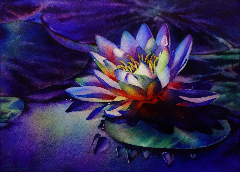
Tranquility, Watercolor on Arches #140 Cold Press Paper, 9"h x 12"w, 2014 #12
Bid in My DPW Auction ( Starting Bid $70)
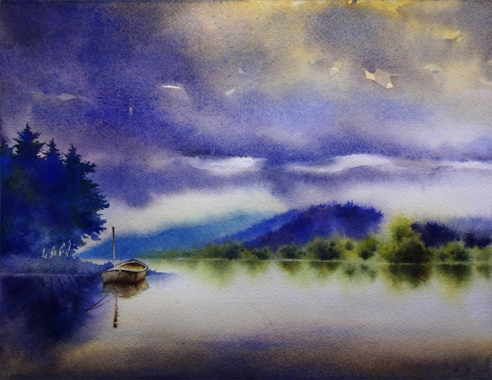
Busy with drawing projects at the atelier for the past two weeks, but I managed to sneak in a few painting hours here and there, and finished "Tranquility". It has started in the "30 Paintings in 30 Days" challenge that I took this January, but had to drop due to health issues of a dear family member. It was part of the "water" themed set of paintings. Now that things are back to normal in my household, I am slowly going back to these unfinished projects and trying to tackle them one by one...
I want to convey the sense of utter stillness and quietude in the early morning hours of an overcast day in this painting, and kept on feeling that the shapes of the cloud and distant trees near the foothills needs to be tweaked more, so I have wet and rewet these areas, dried them, wet them again... It's been a lengthy process. When painting landscapes I often find it's not enough to directly copy the shapes present in your reference materials; instead, conscious, deliberate design choices has to be made to makes tree/mountain/rock/cloud shapes interesting. On the other hand, it is so important to imitate the randomness presented in the natural shapes in your design, and take great care to not make them look too "designed", mechanical or symmetric! It's a delicate dance of balance...

When posting the work in progress shot of this painting in January I was really very happy with how the various purple/blue/green colors has blended freely on the left side group of trees, as well as the shape of the silhouette of them. However, after finishing the distant hills and woods I realize the value of this group of trees do not quite work -- they are way too light and therefore does not balance the image. After agonizing over it for a few days, I have finally gathered enough courage to lay another layer of wash to darken them, taking care to change the color every time I reload the brush to maintain the interest generated by the color variation in the initial version. I did it wet on dry using a small squirrel quill brush, whose soft hair would not disturb the underlying wash. I am really happy with the decision, as well as the result -- with the darker, more intense blues and purples, the shape of this group of trees in the final image gives enough weight to balance with the middle-ground shapes on the right side, and blocks the viewer's eye from wandering off the right side of the picture, therefore emphasizes the moored boat.
Often in landscape paintings like this, I find myself spending much more time staring at the painting than actually "painting" on it toward the end stage. It is not uncommon that every one minute of painting time is accompanied by ten or more minutes of looking and thinking. Sometimes after a long period of repeated starting, pondering and evaluation, I would finally decide to not add anything more and just call it done. However, I don't consider this as time wasted -- time spent evaluating the work to be done with a painting so often saves me much heartaches from taking that "one stroke too much". As painters even when we do not have brush in hand, we may still be mentally "painting" a picture on that virtual sheet of paper. And that, I believe, is a vital exercise for my growth as a painter, and time well spent.
In the mean time, if you have an image of a beautiful landscape, or a flower you like, or anything you might want to see painted, please email them to me at arena.shawn@gmail.com. I will paint them and post them here. From every 10 paintings I make from them, there would be a random drawing, and the lucky winner get to take a original back home for free! Interested? Then send me your photo!
You can now buy high quality Giclee prints of many of my sold paintings, both on paper and canvas, as well as some note cards with my paintings here:
I want to convey the sense of utter stillness and quietude in the early morning hours of an overcast day in this painting, and kept on feeling that the shapes of the cloud and distant trees near the foothills needs to be tweaked more, so I have wet and rewet these areas, dried them, wet them again... It's been a lengthy process. When painting landscapes I often find it's not enough to directly copy the shapes present in your reference materials; instead, conscious, deliberate design choices has to be made to makes tree/mountain/rock/cloud shapes interesting. On the other hand, it is so important to imitate the randomness presented in the natural shapes in your design, and take great care to not make them look too "designed", mechanical or symmetric! It's a delicate dance of balance...
Tranquility, Watercolor on Arches #140 Cold Press Paper, 9"h x 12"w, WIP 1
When posting the work in progress shot of this painting in January I was really very happy with how the various purple/blue/green colors has blended freely on the left side group of trees, as well as the shape of the silhouette of them. However, after finishing the distant hills and woods I realize the value of this group of trees do not quite work -- they are way too light and therefore does not balance the image. After agonizing over it for a few days, I have finally gathered enough courage to lay another layer of wash to darken them, taking care to change the color every time I reload the brush to maintain the interest generated by the color variation in the initial version. I did it wet on dry using a small squirrel quill brush, whose soft hair would not disturb the underlying wash. I am really happy with the decision, as well as the result -- with the darker, more intense blues and purples, the shape of this group of trees in the final image gives enough weight to balance with the middle-ground shapes on the right side, and blocks the viewer's eye from wandering off the right side of the picture, therefore emphasizes the moored boat.
Often in landscape paintings like this, I find myself spending much more time staring at the painting than actually "painting" on it toward the end stage. It is not uncommon that every one minute of painting time is accompanied by ten or more minutes of looking and thinking. Sometimes after a long period of repeated starting, pondering and evaluation, I would finally decide to not add anything more and just call it done. However, I don't consider this as time wasted -- time spent evaluating the work to be done with a painting so often saves me much heartaches from taking that "one stroke too much". As painters even when we do not have brush in hand, we may still be mentally "painting" a picture on that virtual sheet of paper. And that, I believe, is a vital exercise for my growth as a painter, and time well spent.
In the mean time, if you have an image of a beautiful landscape, or a flower you like, or anything you might want to see painted, please email them to me at arena.shawn@gmail.com. I will paint them and post them here. From every 10 paintings I make from them, there would be a random drawing, and the lucky winner get to take a original back home for free! Interested? Then send me your photo!
You can now buy high quality Giclee prints of many of my sold paintings, both on paper and canvas, as well as some note cards with my paintings here: