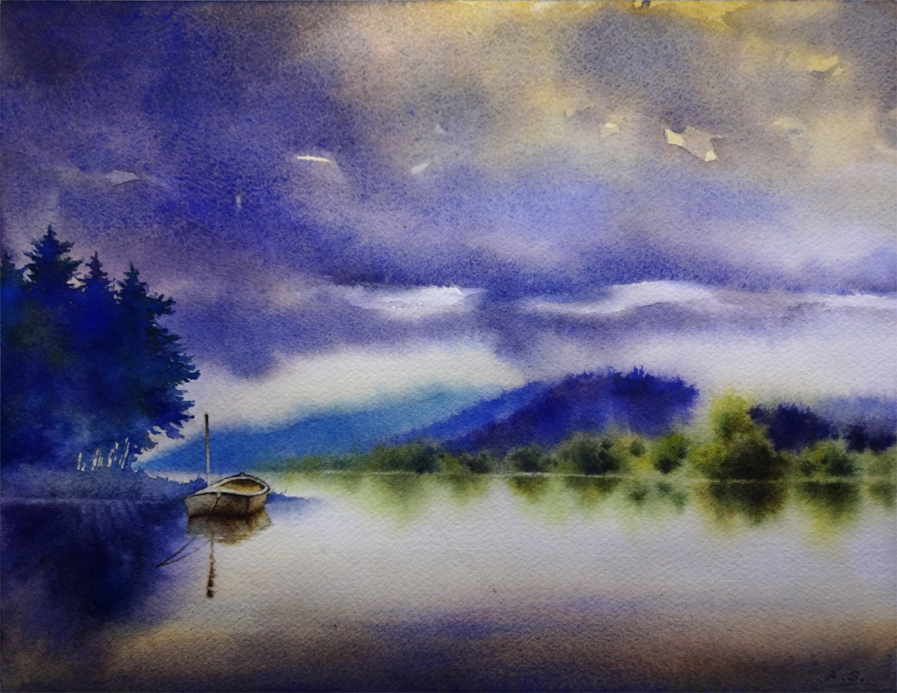
Showing posts with label Fir. Show all posts

Friday, September 18, 2015

Morning Fog, Tamalpais - Day Eighteen of the 30/30 Challenge


Morning Fog, Tamalpais,
 Watercolor on Arches #140 Cold Press Paper, 6"h x 6"w, 2015 #20

Bid in My DPW Auction (Starting Bid $40)

Day Eighteen of the challenge -- Trying to catch up today but was not quiet happy with the other painting I am working on, so maybe I will get a fresh eye tomorrow morning... For this one I again worked from a previous Plein Air piece, changing the format from horizontal to square, allowing more space for the receding mountain ranges. As the evergreen-covered hills gradually get closer, I added more Quinacridone Burnt Orange to warm up the color, and put down the last two tall fir trees in the foreground with thick paint on a quite worn-out old brush to give some more interesting edges. The whole painting was done in one wetting of the paper, but I was not too happy with my first two attempts of it, so this is the third one. Sometimes you can wash off freshly applied watercolor paints and start over on the same piece of the paper, but I find often the surface sizing would largely come off this way, and granulating pigments don't quite settle the same way, so for a small piece like this I would just start anew on a fresh clean sheet. Luckily the shapes worked out quite well the third time... Now it is really time for bed! :-)

Wednesday, September 16, 2015

Autumn Glow - Day Sixteen of the 30/30 Challenge


Autumn Glow, Watercolor on Arches #140 Cold Press Paper, 6"h x 6"w, 2015 #18

Bid in My DPW Auction (Starting Bid $50)

Day Sixteen of the challenge -- I wanted to try something different today and started this one on paper without a reference image, just playing with soft washes of contrasting cool and warm colors that are loosely divided into complimentary color families, being careful to leave enough areas of white paper. When the applied washes mingled on wet paper, I titled the painting in different ways to encourage the blending of complimentary colors in certain areas, and prevent them from blending so that higher saturation could be retained in other areas, especially near where the reserved white is, as I could like to design my center of interest near these areas. When this initial wash dried, I looked at the resulted color-value shapes and saw rocks and back-lid foliage in the glowing autumn light in the foreground, and dark woods behind it. So I enhanced this imagery with further glazing on dry paper, careful not to lose all the soft edges created in the first wet-in-wet wash (it is so easy to overglaze and lose all the soft edges before one realizes!). I also lifted light linear shapes hinting stems and branches of fir trees in the dark background, thus suggesting a dense growth of evergreen forest behind the rock and center pine tree. To counter balance the dominating vertical shapes of trees, I added horizontal shapes at the bottom of the image -- interesting shapes in light and dark glazes overlapping each other, be them suggestion of rock ledges, water or reflections. I am quite excited about this project, as it is very different procedure from how I usually work, and forces me to think more abstractly about the balance of values, shapes and lines. It is from inside out, not outside in. Think I will try it a few more times for the 30/30 challenge...

Monday, September 14, 2015

Marsh Dawn - Day Fourteen of the 30/30 Challenge


Marsh Dawn, Watercolor on Arches #140 Cold Press Paper, 6"h x 6"w, 2015 #16

Bid in My DPW Auction (Starting Bid $30)

Day fourteen of the challenge -- I am really late for this one. I tried a very limited palette of Cobalt Blue and Quinacridone Burnt Orange on this one, going for mood and atmosphere rather than details. I found that with restrictions often comes poetry, such as Haiku, with its extremely constrained forms the wonder of poetry often comes through quite easily compared to free-form modern poems where everything goes. 

This is not a particular scene that I am painting from life, but I have seen it so many times while taking morning walks in different wetland parks bordering evergreen forests -- at the mouth of redwood forest streams, near the river estuaries of Olympia National Park, even along mountain meadows at the edge of alpine forests in a wet season. The lingering fog and the mirror-clear reflection of the forest is woven into my most intimate memories. When I close my eyes, it can just flow out to the tip of my brush. I can almost smell the moist air tinged with the scent of new grass. Somethings you just never forget...

Friday, September 11, 2015

Heart's Desire - Day Eleven of the 30/30 Challenge


Heart's Desire, Watercolor on Arches #140 Cold Press Paper, 6"h x 6"w, 2015 #13

Bid in My DPW Auction (Starting Bid $45)

Day eleven of the challenge -- I made it to the double digits! Again, a very busy day and I did not get to start painting until much later in the day. So I worked on this piece based on a previously finished plein air version of it at Ruby Beach, Olympia National Park, Washington. I used analogous color scheme of blues and purples as well as greyed-down versions of them by adding a bit Cadmium Orange and Quinacridone Burnt Orange to the mixture, hoping to create a more somber mood. For the tree and shrub shapes, I tried to design the linear elements to contrast and compliment the diffused cloud mass and the distant headland with soft edges. For the near-shore rocks I combined staining and granulating pigments so that when I use a palette knife to scrape off the damp colors to create the light planes of the rock, only the staining colors were left in the scraped park, creating more interesting color variations. I love the mood of evening gradually sinking in and hope to convey it in this painting... Dusky hours are my favorite ones in a day. How about you, my friend?...

Saturday, September 5, 2015

Wild Things - Day Five of the 30/30 Challenge


Wild Things, 
Watercolor on Arches #140 Cold Press Paper, 6"h x 6"w, 2015 #7

Bid in My DPW Auction (Starting Bid $35)

Day five of the challenge -- continuing my adventure with my slanted 1" bristle brush, trying to load more than one pigment onto different corner of the brush, and let them freely blend on paper. Doing a painting without drawing has an especially freeing effect after a day at my easel working out the detailed drawing of a larger floral painting. I let my rigger brush dance freely on the paper to create the twisted branches of the foreground twigs. Painting snow in the heat of summer is also fun. I am feeling the cool breathe of air when laying down those cool blues, purples and muted greens...

Thursday, September 3, 2015

Day's End - Day Three of the 30/30 Challenge


Day's End, 
Watercolor on Arches #140 Cold Press Paper, 6"h x 6"w, 2015 #5

Bid in My DPW Auction (Starting Bid $50)

Day three of the challenge -- one of the goals I have for this 30/30 challenge is to try using as big a brush I can manage and carry the painting to as far a point as I could, as I did in the last painting, "Woodland Fall"; a second goal I have is to experiment with non-conventional brushes and surfaces without the worry of "failing", i.e., not turning out a beautiful little painting in the end. 

For this 6" x 6", I used primarily a slanted 1" stiff bristle brush to lay in the soft sky and foreground snow on very wet paper, and added gradually thickened pigments to create the distant mountain with fir trees as well as to establish the general shape of the snow-laden evergreens in the foreground before the paper dried. The advantage of bristle brush is, they really can pick up and carry a lot more pigment (especially if your pigment is not fresh squeezed out of a tube) compared to traditional watercolor brushes, even the stiffer synthetic haired ones. Another advantage of these brushes is that they have very jagged hair, hence it is absolutely futile to try to get any detail out of them when painting. One is thus forced to pay attention to the general tone, color and overall silhouette of each value shape, and design the bigger picture before putting in the details (which would require switching to a different type of brush). 

I did eventually switch to smaller bristle brushes to establish the darker crevices on the rocks, the branches of foreground fir, etc., and used a small rigger brush to suggest some bare branches of deciduous trees as well as shrubs, but most of the painting was done with the big 1" bristle that at times made me feel very awkward and not knowing what I was doing. Overcoming that awkward feeling was very liberating, since I know I am going beyond my own comfort zone, pushing myself to learn more and grow as a painter. The results is not always as exciting as the process itself, but in case of this little painting, I am feeling quite satisfied...

Friday, February 14, 2014

Tranquility, and Thoughts on "Virtual Painting"


Tranquility,  Watercolor on Arches #140 Cold Press Paper, 9"h x 12"w, 2014 #12

Bid in My DPW Auction ( Starting Bid $70)

Busy with drawing projects at the atelier for the past two weeks, but I managed to sneak in a few painting hours here and there, and finished "Tranquility". It has started in the "30 Paintings in 30 Days" challenge that I took this January, but had to drop due to health issues of a dear family member. It was part of the "water" themed set of paintings. Now that things are back to normal in my household, I am slowly going back to these unfinished projects and trying to tackle them one by one...

I want to convey the sense of utter stillness and quietude in the early morning hours of an overcast day in this painting, and kept on feeling that the shapes of the cloud and distant trees near the foothills needs to be tweaked more, so I have wet and rewet these areas, dried them, wet them again... It's been a lengthy process. When painting landscapes I often find it's not enough to directly copy the shapes present in your reference materials; instead, conscious, deliberate design choices has to be made to makes tree/mountain/rock/cloud shapes interesting. On the other hand, it is so important to imitate the randomness presented in the natural shapes in your design, and take great care to not make them look too "designed", mechanical or symmetric! It's a delicate dance of balance...


Tranquility,  Watercolor on Arches #140 Cold Press Paper, 9"h x 12"w, WIP 1

When posting the work in progress shot of this painting in January I was really very happy with how the various purple/blue/green colors has blended freely on the left side group of trees, as well as the shape of the silhouette of them. However, after finishing the distant hills and woods I realize the value of this group of trees do not quite work -- they are way too light and therefore does not balance the image. After agonizing over it for a few days, I have finally gathered enough courage to lay another layer of wash to darken them, taking care to change the color every time I reload the brush to maintain the interest generated by the color variation in the initial version. I did it wet on dry using a small squirrel quill brush, whose soft hair would not disturb the underlying wash. I am really happy with the decision, as well as the result -- with the darker, more intense blues and purples, the shape of this group of trees in the final image gives enough weight to balance with the middle-ground shapes on the right side, and blocks the viewer's eye from wandering off the right side of the picture, therefore emphasizes the moored boat. 

Often in landscape paintings like this, I find myself spending much more time staring at the painting than actually "painting" on it toward the end stage. It is not uncommon that every one minute of painting time is accompanied by ten or more minutes of looking and thinking. Sometimes after a long period of repeated starting, pondering and evaluation, I would finally decide to not add anything more and just call it done. However, I don't consider this as time wasted -- time spent evaluating the work to be done with a painting so often saves me much heartaches from taking that "one stroke too much". As painters even when we do not have brush in hand, we may still be mentally "painting" a picture on that virtual sheet of paper. And that, I believe, is a vital exercise for my growth as a painter, and time well spent.

In the mean time, if you have an image of a beautiful landscape, or a flower you like, or anything you might want to see painted, please email them to me at arena.shawn@gmail.com. I will paint them and post them here. From every 10 paintings I make from them, there would be a random drawing, and the lucky winner get to take a original back home for free! Interested? Then send me your photo!

You can now buy high quality Giclee prints of many of my sold paintings, both on paper and canvas, as well as some note cards with my paintings here:


Monday, January 13, 2014

Amber Glow -- 30 Paintings in 30 Days Challenge, Round 3, Day 12


Amber Glow,  Watercolor on Arches #140 Rough Paper, 7"h x 10"w, 2014 #9

Bid at My DPW Auction (Starting Bid $50) 

Sometimes misfortune happens in pairs as well -- I managed to finish this little painting last night but did not get a chance to photograph or post it until now, since I had to take a dear family member to the emergency room for his cardiac episode. Please pray for me that everything would be OK... We often do not think about how fortunate we are to have health until we are on the fridge of losing it...

It's very unlikely at this point I will be able to finish 30 paintings in January, but I will keep on painting at least a couple of hours a day. It actually keeps my mind in peace in times of worries... 

In the mean time, if you have an image of a beautiful landscape, or a flower you like, or anything you might want to see painted, please email them to me at arena.shawn@gmail.com. I will paint them and post them here. From every 10 paintings I make from them, there would be a random drawing, and the lucky winner get to take a original back home for free! Interested? Then send me your photo!

You can now buy high quality Giclee prints of many of my sold paintings, both on paper and canvas, as well as some note cards with my paintings here:


Sunday, January 12, 2014

Sky in Progress -- 30 Paintings in 30 Days Challenge, Round 3, Day 8, 9, 10, 11


Tranquility,  Watercolor on Arches #140 Cold Press Paper, 9"h x 12"w, WIP 1

With a progressing cold I fell significantly behind on my "Sky" paintings the past few days. I have been painting but since painting sky requires some serious wetting of the paper, I tend to work on several of them at the same time, so that I can continue working on one when others are in various stages of drying. So, here they are, some very close to finish, just waiting for me to put on the details; others just starting, with one or two wet-in-wet layers of clouds and nothing else yet... 


Amber Glow,  Watercolor on Arches #140 Rough Paper, 7"h x 10"w, WIP 1


Shades of Dusk,  Watercolor on Arches #140 Cold Press Paper, 8"h x 10"w, WIP 1


Night Sail,  
Watercolor on Lanaquarelle #140 Cold Press Paper, 3"h x 7"w, 2014 #8

In the mean time, if you have an image of a beautiful landscape, or a flower you like, or anything you might want to see painted, please email them to me at arena.shawn@gmail.com. I will paint them and post them here. From every 10 paintings I make from them, there would be a random drawing, and the lucky winner get to take a original back home for free! Interested? Then send me your photo!

You can now buy high quality Giclee prints of many of my sold paintings, both on paper and canvas, as well as some note cards with my paintings here:


Wednesday, January 8, 2014

Storm over Estuary, Lewis and Clark National Park, Oregon -- 30 Paintings in 30 Days Challenge, Round 3, Day 7


Storm over Estuary, Lewis and Clark National Park, Oregon 
Watercolor on Fabriano Artistico #140 Cold Press Paper, 6"h x 6"w, 2014 #7


Bid at My DPW Auction (Starting Bid $25) 

I have forgotten how difficult it is to paint big sky paintings -- and how little control you have of the outcome. Paint clouds wet in wet means that you are totally at the mercy of the paper and water. I had three wipe-outs (wash-outs to be exact) for this one and yesterday's painting each, because the cloud simply did not come out to be interesting shapes with enough value change in them when dried. I have resorted a simplest palette of only two colors: Payne's Gray and Quinacridone Burnt Sienna to capture this scene from a reference photo I've taken along the Lewis and Clark trail in coastal Oregon. When painting it I remembered so vividly of the big sky, open water, and evergreen trees standing on the edge of the estuaries. I took the road trip during Christmas-New Year break, and when I arrived at the national park that chilly winter afternoon, there is not a soul to be found around. There are some places on this earth that truly allows one's soul to quiet down, take the rhythm of the flowing water and the roaming wind. The coast of Oregon (which is deliberately kept to be public land by the state law) is definitely one of them. Theme for this week: "Sky".


In the mean time, if you have an image of a beautiful landscape, or a flower you like, or anything you might want to see painted, please email them to me at arena.shawn@gmail.com. I will paint them and post them here. From every 10 paintings I make from them, there would be a random drawing, and the lucky winner get to take a original back home for free! Interested? Then send me your photo!

You can now buy high quality Giclee prints of many of my sold paintings, both on paper and canvas, as well as some note cards with my paintings here:


The Big Freeze -- 30 Paintings in 30 Days Challenge, Round 3, Day 6


The Big Freeze,  Watercolor on Arches #140 Cold Press Paper, 5"h x 7"w, 2014 #6

Bid at My DPW Auction (Starting Bid $25) 

With the large part of the country freezing over the Arctic Vortex, I thought winter stormy sky should be an appropriate topic of my 30/30 painting yesterday. Here's my painting of Day 6 -- "The Big Freeze". Theme for this week: "Sky".

In the mean time, if you have an image of a beautiful landscape, or a flower you like, or anything you might want to see painted, please email them to me at arena.shawn@gmail.com. I will paint them and post them here. From every 10 paintings I make from them, there would be a random drawing, and the lucky winner get to take a original back home for free! Interested? Then send me your photo!

You can now buy high quality Giclee prints of many of my sold paintings, both on paper and canvas, as well as some note cards with my paintings here:


Wednesday, September 25, 2013

Rockies Sunset -- 30 Paintings in 30 Days Challenge (Round Two), Day 24


Rockies Sunset, Watercolor on Arches #140 Rough Paper, 4"h x 6"w, 2013 #74

Bid at My DPW Auction (Starting Bid $20) 

This little guy took way longer than I initially expected -- mostly to get the textural marks look right and not so contrived took quite a bit of practice on scrape sheets. I wanted to capture that last magical light of the day as it set the highest snowy peak on fire, and throwing the lower part of the mountain into deep, deep blue-green shadow. I love the dramatic quality of the light at such moment -- the warmth of the peak as it glows with yellow-orange hue, the cool sky behind it which is gradually sinking into quiet, somber night color, the strange sense of wonder, awe and anything is possible in the air... As I paint this one and "Moon Rise" (still in progress, hopefully will be done tomorrow), my heart was singing with the intoxicating high-mountain summer air I remembered when watching this magic happen -- a trip at the tail of summer to Colorado, a spontaneous camping trip into the Rockies, two days and two nights spent among the evergreens and aspens, watching glorious sunset and stars rising out of crystal black sky... It was then and there I start to understand why I love this country so much, and why despite of all the security and comfort it would provide, I could never persuade myself to hold onto a corporate job. Beyond everything in life I cherish this the most -- this sense of freedom and chance to be one with my surroundings, the most splendid creations called THE WILDERNESS. 

Born in an overcrowded nation I cherish this space to breathe and to be alone so much. Coming from a city of 30 million people, I know very clearly what luxury it is to be accompanied by no one else but the mountains. Somethings can never be forgotten once realized. Everyday, I count my blessings.

And you, my dear artists friends and collectors, you are helping me getting close to my dreams one step a day. Thank you. 

THANK YOU. 

(P.S.: Since this is a small piece I have actually painted to the edge of the paper, and if purchased it can be float-mounted, showcasing the deckled edge.)

You can now buy high quality Giclee prints of many of my sold paintings, both on paper and canvas, as well as some note cards with my paintings here:


Monday, September 23, 2013

South Wind -- -- 30 Paintings in 30 Days Challenge (Round Two), Day 22 (This One is Finished!!!)


South Wind Watercolor on Arches 140# Cold Press Paper, 11"h x 15"w, 2013 #72

Bid at My DPW Auction (Starting Bid $95) 

Today is a really productive day -- I finished two 11" x 15" sized paintings -- "South Wind" and "Stormy Weather", and almost finished "Under the Autumn Sky". Most time were spent designing the shapes of various trees, meadows, rocks, etc. in these paintings, as the shapes of these objects in the initial reference photos may well need to be altered to be made interesting. This is one of the things I consider as very difficult for landscape painting -- often you cannot simply put down what you see in front of you, not like still life and flower painting! It is certainly a brain-intensive day of painting...


Stormy Weather Watercolor on Arches 140# Cold Press Paper, 11"h x 15"w, 2013 #71

Bid at My DPW Auction (Starting Bid $125) 

This is the final version of "Stormy Weather" -- I was very happy with the negative painting of some of the light fir trees on the left side, as well as the calligraphy to suggest tree branches in the middle ground light colored tree shapes. I did quite a few negative paintings on this one, using the dark mountain shapes behind to set the edge of the middle ground tree that is being lid. The main point of exercise for this one is trying to depict dramatic lighting, and using brushwork to suggest mountain, tree and grass. I have certainly learned quite a bit designing those shapes...

Unfortunately, along with these good progress something really bad also happened -- I drove to the gallery today and discovered that one of my little landscape painting was stolen from the gallery. It was unframed, only matted and put in the "matted original" bin in the gallery, and it is nowhere to be found. I have left it in the gallery only a week ago after my "Meet the Artists Day" in Filoli, and now it's gone. I checked the sales records -- it was not sold; I checked everywhere in the gallery, and it was just nowhere to be found. It really saddens me to think anyone who likes my art to the extent of wanting to bring it back home would opt to not pay a mere $35 and choose to steal it. This just breaks my heart... I do not know whether I should feel sad or angry about such incident... Has it ever happened to you, my artists friends? 

You can now buy high quality Giclee prints of many of my sold paintings, both on paper and canvas, as well as some note cards with my paintings here:


Sunday, September 22, 2013

Stormy Weather -- 30 Paintings in 30 Days Challenge (Round Two), Day 21 (Sorry, WIP Again...)


Stormy Weather Watercolor on Arches 140# Cold Press Paper, 11"h x 15"wWIP 2

I've been painting a lot of landscapes lately, and some of them are getting bigger than the usual size I work on. This one is not finished and now I have to try really hard not to wreck it! I've nervously stood in front of this painting putting on one stroke after another using a really big brush (the size of the paper is 11" x 15", which is not really big, but big for me) when it was changing from soaking wet to almost dry, and I think I've gained another level of understanding of wet water cycle on watercolor paper after this one! I am really excited about all the soft but definite edges I was able to achieve on it...

I feel very lazy comparing to all my friends out there who are really finishing a painting a day -- from tomorrow I will try to finish the piece I am working on again, and get the last two pieces finished! I promise... I think although this has been a great exercise of discipline, it does start to take a toll on me to paint non-stop from morning to late night for more than three weeks. Sometimes I swear that I literally feel my wrist is getting stiff! But, I do not want to be a whiner -- I just really admire those of you who, despite of all the other tasks and obligations in life, still manage to start and finish a painting in a day's time! Hang on friends, we are almost there!... ;-P


Stormy Weather Watercolor on Arches 140# Cold Press Paper, 11"h x 15"w, WIP 3

This is what it has progressed to after more work last night and this morning. With three unfinished work going on in the same time, it was actually fairly easy to get a refreshed view switching back and forth between them. I think with a few details on the middle ground trees and some further refinement of the conifers on the left, it could be finished within a couple of hours. I will take extra caution not to get carried away adding those last details...


Stormy Weather Watercolor on Arches 140# Cold Press Paper, 11"h x 15"w, 2013 #71

Bid at My DPW Auction (Starting Bid $125) 

I think this piece is now finished -- I was very happy with the negative painting of some of the light fir trees on the left side, as well as the calligraphy to suggest tree branches in the middle ground light colored tree shapes. I did quite a few negative paintings on this one, using the dark mountain shapes behind to set the edge of the middle ground tree that is being lid. The main point of exercise for this one is trying to depict dramatic lighting, and using brushwork to suggest mountain, tree and grass. I have certainly learned quite a bit designing those shapes...

You can now buy high quality Giclee prints of many of my sold paintings, both on paper and canvas, as well as some note cards with my paintings here:


Saturday, September 21, 2013

Under the Autumn Sky -- 30 Paintings in 30 Days Challenge (Round Two), Day 20 (Almost Done...)


Under the Autumn Sky, 
Watercolor on Fabriano Artistico #140 Cold Press Paper , 9"h x 12"w, WIP 1

This one started plein air -- around the Alviso Slough. When I am working on the foreground marsh grass area, rain started drifting in. Since I am working on Fabriano paper which allows colors to be lifted easily, I decide to avoid the rain so that the darker tones I have already put in the foreground would not all lift with the drizzle. I may have to go back tomorrow to finish this one, or, I could refer to some of the nice reference images and notes I took from Sterling Edwards' workshop (he is a master for creating interesting foregrounds and design tree shapes) and finish it off in the comfort of my studio. I have not yet decided what to do about it -- again, sleeping on it may not be such a bad idea in situations like this... 


You can now buy high quality Giclee prints of many of my sold paintings, both on paper and canvas, as well as some note cards with my paintings here:


Monday, September 16, 2013

End of Storm -- 30 Paintings in 30 Days Challenge (Round Two), Day 15


End of Storm, Watercolor on Sennelier #140 Rough Paper , 4"h x 9"w, 2013 #66

Bid at My DPW Auction (Starting Bid $35) 

A few years ago I had the pleasure of taking a workshop from Sterling Edwards, a wonderful landscape painter in watercolor, from whom I have learned to paint with big square brushes wet in wet, manipulating soft shapes using a stiff bristle brush. At that time my proficiency of working with watercolor is still very limited, so the projects I have attempted during the workshop failed miserably. But I kept the class materials and took them out from time to time to ponder upon. Then today, I felt that I could give them another try -- after all, I have definitely progressed as an artist during the past two years while I was painting almost everyday. I started six projects in the same time, reflecting what I have learned in class, painting mostly from memories and imagination, recalling familiar images of wetlands, woodlands and sea shores that I have wandered through when making a particular shape. The whole process is really refreshing. I've also deliberately stayed away from the good old Arches, and picked soft surfaced papers and even hot press papers that dried relatively fast, and have completely different handling qualities when wet. The unfamiliarity created more stimulation, and as a result, I have completely enjoyed the process. And this little piece is the first one that came out of such exercise...

You can now buy high quality Giclee prints of many of my sold paintings, both on paper and canvas, as well as some note cards with my paintings here:


Friday, September 13, 2013

Spring Meadow, Tamalpais -- 30 Paintings in 30 Days Challenge (Round Two), Day 12


Spring Meadow, Tamalpais 
Watercolor on Winsor Newton 140# Cold Press Paper , 6"h x 10"w2013 #63

Sold!

My theme for the "30 Paintings in 30 Days Challenge" this week is "landscape with water" -- I guess fog is a form of water hence this painting still fits the theme. ;-) I've learned a lot about using aerial perspective and soft-to-hard edge transition to create a sense of depth from doing this painting, as well as how to create varied shapes within repetition -- it is really hard to make every next stroke representing a fir branch to be of a different size, shape, direction and color from the last one! I don't think I've done an excellent job here -- more practice definitely needed. I've also experimented only using color transition and texture to represent the meadow. Unfortunately it looks more interesting in person than on the photo...

For those of you who are in the bay area -- tomorrow (Saturday, September 14th) and the day after tomorrow (Sunday, September 15th) will be the "Meet the Artists Day" event for the exhibition at Filoli Garden - "Nature’s Many Splendors: Farms, Gardens and Woodlands"! You are all invited to this special art-festival-like weekend, to meet the artists in the show, watch them doing art demos, chat with them and learn what has inspires them to create their art pieces. Framed pieces, prints, note cards and other items will be for sale both during the show and at the "Meet the Artist Day" event. And I will be doing demo there! The show runs from August 27th through October 27th, at the art gallery area in Filoli Garden, which is located at 86 Canada Rd in the lovely town of Woodside, California.

You can now buy high quality Giclee prints of many of my sold paintings, both on paper and canvas, as well as some note cards with my paintings here:


Thursday, September 12, 2013

Edgewood -- 30 Paintings in 30 Days Challenge (Round Two), Day 11, and What I Have Learned from It about Underpainting


Edgewood,
 Watercolor on Saunders Waterford #140 Cold Press paper, 10"h x 10"w, 2013 #62

Bid at My DPW Auction
 (Starting Bid $65) 

One of the consequence of painting landscape everyday for quite a few days is -- I start to crave to paint on slightly bigger pieces of paper and really allow the wet paint flow. This is something very hard to achieve on tiny formats such as 5" x 7" or 6" x 6" -- there is just not enough space for very wet washes to run, and the quantity of water has to be very strictly controlled so that you do not lose all precious white space after the first wash. And a few pieces that I liked after observing what such runny washes have done were further developed with glazes, including this one.

When applying the first layer of underpainting, sometimes I just apply a very simple all-over color tone to unify the future painting, giving it certain mood -- for example, a light yellow first layer can almost warm up the coldest, harshest paintings on top of it and gives a subtle sunny feeling to it. But most of the time, I would try to create soft-edged shapes with this first, very wet application of paint. Sometimes these shapes are related directly with the shapes, tones, directions, sizes, lines textures and colors which will follow, other times I just start with a rough idea, which means the first underpainting layer would only by partially, or approximately related to these aspects of the painting to come. And then, on other occasions, I've started with a blank mind not knowing what I'm going to paint on this piece of paper, and just apply very light colors an tones on soaking wet paper, and observe their movements -- which may give me some idea. I have even superimposed the value and color structure of another painting or other reference materials (instead of the one I am currently painting) in ghostly light versions as an underpainting, which means it would not at all correspond to the shapes, colors and values of the current painting that is to be developed on the same piece of paper -- and surprisingly, often enough, I have found that add a lot of surface interest instead of being a total disaster.

This has made me think why I have always liked to start with such a soft-edged, light underpainting layer, if it is not always to hint what's going to come. I believe underpaintings comes with its own advantages: It gives variations in the "white" section of the painting, and allow optical superimposition of color and tone. Since optical color is the synthesis made by our eye when seeing the underpainted color thought the overpainting, it is unlike any single layer and has its own mysterious "shine" or "glowing" quality when done right. An underpainting, especially when not totally correlated with the overpainting, often promotes an abstract quality of the image developed, and soft under hard edges usually makes a rich counterpoint and makes the pictorial experience more interesting and stimulating for the viewer. As long as one keeps the underpainting layer soft and light (usually lighter than midtone in value), allowing for final considerations and readjustment of edges and drawing during the overpainting process, it usually would not be too intrusive as to interfere with the viewer's experience with the overpainted image, just like the ambient sound of forest or ocean often do not interfere with our experience of music in such environment, although their rhythm or beat may not coincide with that of the music's.

For this particular painting, I have applied a very light, gradated magenta wash from top down, adding various greens, blues and purples toward the bottom, because I roughly had the idea that I wanted to paint a sunset  in the woods on a cold, snowy winter day. But I did not exactly draw out the trees, the rocks or the topography on the snow-covered field. Instead I have concentrated to vary the color temperature and value while applying this wet wash. As a result, I really liked the added interest this first layer has created on the otherwise all-white snowy field. And because of the dark woods and rock shapes developed in the overpainting, the light purple and blue areas at the bottom still read as "white" and "snow". One thing I wanted to improve on this is to add more color variations in the areas that I know will be very light (such as the sky) when doing the underpainting. I was a little timid about doing this when painting "Edgewood", and as a result, there is not a lot of color variations in the sky, and makes it a little bland compared with other areas of the image. Luckily, there are enough business in the woodland area directly below it, so that quiet patch of sky can actually give the viewer's eye some rest and relief. It was not planned, but I'm glad it worked out this way... What do you think, my friend?

You can now buy high quality Giclee prints of many of my sold paintings, both on paper and canvas, as well as some note cards with my paintings here:


Related Posts Plugin for WordPress, Blogger...