Showing posts with label 9x12. Show all posts

Wednesday, September 2, 2015

Woodland Fall - Day Two of the 30/30 Challenge


Woodland Fall, 
Watercolor on Arches #140 Cold Press Paper, 12"h x 9"w, 2015 #4

Bid in My DPW Auction (Starting Bid $40)

Day two of the challenge -- I started this painting in Carl Purcell's workshop last year, and was not happy with the results. The emphasis is to use layering of gradually darker values with various brushwork to invoke a sense of growth and abundance without painting each branch and each leaflet separately, but I was feeling very nervous about painting wet-on-dry and was not happy about the shapes of resulted dark and light foliage. So, out goes the "Mr. Clean Magic Eraser" and the whole painting was reduced to faint ghost colors. I painted the new shapes on top of this nice soft stain, using stiffer synthetic flats that are 1" wide, let the brush dance on its edges and corners to create more interesting shapes and edges. Much happy with it now! And this is also why I love the 30/30 challenge -- you get to try different things, knowing if it is not successful this time, tomorrow is another start for another experiment! 

Friday, February 14, 2014

Tranquility, and Thoughts on "Virtual Painting"


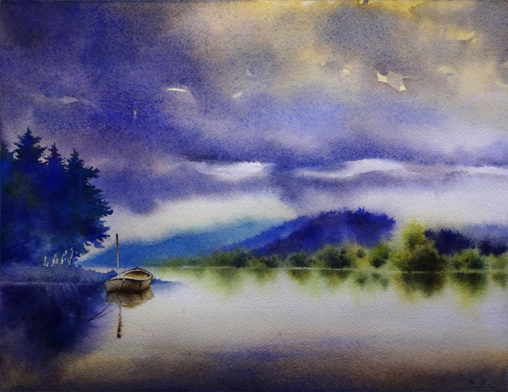
Tranquility,  Watercolor on Arches #140 Cold Press Paper, 9"h x 12"w, 2014 #12

Bid in My DPW Auction ( Starting Bid $70)

Busy with drawing projects at the atelier for the past two weeks, but I managed to sneak in a few painting hours here and there, and finished "Tranquility". It has started in the "30 Paintings in 30 Days" challenge that I took this January, but had to drop due to health issues of a dear family member. It was part of the "water" themed set of paintings. Now that things are back to normal in my household, I am slowly going back to these unfinished projects and trying to tackle them one by one...

I want to convey the sense of utter stillness and quietude in the early morning hours of an overcast day in this painting, and kept on feeling that the shapes of the cloud and distant trees near the foothills needs to be tweaked more, so I have wet and rewet these areas, dried them, wet them again... It's been a lengthy process. When painting landscapes I often find it's not enough to directly copy the shapes present in your reference materials; instead, conscious, deliberate design choices has to be made to makes tree/mountain/rock/cloud shapes interesting. On the other hand, it is so important to imitate the randomness presented in the natural shapes in your design, and take great care to not make them look too "designed", mechanical or symmetric! It's a delicate dance of balance...


Tranquility,  Watercolor on Arches #140 Cold Press Paper, 9"h x 12"w, WIP 1

When posting the work in progress shot of this painting in January I was really very happy with how the various purple/blue/green colors has blended freely on the left side group of trees, as well as the shape of the silhouette of them. However, after finishing the distant hills and woods I realize the value of this group of trees do not quite work -- they are way too light and therefore does not balance the image. After agonizing over it for a few days, I have finally gathered enough courage to lay another layer of wash to darken them, taking care to change the color every time I reload the brush to maintain the interest generated by the color variation in the initial version. I did it wet on dry using a small squirrel quill brush, whose soft hair would not disturb the underlying wash. I am really happy with the decision, as well as the result -- with the darker, more intense blues and purples, the shape of this group of trees in the final image gives enough weight to balance with the middle-ground shapes on the right side, and blocks the viewer's eye from wandering off the right side of the picture, therefore emphasizes the moored boat. 

Often in landscape paintings like this, I find myself spending much more time staring at the painting than actually "painting" on it toward the end stage. It is not uncommon that every one minute of painting time is accompanied by ten or more minutes of looking and thinking. Sometimes after a long period of repeated starting, pondering and evaluation, I would finally decide to not add anything more and just call it done. However, I don't consider this as time wasted -- time spent evaluating the work to be done with a painting so often saves me much heartaches from taking that "one stroke too much". As painters even when we do not have brush in hand, we may still be mentally "painting" a picture on that virtual sheet of paper. And that, I believe, is a vital exercise for my growth as a painter, and time well spent.

In the mean time, if you have an image of a beautiful landscape, or a flower you like, or anything you might want to see painted, please email them to me at arena.shawn@gmail.com. I will paint them and post them here. From every 10 paintings I make from them, there would be a random drawing, and the lucky winner get to take a original back home for free! Interested? Then send me your photo!

You can now buy high quality Giclee prints of many of my sold paintings, both on paper and canvas, as well as some note cards with my paintings here:


Sunday, January 12, 2014

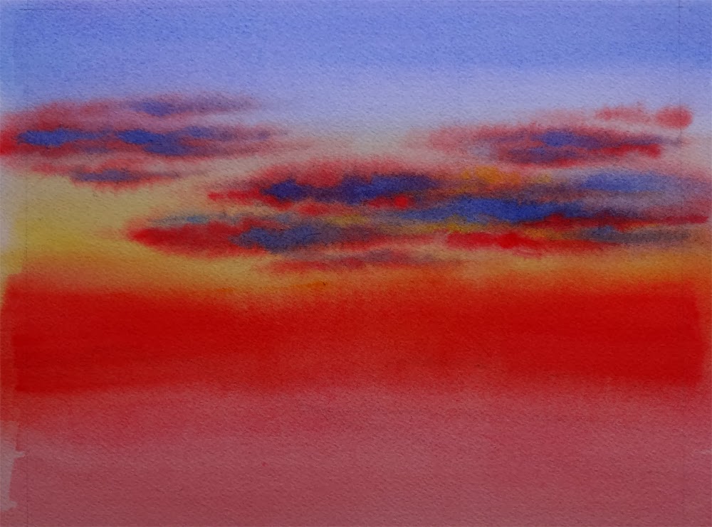
Sky in Progress -- 30 Paintings in 30 Days Challenge, Round 3, Day 8, 9, 10, 11


Tranquility,  Watercolor on Arches #140 Cold Press Paper, 9"h x 12"w, WIP 1

With a progressing cold I fell significantly behind on my "Sky" paintings the past few days. I have been painting but since painting sky requires some serious wetting of the paper, I tend to work on several of them at the same time, so that I can continue working on one when others are in various stages of drying. So, here they are, some very close to finish, just waiting for me to put on the details; others just starting, with one or two wet-in-wet layers of clouds and nothing else yet... 


Amber Glow,  Watercolor on Arches #140 Rough Paper, 7"h x 10"w, WIP 1


Shades of Dusk,  Watercolor on Arches #140 Cold Press Paper, 8"h x 10"w, WIP 1


Night Sail,  
Watercolor on Lanaquarelle #140 Cold Press Paper, 3"h x 7"w, 2014 #8

In the mean time, if you have an image of a beautiful landscape, or a flower you like, or anything you might want to see painted, please email them to me at arena.shawn@gmail.com. I will paint them and post them here. From every 10 paintings I make from them, there would be a random drawing, and the lucky winner get to take a original back home for free! Interested? Then send me your photo!

You can now buy high quality Giclee prints of many of my sold paintings, both on paper and canvas, as well as some note cards with my paintings here:


Sunday, January 5, 2014

Autumn Colors... 30 Paintings in 30 Days Challenge, Round 3, Day 4


Bon Fire,  Watercolor on Arches #140 Cold Press Paper, 10"h x 4"w, WIP 1

With theme of today's painting being "Foliage", I could not decide whether to work on a tree or a field of grass. Being the ADD artist I am, I ended up doing the exact wrong thing -- being way to ambitious and decided to work on two paintings in the same time, one a small vertical format study of an autumn maple tree, and the other the exploration of textural and wet-in-wet manipulation of color on a golden wheat field of countryside. I liked the progress of both, but with the day fast drawing to an end, and the obligation of having to drive down to the south bay to hang some of my work at Brian's Restaurant in Los Altos for a little two-person show arranged by my local Los Altos Art Club (LAAC), I realized that I might not be able to finish either of them today! I don't want to just rush to an end since I liked both of them at this stage, and want to take time to tweak shapes and colors, doing a little calligraphy here and there, and a lot of gazing in between. We'll see how I am doing! I would do an update before going to bed... It's going to be a long night...


Fields of Gold,  Watercolor on Arches #140 Cold Press Paper, 9"h x 12"w, WIP 1


Update: I did not finish this painting until the morning of the next day, but I was happy about the extra time I got to explore the shapes and space divisions by the branches. One thing I found about making small twigs looking real is to lighten and cool down their color toward the end. Of course a little dry brush work also goes a long way!


Bon Fire,  Watercolor on Arches #140 Cold Press Paper, 10"h x 4"w, 2014 #4

Bid at My DPW Auction (Starting Bid $35) 

In the mean time, if you have an image of a beautiful landscape, or a flower you like, or anything you might want to see painted, please email them to me at arena.shawn@gmail.com. I will paint them and post them here. From every 10 paintings I make from them, there would be a random drawing, and the lucky winner get to take a original back home for free! Interested? Then send me your photo!

You can now buy high quality Giclee prints of many of my sold paintings, both on paper and canvas, as well as some note cards with my paintings here:


Wednesday, January 1, 2014

Under the Autumn Sky - 30 Paintings in 30 Days Challenge, Round 3, Ready, Set, Go!...


Under the Autumn Sky, 
Watercolor on Fabriano Artistico #140 Cold Press Paper, 9"h x 12"w, 2014 #1

Bid at My DPW Auction (Starting Bid $75) 

OK, call me crazy but yes, after much struggle with myself I've decided to take up Leslie Saeta's "30 Paintings in 30 Days" challenge yet again! Needless to say, last year after doing this challenge in September, my blog postings have become sporadic, and I've not finished many paintings since. There is definitely a possibility of "burning out" for a slow painter like me to take up such a challenge. (In fact I got very sick toward the end of the year, possibly because of the pressure I put myself through doing all the holiday shows, and the school work in the Atelier... :-() But my new year's resolution is to try painting more landscapes in a looser style (yes, you've probably heard me saying this on my various blog posts a couple of times if you have me visiting this blog for a while -- on my defense I did try really hard each time! But being "loose" is such an elusive goal for me -- it is the final product that has to evoke such sense, yet in each of the step toward creating a looser, freer, more atmospheric painting a painter has to be very deliberate and really know what he/she is doing! I have to admit I am struggling here...), so I've decided to take up this challenge with that goal in mind. 

In the following weeks of January, I will try to do a little landscape painting each day, and each week there would be a slightly different focus: sky, water, mountains and foliage (trees, brushes and grassland). This first one, "Under the Autumn Sky", is a sky-focused painting. My main goal here is to capture the fleeting sense of light near sunset on a slightly overcast day, and emulate the beautiful cloud shapes that changes every second you look without getting fixated on being "exact". It has started as a Plein-Air Sketch in the Palo Alto Bayland Marsh last fall (yes, during the last 30/30 challenge =_=b...), but I was not quite sure what I was trying to say in the piece, and had to put it aside for a while until I could see it in my mind's eye. In the end I had to revisit the lessons I've learned from landscape master Sterling Edwards and Carl Purcell's workshop, and revise the composition to emphasize the sky area, making sure the foreground marsh and tree line in the middle ground are not too busy as to detract from this center of focus.

A good lesson I have learned from doing this painting is to try to say one thing, and one thing only in one small painting like this. Since I was initially attracted by the sky when started this painting, I decided to stick with it. The other equally interesting shapes and textures, the lovely distant tree line, for example, is better explored in detail in another painting! (That's the beauty of doing such challenges -- you know you'll have another painting to do just the next day! lol...)


In the mean time, if you have an image of a beautiful landscape, or a flower you like, or anything you might want to see painted, please email them to me at arena.shawn@gmail.com. I will paint them and post them here. From every 10 paintings I make from them, there would be a random drawing, and the lucky winner get to take a original back home for free! Interested? Then send me your photo!

You can now buy high quality Giclee prints of many of my sold paintings, both on paper and canvas, as well as some note cards with my paintings here:


Thursday, December 19, 2013

Emerging after My Long Period of Absence... Some Fall Colors in Winter, Some New Finished Paintings, and My Last Holiday Fair of the Season


Fall Colors, Little Cottonwood Canyon, Utah,
 Watercolor on Arches #140 Rough, 12"h x 9"w, WIP 1

Finally painting again! From October to December the Atelier work turned out more demanding as the projects get harder, and I will finally start chalk and charcoal next semester! It has seriously eaten into my watercolor painting time, and the busy holiday fair season did not help either -- between getting prints and small gift products ready for the shows and doing my charcoal drawings from life, I did not have much breathing room in the past few months... Hence the lack of new paintings here and no update on my blog (shame on me...) -- but, no more excuses, I am painting again! Yay!


Quicken Aspens, Park City, Utah,
 Watercolor on Arches #140 Rough, 8"h x 12"w, WIP 1

Here's a couple of landscapes I have started in Carl Purcell's workshop the past summer (really? It has been so long?...) and like everything started during a workshop, they did not get finished. I've started five of them and the closest one is about 70% done, but none of these. Maybe it is just me -- I always feel quite rushed in the drawing part whenever I am attending a workshop, and was not quite happy with the hard-edged shapes of the foliage on all these tree paintings. To me, a foliage clump in a painting needs to have very interesting and well-designed but natural-looking shapes and a blend of hard, soft and broken edges to really make it look like "foliage" instead of just "choppy brush strokes", and mine in any of these paintings certainly did not meet the standard. 


Quiet Meadows, Sonoma Pasture, 
 Watercolor on Arches #140 Rough, 12"h x 8"w, WIP 1

Not to worry -- off to the faucet! Arches paper can really take some abuse and that's why we love it! When the paper is soaking wet and the half-finished painting is not completely erased but with a lovely ghost image left on the paper, I took out the reference materials from the workshop and started to lay in colors wet in wet. Then I let them dry -- and I've liked these altered images much more. Next step is adding more definitions on dry paper, which involves some serious thought process on designs. Busy paintings filled with various shapes and colors (such as these depicting woods, forest, undergrowth, etc.) really needs succinct silhouette of the center of focus and some quiet areas to let viewer's eyes rest. For example, all the foliage clumps in "Quiet Meadows, Sonoma Pasture" are too symmetric and similar in size, which  is a residue problem from the not-carefully-thought-out initial drawings during the workshop, and therefore needs to be redesigned. I will do some sketch to figure that out... 


Summer Glow II, Watercolor on Arches #140 Cold Press Paper, 5"h x 7"w, 2013 #81

Sold!

Here's a couple of paintings I've finished but never had a chance to share with you on my blog. The first one is a second version of "Summer Glow"... All because I was stupid enough to want to repair a small smear damage on the first one, and you know what happens next -- the repairs have completely damaged the first version and the only thing I could do is to repaint it... I should have learned my lessons of not messing with a finished watercolor by now... Sometimes I really wonder what I was thinking...


Soar II, Watercolor on Arches #140 Cold Press Paper, 6"h x 6"w, WIP 1


This one is actually finished and sold to a collector in England. I just did not have a good photo of it -- accidentally dropped my camera and broke it so now I only have my ipad as a camera, which is seriously not adequate to take images of finished paintings... (WIP photos, maybe, but not finished works, especially not when a piece is flying out and I may never get the chance to see it ever again...) So I will be posting the finished image when I get my new camera, I promise ;-)

Finally, since I did quite a few holiday shows this winter, and the holiday fair season is drawing to a close, I thought I'd give a shout-out here for my last fair of the season... It is a very cool venue: I will be selling my Watercolors, Giclee Prints, Holiday Cards, Calendars and MORE in the SF Bazaar Zoo Lights Event at San Francisco Zoo Entry Village Circle, located at Sloat Blvd. & the Great Highway this weekend (both Saturday and Sunday), December 21st & 22nd, between 3:00pm and 8:00pm. So if you find yourself in the city over the weekend, or want to take your kids to see the animals in the San Francisco Zoo under the evening lights, drop by and get some beautiful, hand-made, animal-related art gifts for your holidays!


Especially for this fair I have designed and made some holiday cards (yes, they are year-round good but I made this set of eight especially for the winter season). These little ones are printed on 3.5" x 5" sized Strathmore watercolor cards, and a set contains 8 different winter snow scenes, with name of the painting and my info printed at the back of the card. I have named it "Winter Wonderland" and will upload it for sale to my etsy shop soon, at a price of $20/set. I also have the same set of a larger size -- 5" x 7" for $25. Drop me an email if you are interested in having one!

In the mean time, if you have an image of a beautiful landscape, or a flower you like, or anything you might want to see painted, please email them to me at arena.shawn@gmail.com. I will paint them and post them here. From every 10 paintings I make from them, there would be a random drawing, and the lucky winner get to take a original back home for free! Interested? Then send me your photo!

You can now buy high quality Giclee prints of many of my sold paintings, both on paper and canvas, as well as some note cards with my paintings here:


Saturday, September 21, 2013

Under the Autumn Sky -- 30 Paintings in 30 Days Challenge (Round Two), Day 20 (Almost Done...)


Under the Autumn Sky, 
Watercolor on Fabriano Artistico #140 Cold Press Paper , 9"h x 12"w, WIP 1

This one started plein air -- around the Alviso Slough. When I am working on the foreground marsh grass area, rain started drifting in. Since I am working on Fabriano paper which allows colors to be lifted easily, I decide to avoid the rain so that the darker tones I have already put in the foreground would not all lift with the drizzle. I may have to go back tomorrow to finish this one, or, I could refer to some of the nice reference images and notes I took from Sterling Edwards' workshop (he is a master for creating interesting foregrounds and design tree shapes) and finish it off in the comfort of my studio. I have not yet decided what to do about it -- again, sleeping on it may not be such a bad idea in situations like this... 


You can now buy high quality Giclee prints of many of my sold paintings, both on paper and canvas, as well as some note cards with my paintings here:


Sunday, January 13, 2013

Winter Light (Version 2) (30 Paintings in 30 Days Challenge: Day 12)


Winter Light (Version 2), 
Watercolor on Fabriano Artistico 140# Cold Press Paper, 9"h x 12"w, 2013 #14

Bid at My DPW Auction (Starting Bid $35)

I have to admit that keeping the full pace of one painting a day after class has resumed in the atelier today has proven a challenge -- I've only got two hours in the morning and three hours in the evening to devote to painting (and the rest that goes on in REAL life -- cooking, laundry, commute, etc.) I have managed to pull out this painting, which I did a smaller version previously, and really loved the results, and thought I would love to try it on a slightly smoother paper and a larger size. The separation of granulating Cobalt Blue from Burnt Sienna is not as evident on this one compared to on the rougher paper I used for the last version, however, the light appeared softer, and more tender because of exactly the same reason.


You can purchase my 2013 wall and desk calendars here:


Tuesday, March 6, 2012

Work in Progress: Dancing Tulip (Almost Finished, Really...), & Class with Jeanne Vooden

I'm still painting away for the upcoming tulip art festival in Oakland, adding denser pigment wet-in-wet on the leaves to create a glow of spring yellow-green. When finished, the leaves would be the only true light-colored shapes and contrasting with the deep burgundy-purple flower. I am a little worried that they would attract the eye too much and draw the attention away from the main flower, but I do like the reddish purple vs. yellow green color scheme. We'll see how it goes. I also added more of the same color on the upper left corner of background to hint foliage in the distance, and to balance the movement of color throughout the image.

Most work I did was on the flower pedals. I found Fabriano Artistico Cold Press paper very very hard to glaze on -- even the staining colors seem to lift easily. And when the pigment density is too high, it seems that they don't get absorbed into the paper at all, just floating on the surface and being pushed around by the next brush load of pigments. I'm a bit annoyed at this stage, but decided to carry on -- after all, almost all mistakes made on this paper can be corrected easily with lifting! I guess I just have to learn the art of dancing with the devil...


Dancing Tulip,  Watercolor on Fabriano Artistico 140# Cold Press Paper , 5"h x 7"w, WIP 4

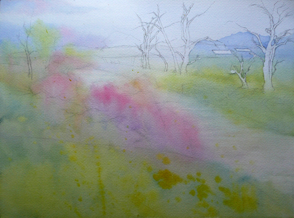
What made me super excited today was I got to start my six-week class with the amazing artist Jeannie Vodden! She paints with beautiful, delicate mingled fluid washes of very limited palette -- most often just one red, one yellow and one blue, letting the pigments mixing both on palette and on paper to create a rainbow of hues. Her method involves very patient glazing and our class project this time was a landscape. I am showing my humble efforts here -- it looks so pale and subtle, but it's already three washes on wet paper! -- The first one going down from the sky region and covered almost all paper, changing color from the Cobalt Blue Sky to the light yellow-green of meadows, then to the pink flowering bush, all finished by applying a combination of Permanent Rose, Lemon Yellow and Cobalt Blue on pre-wetted paper. The second wash strengthened colors on the left bank wet-on-dry, and the third partially covered the right bank in the same manner, carefully painted around the tree trunks and distant rooftops. It's very different from my usual painting method, and I can't wait to see how it would turn out... 


Spring Run,  Watercolor on Arches140# Cold Press Paper , 9"h x 12"w, WIP 1


Wednesday, January 18, 2012

California Poppy Study (Master Study)

Several years ago, when I just started painting in watercolor, I was rummaging through the collections of local libraries for instructional books, I came across one by artist Kathy Dunham. I studies the book and did some of the projects in it with quite embarrassing results, which I came across again when cleaning up my studio this morning. After giving it some thought, I decided to try them again, starting with the California poppy showing below:


California Sun Shine (Master Study),  
Watercolor on Arches 140# Cold Press Paper , 12"h x 9"w, 2012#6

I was quite happy with the result this time, and thought that I've learned some very valuable things by doing it again:
  • This is a painting with large area of saturated color, which commands attention. A background with complementary color helps to focus the attention, but it is of vital importance that the background is not of equal color intensity. In this case, the muted blue-green works with the bright orange flower;
  • When the subject of a painting is a single flower with few pedals, relatively simple shapes and not too many details of folds and shadows, the main struggle is to capture and maintain viewer interest across large area of the painting without specific details through subtle change of color, value and surface texture. Large, smooth, single-colored area would easily bore the viewer's eye and I struggled to avoid that in doing this painting;
  • When a watercolor painting is relatively high-keyed but without true white areas, the sense of brilliance of the painting is easily lost. Leaving the stamens as very high-key yellow close to white may be a solution for this particular painting, but when I lift the stamens out of the dark red pedal color, I lost my chance. Maybe next time?...
Doing studies of a master artist's painting or project from instructional books/DVDs can be very helpful in pulling me out of my comfort zone and and forcing me to face subjects that I would subconsciously avoid because I secretly feel there are some problems I could encounter trying to paint them, and I may not have a clue how to solve these problems  -- in design, in execution, and in everything else. But  when I take the plunge, I always feel that I have grown a bit as a painter afterwards...

Related Posts Plugin for WordPress, Blogger...