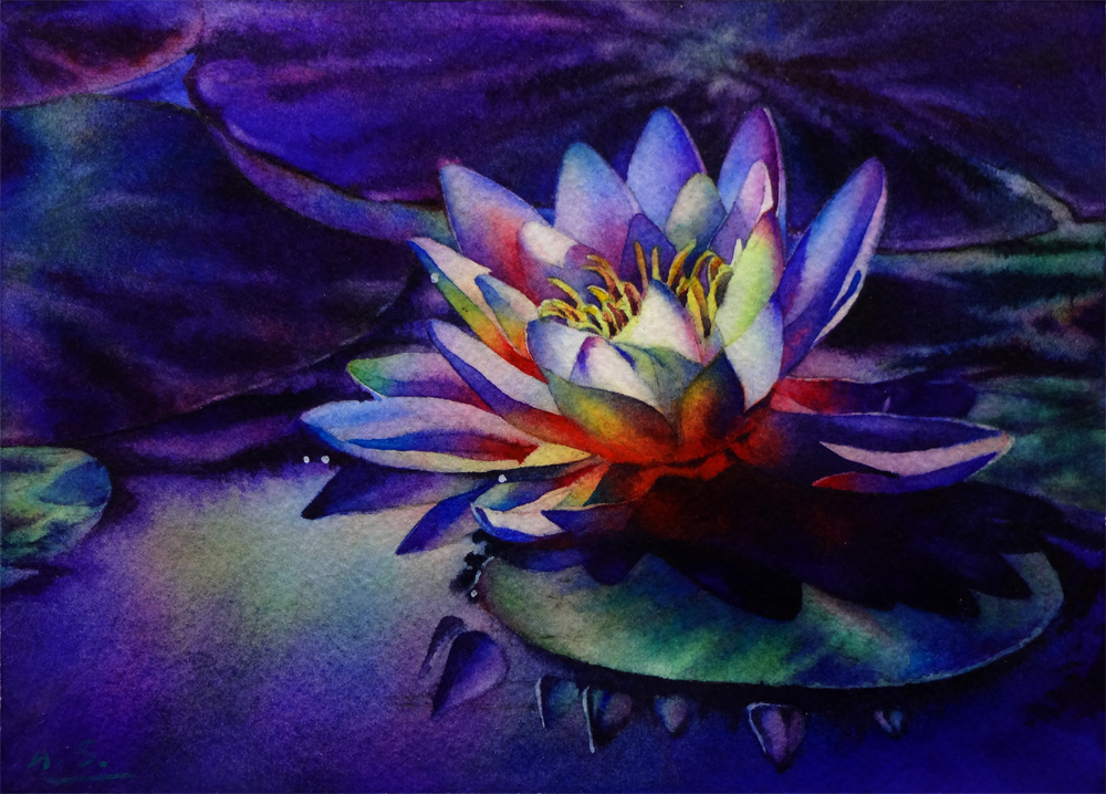
The new semester in the Atelier has started, and my watercolor painting time has again become few and far between... But I have not fallen into the oblivion! In fact, I have been invited to a great blog party! My dear artist friend, Kara K. Bigda has been kind enough to inviteme to participate in the "Around The World Blog Hop!" (Thank you, Kara! :) So I'll be answering a few questions she asked regarding my paintings, and then I will be sharing with you links to 3 people I've invited to participate in this online event.
If you are familiar with the website that hosts my online gallery and sells my art works - Daily Paintworks, you are probably already very familiar with Kara's beautiful still life paintings and her whimsical "Little People" series. She was one of the original artist members of Daily Paintworks before they opened their membership for a larger artists' community, and now is a featured artist of DPW. I've been a long time fan of her work. To me, her paintings are best described as visual poetry, and reminds me of the world of Emily Dickinson -- quiet, unassuming, yet filled with beauty that are so often not notices in our daily glance... They are carefully woven tapestries of subtle nostalgia, soft winter light of New England and the passing of time. Her compositions are often simple - a pot, some wild flowers picked from roadside or the backyard, a plate of fresh blueberry on light patterned fabrics, the corner of the living room -- yet they are always very effective, carefully planned, with beautiful layered washes and vivid rendering of the texture of different subjects. Light is the biggest star of her painting, and it works the magic to make the most ordinary object appear glorious, showing the personality of an old, chipped desk, or the playfulness of half-eaten strawberries. She never ceases to amaze me by opening my eyes again and again toward something I have glanced over perhaps a million times in my daily life, but never actually "seen". On top of that, she also does amazing, life-like pet portraits on the (very difficult!) surface of Aquabord, and use her great sense of humor to make me crackle up every time she designs and paints yet another scene of her little Fisher-Price "people" in their tiny desktop community. If you are not familiar with her work, be sure to stop by her blog and website to take a look! And, you can purchase some of the amazing art pieces she creates from her Daily Paintworks Gallery (they make great gifts for the holidays ;-).

Ok... Now onto the questions:
1. What am I working on?
I am actually working on my first every oil painting! (Well, that is not entirely true since I have tried my hands on oils before by taking some classes with a very talented still-life painter, David Chefeitz. But I quickly realized that to be able to paint expressively, one has to be able to draw quite accurately, hence the embark of the whole journey in the classical atelier... And now, two years and many long-pose figure and cast drawing from life later, I am doing my first oil painting in the atelier! It is only in black and white for now, but I will be painting the cast of the ear of Michelangelo's David, and doing a figure from live model (whose name, coincidentally, is also David!), both starting this week! I am still working on the transfer drawing at this stage, so no oils to show yet, but there will be in the coming few days, and I'm so excited to apply all the things I have learned through two year's drawing process to painting!

That aside, I am working on two separate series of watercolor paintings -- a series of 6" x 6" sized rose paintings on Aquabord (which has proven a very challenging surface to me, as I have mentioned in previous posts). I really love the brilliance of color you can achieve on this surface, which is great for floral paintings! So I will keep on experimenting with it until I know how it will behave with each wash like the back of my hand...

The other series I am working on is "Winter Woods", which will be quater-sheet sized landscape paintings of snowy woodlands. So far I am doing sketches and small studies on different types of paper, trying out various methods of creating the rough bark texture of different kinds of trees, and observing how I can utilize the soft texture of snow and distant woods painted wet-in-wet to contrast with the linear elements of tree branches and twigs to generate pictorial interest. Below are two examples of small studies I am doing for this series:

2. How does my work differ from others of its genre?
Since most of my paintings have a floral theme (although I have also dabbed in landscape paintings from time to time), I will first answer this question in the floral genre. I think what makes my floral paintings differ from most other painter is that I am interested in not only the painted image, but also the painting process, especially the wet-in-wet process so unique to watercolor. Hence, my flower painting often has a very soft, blurred background with only shapes suggesting distant foliage or flowers contrasting with a center blossom in sharp focus, creating high-drama and a "spot light" effect. To heighten such effect, most of my flowers are painted in very rich, saturated color, with dramatic dark background to contrast with it, creating a sense almost like theater stage lighting. I often only put one blossom in the center stage of a painting, making it the "diva" of my watercolor show. By utilizing these design tools, I hope my watercolor painting of flowers can be read as the portrait of one particular blossom, instead of just a general depiction of yet another rose or tulip.

My landscape paintings are often developed from (or simply are) small plein air studies. I am not interested in painting just "the place" or well known landmarks, though, instead I am interested in capture the mood and atmosphere of a particular moment in time.

I am especially interested in quiet, less busy scenes with barely any "things" in it, when the elements has largely did the editing for me and got rid of the non-essential objects from my view -- such as fog blurring the distant mountains, or snow covering the busy ground. I like the "zen" like feeling of such scenery, and choose to paint them on very wet paper, often finishing each painting in one drying cycle of the paper, letting water doing most of the work for me and create interesting soft gradations and organic shapes.

I only use a very limited palette for my landscape painting, mostly just browns and blues, sometimes with a little bit of earthy yellows. I like the harmony created by the restraint of color, and feel these quiet landscapes are good contrasts to my floral work (which is often very high in chroma and energy), providing me necessary meditation time and peace of mind when painting them.

Sold!
3. How does my creating process work?
Most of my flower painting starts when the a glimpse of an image I have taken catches my eye again -- I usually let my reference images sit for a while before painting from them, using this to test whether they will still be interesting enough for me with the text of time, when the intial "wow" effect has faded. Then I will print out the image and play with the composition with old-fashioned corner mats, rotating and cropping the initial image until I am roughly happy with the composition. Next comes photoshop -- I will do my cropping of the digital image in the computer according to what I have done with the mats, and also digitally enhance the images by creating copies with blurred background, increased color saturation, increased contrast and/or luminosity... I work from these multiple reference images generated from the initial photograph: when I paint the background, I paint from the blurred image to take it out of focus; when I paint the flower I often work with the image with increased color saturation, and sometimes with the image with lightened shadows... etc. I am aware of the fact that the camera does not have nearly as large a dynamic range for values as the human eye, so these changes are merely necessary to make the final painting closer to the reality perceived with our eye, instead of through the cold mechanics of a camera lens.
For the actual painting, I often do multiple glazes wet-in-wet, rewetting each section (larger than the area I am working on to create seamless connections between sections) after the last glaze dries. I usually paint from the background to foreground, and doing a faint-colored underpainting before doing the wet-in-wet application, so that I would have a road map when the paper is dripping wet and everything is in heightened motion. You can see an example of my underpainting and finished painting of "High Summer Dreams" below:


To view more of my work, you can visit my website, or my Daily Paintworks gallery.
And now for my invitees who will be blogging next Monday - October 20th.
Taryn Day - is one of my favorite oil painters that blogs. Her works are amazing combination of abstract brushwork and realistic depiction of the plane and forms of subjects, and she has such a great sense of composition, making the most ordinary snapshot morph into great paintings every time. It just makes my jaw drop. On top of that, she curates this other blog - the Art Room - that introduces artworks of other great artists she loves. I just don't know how she does it.

Brienne Brown - is an amazing landscape painter in watercolor, and she whips out these atmospheric plein air paintings wherever she goes -- her friends farm, the corner of a street, even the boat dock of a small park. They are filled with interesting shapes and textures as well as vigorous brushwork, yet the big washes unifies everything and her paintings never looks too "busy" with details -- just enough to suggest and intrigue. Did I mention I love how she use colorful and luminous shadow shapes (sometimes invented shadow shapes that are not actually in the reference photos!) to create the coolest compositional designs, and add interest to large boring foreground areas? No wonder she is winning plein-air competitions left and right, and is a staple in Daily Paintworks' monthly competition as the judges' pick. Oh, I forgot to mention that just like me, she has a science background and worked in labs before becoming a full-time artist. How cool is that?

Yevgenia Watts -- She is one of the most creative watercolor painter I have discovered since taking up blog and social media. Known for her loose, vivid portraits with beautiful brushwork, and her quick pen-and-ink watercolor sketches that is both whimsical and charming, now she has embarked a completely different journey, painting half-abstract architecture-themed paintins on Yupo! This latest series of hers just makes my jaw drop -- they are filled with beautiful color and texture, and the imagery just straddles between realism and mystical abstract shapes, filling the viewer the imagination with the wildest dreams.

Wow! This is such a lengthy blogpost... If you're still with me now, I really owe you a big big thanks! Thanks for stopping by and do check the artists I mentioned in this blog -- all of them have taught me so much about painting!
Enough rambling for now! I should really get back to my watercolor table... In the mean time, if you have an image of a beautiful landscape, or a flower you like, or anything you might want to see painted, please email them to me at arena.shawn@gmail.com. I will paint them and post them here. From every 10 paintings I make from them, there would be a random drawing, and the lucky winner get to take a original back home for free! Interested? Then send me your photo!
If you are familiar with the website that hosts my online gallery and sells my art works - Daily Paintworks, you are probably already very familiar with Kara's beautiful still life paintings and her whimsical "Little People" series. She was one of the original artist members of Daily Paintworks before they opened their membership for a larger artists' community, and now is a featured artist of DPW. I've been a long time fan of her work. To me, her paintings are best described as visual poetry, and reminds me of the world of Emily Dickinson -- quiet, unassuming, yet filled with beauty that are so often not notices in our daily glance... They are carefully woven tapestries of subtle nostalgia, soft winter light of New England and the passing of time. Her compositions are often simple - a pot, some wild flowers picked from roadside or the backyard, a plate of fresh blueberry on light patterned fabrics, the corner of the living room -- yet they are always very effective, carefully planned, with beautiful layered washes and vivid rendering of the texture of different subjects. Light is the biggest star of her painting, and it works the magic to make the most ordinary object appear glorious, showing the personality of an old, chipped desk, or the playfulness of half-eaten strawberries. She never ceases to amaze me by opening my eyes again and again toward something I have glanced over perhaps a million times in my daily life, but never actually "seen". On top of that, she also does amazing, life-like pet portraits on the (very difficult!) surface of Aquabord, and use her great sense of humor to make me crackle up every time she designs and paints yet another scene of her little Fisher-Price "people" in their tiny desktop community. If you are not familiar with her work, be sure to stop by her blog and website to take a look! And, you can purchase some of the amazing art pieces she creates from her Daily Paintworks Gallery (they make great gifts for the holidays ;-).
Morning Sun, by Kara K. Bigda
Ok... Now onto the questions:
1. What am I working on?
I am actually working on my first every oil painting! (Well, that is not entirely true since I have tried my hands on oils before by taking some classes with a very talented still-life painter, David Chefeitz. But I quickly realized that to be able to paint expressively, one has to be able to draw quite accurately, hence the embark of the whole journey in the classical atelier... And now, two years and many long-pose figure and cast drawing from life later, I am doing my first oil painting in the atelier! It is only in black and white for now, but I will be painting the cast of the ear of Michelangelo's David, and doing a figure from live model (whose name, coincidentally, is also David!), both starting this week! I am still working on the transfer drawing at this stage, so no oils to show yet, but there will be in the coming few days, and I'm so excited to apply all the things I have learned through two year's drawing process to painting!
Morning Light, Watercolor on Ampersand Aquabord, 6"h x 6"w, 2014 #21
Sold!
That aside, I am working on two separate series of watercolor paintings -- a series of 6" x 6" sized rose paintings on Aquabord (which has proven a very challenging surface to me, as I have mentioned in previous posts). I really love the brilliance of color you can achieve on this surface, which is great for floral paintings! So I will keep on experimenting with it until I know how it will behave with each wash like the back of my hand...
Morning Light II, Watercolor on Ampersand Aquabord, 6"h x 6"w, 2014 #18
Bid in My DPW Auction ( Starting Bid $75)
The other series I am working on is "Winter Woods", which will be quater-sheet sized landscape paintings of snowy woodlands. So far I am doing sketches and small studies on different types of paper, trying out various methods of creating the rough bark texture of different kinds of trees, and observing how I can utilize the soft texture of snow and distant woods painted wet-in-wet to contrast with the linear elements of tree branches and twigs to generate pictorial interest. Below are two examples of small studies I am doing for this series:
Studies for "Winter Woods" Series, WIP
2. How does my work differ from others of its genre?
Since most of my paintings have a floral theme (although I have also dabbed in landscape paintings from time to time), I will first answer this question in the floral genre. I think what makes my floral paintings differ from most other painter is that I am interested in not only the painted image, but also the painting process, especially the wet-in-wet process so unique to watercolor. Hence, my flower painting often has a very soft, blurred background with only shapes suggesting distant foliage or flowers contrasting with a center blossom in sharp focus, creating high-drama and a "spot light" effect. To heighten such effect, most of my flowers are painted in very rich, saturated color, with dramatic dark background to contrast with it, creating a sense almost like theater stage lighting. I often only put one blossom in the center stage of a painting, making it the "diva" of my watercolor show. By utilizing these design tools, I hope my watercolor painting of flowers can be read as the portrait of one particular blossom, instead of just a general depiction of yet another rose or tulip.
Fire Dance,
Watercolor on Fabriano Artistico #140 Cold Press Paper, 6"h x 6"w, WIP 9
My landscape paintings are often developed from (or simply are) small plein air studies. I am not interested in painting just "the place" or well known landmarks, though, instead I am interested in capture the mood and atmosphere of a particular moment in time.
Fisherman's Evening II, Watercolor on Arches #140 Hot Press Paper, 7"h x 10"w, 2014 #2
Sold!
Falling Snow (Thoughts of You Fall Quietly upon Me...),
Watercolor on Arches 140# Rough Paper , 7"h x 8"w, 2012 #30
Sold!
Spring Meadow, Tamalpais,
Watercolor on Winsor Newton 140# Cold Press Paper , 6"h x 10"w, 2013 #63
Sold!
3. How does my creating process work?
Most of my flower painting starts when the a glimpse of an image I have taken catches my eye again -- I usually let my reference images sit for a while before painting from them, using this to test whether they will still be interesting enough for me with the text of time, when the intial "wow" effect has faded. Then I will print out the image and play with the composition with old-fashioned corner mats, rotating and cropping the initial image until I am roughly happy with the composition. Next comes photoshop -- I will do my cropping of the digital image in the computer according to what I have done with the mats, and also digitally enhance the images by creating copies with blurred background, increased color saturation, increased contrast and/or luminosity... I work from these multiple reference images generated from the initial photograph: when I paint the background, I paint from the blurred image to take it out of focus; when I paint the flower I often work with the image with increased color saturation, and sometimes with the image with lightened shadows... etc. I am aware of the fact that the camera does not have nearly as large a dynamic range for values as the human eye, so these changes are merely necessary to make the final painting closer to the reality perceived with our eye, instead of through the cold mechanics of a camera lens.
For the actual painting, I often do multiple glazes wet-in-wet, rewetting each section (larger than the area I am working on to create seamless connections between sections) after the last glaze dries. I usually paint from the background to foreground, and doing a faint-colored underpainting before doing the wet-in-wet application, so that I would have a road map when the paper is dripping wet and everything is in heightened motion. You can see an example of my underpainting and finished painting of "High Summer Dreams" below:
High Summer Dreams II, Finished Underpainting
High Summer Dreams II, Completed Painting
To view more of my work, you can visit my website, or my Daily Paintworks gallery.
And now for my invitees who will be blogging next Monday - October 20th.
Taryn Day - is one of my favorite oil painters that blogs. Her works are amazing combination of abstract brushwork and realistic depiction of the plane and forms of subjects, and she has such a great sense of composition, making the most ordinary snapshot morph into great paintings every time. It just makes my jaw drop. On top of that, she curates this other blog - the Art Room - that introduces artworks of other great artists she loves. I just don't know how she does it.
Franz Kline and a Blue Hat, by Taryn Day
Brienne Brown - is an amazing landscape painter in watercolor, and she whips out these atmospheric plein air paintings wherever she goes -- her friends farm, the corner of a street, even the boat dock of a small park. They are filled with interesting shapes and textures as well as vigorous brushwork, yet the big washes unifies everything and her paintings never looks too "busy" with details -- just enough to suggest and intrigue. Did I mention I love how she use colorful and luminous shadow shapes (sometimes invented shadow shapes that are not actually in the reference photos!) to create the coolest compositional designs, and add interest to large boring foreground areas? No wonder she is winning plein-air competitions left and right, and is a staple in Daily Paintworks' monthly competition as the judges' pick. Oh, I forgot to mention that just like me, she has a science background and worked in labs before becoming a full-time artist. How cool is that?
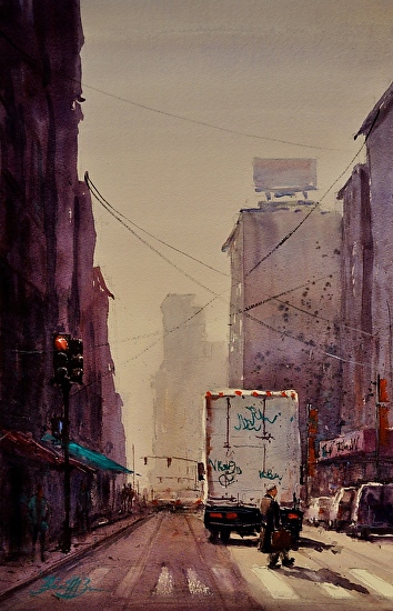
Tagged Again, by Brienne Brown
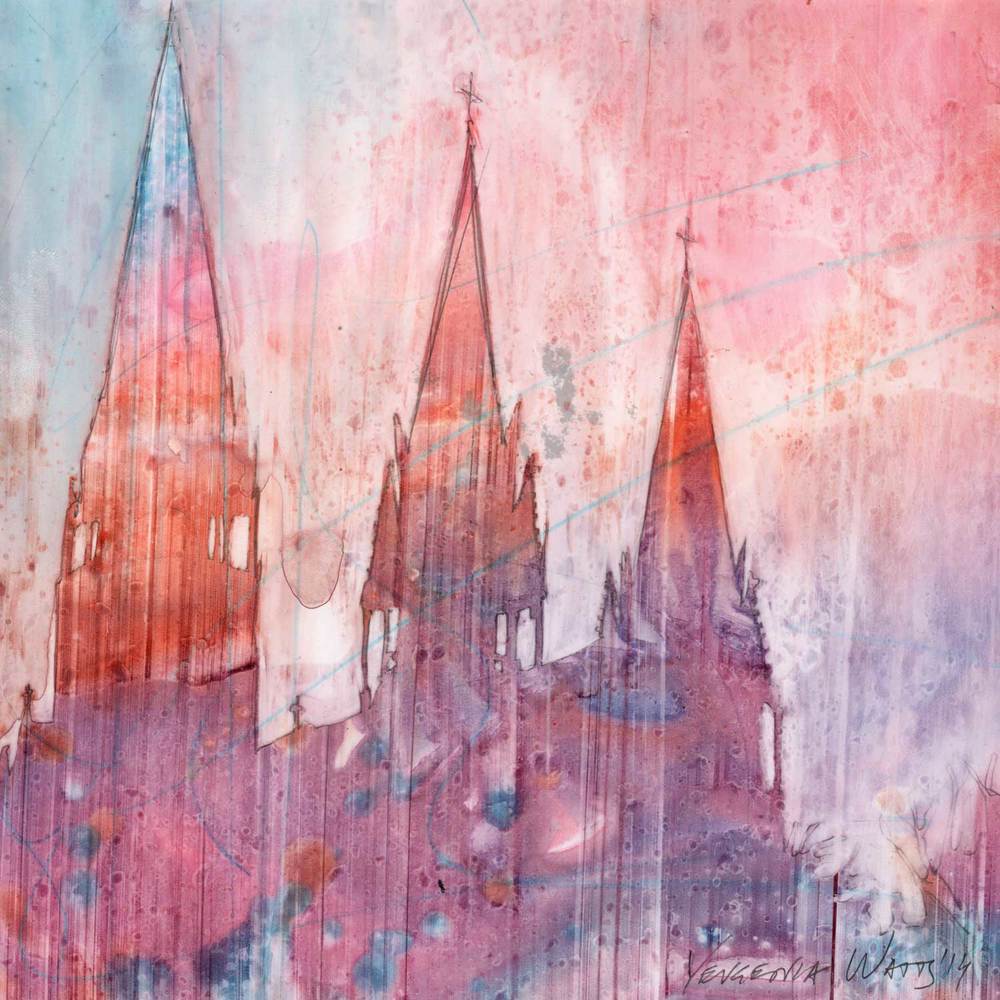
Unity 21, by Yevgenia Watts
Wow! This is such a lengthy blogpost... If you're still with me now, I really owe you a big big thanks! Thanks for stopping by and do check the artists I mentioned in this blog -- all of them have taught me so much about painting!
Enough rambling for now! I should really get back to my watercolor table... In the mean time, if you have an image of a beautiful landscape, or a flower you like, or anything you might want to see painted, please email them to me at arena.shawn@gmail.com. I will paint them and post them here. From every 10 paintings I make from them, there would be a random drawing, and the lucky winner get to take a original back home for free! Interested? Then send me your photo!
You can now buy high quality Giclee prints of many of my sold paintings, both on paper and canvas, as well as some note cards with my paintings here: