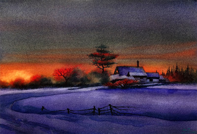
Winter Mirage (Version 3),
Watercolor on Lanaquarelle140# Cold Press Paper, 7"h x 10"w, 2013 #5
Sold!
Watercolor on Lanaquarelle140# Cold Press Paper, 7"h x 10"w, 2013 #5
Sold!
I've done a small version of this painting and sold it last year, and in my struggle to regain my skills of wet-in-wet application over a large (relatively speaking...) uninterrupted area I decided to try it again in this slightly larger version on a soft-surfaced paper. I liked certain aspect of this one better than the last -- the more interesting shapes of the brushes and the fir, the linework of the fence lines, and I do think this version has better captured that warm glow of sunset color on a cold winter evening. But I have to admit, it was more of a struggle to paint this one that the last, and the first pass I did of the sky end up drying way too light! It is also much harder to create a smooth blending of colors on cold press paper than on rough paper. However, I do think these daily exercises are getting me back into my grooves! It is also a tremendous comfort to know that if one painting does not turn out ideally, there is always another chance tomorrow! I have been able to enjoy the process more with this mindset, which I think by itself is worth all the effort...
On a separate note -- I will be participating in Silicon Valley Open Studio Events for the three weekend this May. And today I received the confirmation email that my profile is officially established on their website! (You can see it here.) I will give more details as the dates approach -- this is my first year participating and I'm really excited!
On a separate note -- I will be participating in Silicon Valley Open Studio Events for the three weekend this May. And today I received the confirmation email that my profile is officially established on their website! (You can see it here.) I will give more details as the dates approach -- this is my first year participating and I'm really excited!
You can purchase my 2013 wall and desk calendars here:


Happy new year, Arena. And to all of your followers, too. This painting is beautiful. The colours are stunning - intense and vivid, but also very gentle and soft. How'd you do that?! :)
ReplyDeleteI love it!
Thanks for your kind words. The soft color blending was achieved by wetting the top half of the paper thoroughly, and starting with the glowing yellow, gradually adding reds and oranges. As the colors dried and the surface is losing its sheen, I went in with thicker pigments of winsor violet and put it in the top half of the sky. I kept on adding pigment until the surface has completely lost its sheen. If I have gauged everything correctly, it would be done after the surface has dried. But for this one I found the top sky color too light after the painting dried, so I went in and rewetted it, then dropped in more red-oranges in the sky, and reapplied winsor violet. After the second application it is dark enough...
ReplyDeleteHope this has answered your question -- please let me know if it is not clear ^__^ and I can try to describe it some more.
Hi Arena. I am truly enjoying your rich, gorgeous landscapes! And I admire you for doing the 30 day challenge.
ReplyDeleteHi Kathryn, I was feeling a bit rusty after the new year's holiday (during which I did not paint much), and these exercises just prove to be very helpful! And I do think I need to loosen up...
ReplyDelete