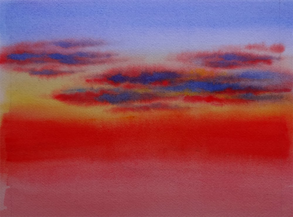
Showing posts with label Winter. Show all posts

Monday, September 7, 2015

Sudden Snow - Day Seven of the 30/30 Challenge


Sudden Snow, 
Watercolor on Arches #140 Cold Press Paper, 6"h x 6"w, 2015 #9

Bid in My DPW Auction (Starting Bid $50)

Day seven of the challenge -- I am still hanging on there!!! (Truely amazing for me, although I admit only barely... :-P) It seems like the hotter the weather gets, the more I feel drawn to painting images of the chilly winter scene... In this one I really wanted to capture the feeling of sudden change of seasons -- a night's snow fall before the brilliant fire of fall colors have a chance to run their course and gradually diminish. I experimented with very granulating colors such as Cobalt Blue, Ultramarine Blue, Cobalt Violet and Manganese Violet on the snow washes, then scrubbed with a damp, relatively stiff synthetic brush and blotted with tissue to lift out the light shapes on the snow field. By using a relatively soft brush and varying its degree of dampness as well as the pressure applied, I was able to achieve softer and harder transitions at the edge of these lifted shapes. I really liked this technique and decide to try it more in my future paintings. The light facets on the snow-covered rocks were squeezed out with a palette knife before the applied dark colors have totally dried.


Water's EdgeWatercolor on Aches #140 Cold Press Paper, 5"h x 7"w, 2014 #19


On a separate note, a painting I created for last year's 30/30 challenge in September (which I was not able to complete but nevertheless is still a great exercise) was chosen as the judge's pick by Carol Marine on Daily Paintworks. I feel very honored to be selected by an artist who I admire among so many great competitors. Thanks Carol! 

Saturday, September 5, 2015

Wild Things - Day Five of the 30/30 Challenge


Wild Things, 
Watercolor on Arches #140 Cold Press Paper, 6"h x 6"w, 2015 #7

Bid in My DPW Auction (Starting Bid $35)

Day five of the challenge -- continuing my adventure with my slanted 1" bristle brush, trying to load more than one pigment onto different corner of the brush, and let them freely blend on paper. Doing a painting without drawing has an especially freeing effect after a day at my easel working out the detailed drawing of a larger floral painting. I let my rigger brush dance freely on the paper to create the twisted branches of the foreground twigs. Painting snow in the heat of summer is also fun. I am feeling the cool breathe of air when laying down those cool blues, purples and muted greens...

Friday, September 4, 2015

Northern Exposure - Day Four of the 30/30 Challenge


Northern Exposure, 
Watercolor on Arches #140 Cold Press Paper, 6"h x 6"w, 2015 #6

Bid in My DPW Auction (Starting Bid $30)

Day four of the challenge -- continuing with big brushes and try to get all the elements of this minimalist landscape in painting on a piece of soaking wet paper as it was continuously drying. I put in the twigs and brushes by scoring the paper with the blade of painting knife, and added the little bare tree using a #3 rigger. Sometimes a picture almost just paint itself. I am happy this is one of those days. 

Thursday, September 3, 2015

Day's End - Day Three of the 30/30 Challenge


Day's End, 
Watercolor on Arches #140 Cold Press Paper, 6"h x 6"w, 2015 #5

Bid in My DPW Auction (Starting Bid $50)

Day three of the challenge -- one of the goals I have for this 30/30 challenge is to try using as big a brush I can manage and carry the painting to as far a point as I could, as I did in the last painting, "Woodland Fall"; a second goal I have is to experiment with non-conventional brushes and surfaces without the worry of "failing", i.e., not turning out a beautiful little painting in the end. 

For this 6" x 6", I used primarily a slanted 1" stiff bristle brush to lay in the soft sky and foreground snow on very wet paper, and added gradually thickened pigments to create the distant mountain with fir trees as well as to establish the general shape of the snow-laden evergreens in the foreground before the paper dried. The advantage of bristle brush is, they really can pick up and carry a lot more pigment (especially if your pigment is not fresh squeezed out of a tube) compared to traditional watercolor brushes, even the stiffer synthetic haired ones. Another advantage of these brushes is that they have very jagged hair, hence it is absolutely futile to try to get any detail out of them when painting. One is thus forced to pay attention to the general tone, color and overall silhouette of each value shape, and design the bigger picture before putting in the details (which would require switching to a different type of brush). 

I did eventually switch to smaller bristle brushes to establish the darker crevices on the rocks, the branches of foreground fir, etc., and used a small rigger brush to suggest some bare branches of deciduous trees as well as shrubs, but most of the painting was done with the big 1" bristle that at times made me feel very awkward and not knowing what I was doing. Overcoming that awkward feeling was very liberating, since I know I am going beyond my own comfort zone, pushing myself to learn more and grow as a painter. The results is not always as exciting as the process itself, but in case of this little painting, I am feeling quite satisfied...

Tuesday, June 9, 2015

Winter Woods II -- A Limited Palette Watercolor Study


Winter Woods II Study, 
Watercolor on Aches #140 Rough Paper, 7"h x 10"w, 2015 #1

Bid in My DPW Auction ( Starting Bid $65)

I really enjoyed playing with the very limited palette of French Ultramarine, Burnt Sienna and Prussian Blue in this little study, and experimented with combining wet-into-wet and dry-brush to created the texture on the bark of birch trees. I think I might try to play with the composition a bit and make a bigger painting from this little study...

So many things have happened this year! Time really flies... I have just completed the Silicon Valley Open Studio event and it was a blast... And today I learned on the phone that I was chosen as the San Mateo County Fair Artist of the Year again! I am really thrilled to get this award two years in a roll... Yay!

I'm sorry that I haven't been posting as often as I would like to for the past year, since I started painting in oils in the Golden Gate Atelier. This is the first semester of the fourth year I am enrolled at the atelier, and I am making steady progress toward learning the craft of classical methods of drawing and painting from life. I am really grateful for this incredible opportunity, and the fine teaching I've received from my instructors there. I have really struggled very hard to learn how to handling an oil painting brush, as it is very different from painting watercolor (those of you who work in both these media would know :-P). But lately I'm feeling I've finally getting the hang of it -- after a year of almost crying myself to sleep every night thinking it may never work for me. Looking back at my first effort of working in oil (it was truly horrible) I know I've come a long way, although there are way more miles to go ahead of me. I will post a few of my paintings (only in grisaille at this point -- I am not allowed to use color yet) in my next posts and share what I have learned so far. I am finally feeling a bit more relaxed as I am seeing the light at the end of this long black tunnel now...

And nothing better as a celebration than going back to my first love -- watercolor and try out some loose landscapes! Yay! It's like eating candy!...

Monday, January 13, 2014

Amber Glow -- 30 Paintings in 30 Days Challenge, Round 3, Day 12


Amber Glow,  Watercolor on Arches #140 Rough Paper, 7"h x 10"w, 2014 #9

Bid at My DPW Auction (Starting Bid $50) 

Sometimes misfortune happens in pairs as well -- I managed to finish this little painting last night but did not get a chance to photograph or post it until now, since I had to take a dear family member to the emergency room for his cardiac episode. Please pray for me that everything would be OK... We often do not think about how fortunate we are to have health until we are on the fridge of losing it...

It's very unlikely at this point I will be able to finish 30 paintings in January, but I will keep on painting at least a couple of hours a day. It actually keeps my mind in peace in times of worries... 

In the mean time, if you have an image of a beautiful landscape, or a flower you like, or anything you might want to see painted, please email them to me at arena.shawn@gmail.com. I will paint them and post them here. From every 10 paintings I make from them, there would be a random drawing, and the lucky winner get to take a original back home for free! Interested? Then send me your photo!

You can now buy high quality Giclee prints of many of my sold paintings, both on paper and canvas, as well as some note cards with my paintings here:


Sunday, January 12, 2014

Sky in Progress -- 30 Paintings in 30 Days Challenge, Round 3, Day 8, 9, 10, 11


Tranquility,  Watercolor on Arches #140 Cold Press Paper, 9"h x 12"w, WIP 1

With a progressing cold I fell significantly behind on my "Sky" paintings the past few days. I have been painting but since painting sky requires some serious wetting of the paper, I tend to work on several of them at the same time, so that I can continue working on one when others are in various stages of drying. So, here they are, some very close to finish, just waiting for me to put on the details; others just starting, with one or two wet-in-wet layers of clouds and nothing else yet... 


Amber Glow,  Watercolor on Arches #140 Rough Paper, 7"h x 10"w, WIP 1


Shades of Dusk,  Watercolor on Arches #140 Cold Press Paper, 8"h x 10"w, WIP 1


Night Sail,  
Watercolor on Lanaquarelle #140 Cold Press Paper, 3"h x 7"w, 2014 #8

In the mean time, if you have an image of a beautiful landscape, or a flower you like, or anything you might want to see painted, please email them to me at arena.shawn@gmail.com. I will paint them and post them here. From every 10 paintings I make from them, there would be a random drawing, and the lucky winner get to take a original back home for free! Interested? Then send me your photo!

You can now buy high quality Giclee prints of many of my sold paintings, both on paper and canvas, as well as some note cards with my paintings here:


Wednesday, January 8, 2014

The Big Freeze -- 30 Paintings in 30 Days Challenge, Round 3, Day 6


The Big Freeze,  Watercolor on Arches #140 Cold Press Paper, 5"h x 7"w, 2014 #6

Bid at My DPW Auction (Starting Bid $25) 

With the large part of the country freezing over the Arctic Vortex, I thought winter stormy sky should be an appropriate topic of my 30/30 painting yesterday. Here's my painting of Day 6 -- "The Big Freeze". Theme for this week: "Sky".

In the mean time, if you have an image of a beautiful landscape, or a flower you like, or anything you might want to see painted, please email them to me at arena.shawn@gmail.com. I will paint them and post them here. From every 10 paintings I make from them, there would be a random drawing, and the lucky winner get to take a original back home for free! Interested? Then send me your photo!

You can now buy high quality Giclee prints of many of my sold paintings, both on paper and canvas, as well as some note cards with my paintings here:


Thursday, September 12, 2013

Edgewood -- 30 Paintings in 30 Days Challenge (Round Two), Day 11, and What I Have Learned from It about Underpainting


Edgewood,
 Watercolor on Saunders Waterford #140 Cold Press paper, 10"h x 10"w, 2013 #62

Bid at My DPW Auction
 (Starting Bid $65) 

One of the consequence of painting landscape everyday for quite a few days is -- I start to crave to paint on slightly bigger pieces of paper and really allow the wet paint flow. This is something very hard to achieve on tiny formats such as 5" x 7" or 6" x 6" -- there is just not enough space for very wet washes to run, and the quantity of water has to be very strictly controlled so that you do not lose all precious white space after the first wash. And a few pieces that I liked after observing what such runny washes have done were further developed with glazes, including this one.

When applying the first layer of underpainting, sometimes I just apply a very simple all-over color tone to unify the future painting, giving it certain mood -- for example, a light yellow first layer can almost warm up the coldest, harshest paintings on top of it and gives a subtle sunny feeling to it. But most of the time, I would try to create soft-edged shapes with this first, very wet application of paint. Sometimes these shapes are related directly with the shapes, tones, directions, sizes, lines textures and colors which will follow, other times I just start with a rough idea, which means the first underpainting layer would only by partially, or approximately related to these aspects of the painting to come. And then, on other occasions, I've started with a blank mind not knowing what I'm going to paint on this piece of paper, and just apply very light colors an tones on soaking wet paper, and observe their movements -- which may give me some idea. I have even superimposed the value and color structure of another painting or other reference materials (instead of the one I am currently painting) in ghostly light versions as an underpainting, which means it would not at all correspond to the shapes, colors and values of the current painting that is to be developed on the same piece of paper -- and surprisingly, often enough, I have found that add a lot of surface interest instead of being a total disaster.

This has made me think why I have always liked to start with such a soft-edged, light underpainting layer, if it is not always to hint what's going to come. I believe underpaintings comes with its own advantages: It gives variations in the "white" section of the painting, and allow optical superimposition of color and tone. Since optical color is the synthesis made by our eye when seeing the underpainted color thought the overpainting, it is unlike any single layer and has its own mysterious "shine" or "glowing" quality when done right. An underpainting, especially when not totally correlated with the overpainting, often promotes an abstract quality of the image developed, and soft under hard edges usually makes a rich counterpoint and makes the pictorial experience more interesting and stimulating for the viewer. As long as one keeps the underpainting layer soft and light (usually lighter than midtone in value), allowing for final considerations and readjustment of edges and drawing during the overpainting process, it usually would not be too intrusive as to interfere with the viewer's experience with the overpainted image, just like the ambient sound of forest or ocean often do not interfere with our experience of music in such environment, although their rhythm or beat may not coincide with that of the music's.

For this particular painting, I have applied a very light, gradated magenta wash from top down, adding various greens, blues and purples toward the bottom, because I roughly had the idea that I wanted to paint a sunset  in the woods on a cold, snowy winter day. But I did not exactly draw out the trees, the rocks or the topography on the snow-covered field. Instead I have concentrated to vary the color temperature and value while applying this wet wash. As a result, I really liked the added interest this first layer has created on the otherwise all-white snowy field. And because of the dark woods and rock shapes developed in the overpainting, the light purple and blue areas at the bottom still read as "white" and "snow". One thing I wanted to improve on this is to add more color variations in the areas that I know will be very light (such as the sky) when doing the underpainting. I was a little timid about doing this when painting "Edgewood", and as a result, there is not a lot of color variations in the sky, and makes it a little bland compared with other areas of the image. Luckily, there are enough business in the woodland area directly below it, so that quiet patch of sky can actually give the viewer's eye some rest and relief. It was not planned, but I'm glad it worked out this way... What do you think, my friend?

You can now buy high quality Giclee prints of many of my sold paintings, both on paper and canvas, as well as some note cards with my paintings here:


Friday, June 7, 2013

A Few More Pieces for the Climate Crisis Show, and Winter Solitude Finished!


Disappearing Beauty - Langjokull, Central Highland, Iceland, 
Watercolor on Arches #140 Cold Press Paper, 5"h x 7"w, 013 #49

Bid at My DPW Auction (Starting Bid $30) 


One of the other litter pieces in the "Disappearing Beauty" series -- this one depicts another endangered glacier in the central highland of Iceland. During my visit to Iceland I drove across the roadless central highlands -- it was almost a moon landscape with sparse ground vegetation (only lichen and tundra grass, not a tree visible) and its various shades of ochers, siennas and browns due to the iron and sulfur compounds abundant in the volcanic rocks and soil. Most of the mountain encountered on this journey are half-covered with glacier, and when temperature rise during the day, fog start to hover at the base of them, intermingle with wind-carried dust (due to the lack of vegetation), veiling the foothills in such a surreal way. Not another soul to be found in my entire journey -- no people, no animal, no sound of critters. The only thing one hears is the roaring of ever-blowing wind. I feel I was almost transported to an entirely different eon of time. The whole experience was so surreal...

Later I learned that the glacier I saw during this road trip, Langjokull, was one of the small ones in Iceland and was much threatened by the gradual warming of the surrounding sea of Iceland, and its area acreage has shrunk quite considerably in recent year already, because of the fast summer melting in higher average day temperatures, and mild winter without much snow replenish it. It would break my heart to see such unique landscape losing its essential components due to the lack of action on our side -- it takes millennium to make a glacier, but they could be gone in decades in the current trend, and never to be experienced again by future generations...


Disappearing Beauty - Palisade Glacier Lake, Sierra Crest, Summer,
Watercolor on Sennelier #140 Rough Paper, 4"h x 9"w, 2013 #48

Bid at My DPW Auction (Starting Bid $35) 


The third one in the "Palisade Glacier Lake" set -- this one depicts the scene of lush summer. All three are matted together in a triptych format with 16" x 20" frames right now, in the "Climate Crisis" show of the Main Gallery of Redwood City. This exhibition is now open and runs through Sunday, June 30th. The Main Gallery, located at 1018 Main Street in Redwood City, is open every Wednesday through Sunday from 10:00 am to 3:00 pm. If you are in the area, remember to stop by and see all the interesting art pieces in the show!


Winter Solitude, Watercolor on Arches #140 Rough paper, 7"h x 10"w, 2013 #50

Bid at My DPW Auction (Starting Bid $40) 


Finally, I completed "Winter Solitude" by adding foreground calligraphy of little shrub and withered grass, and like the mood -- I may try to paint a larger version of it, on a different type of paper... Recently I am really itching to paint larger and use my 2" and 3" sky flow brushes... I enjoyed exploring the different stage of drying and the textural effects one can achieve by continuing adding dense pigment on a gradually drying surface, which you can see on the foreground tree bark and shrub -- some part of its main stem has a fuzzy look which is accidentally achieve when a rigger brush loaded with stiff mixture of brown and blue is pressed hard on surfaces with different level of wetness, and in the wetter areas the pigment would diffuse just enough to create the fuzzy look. I thought it added surface interest and decided to keep it, and maybe explore this effect later more deliberately in future paintings... One of the "happy accidents" so famous for the media of watercolor, isn't it? ;-)

You can now buy high quality Giclee prints of many of my sold paintings, both on paper and canvas, as well as some note cards with my paintings here:


Monday, June 3, 2013

Visual Poetry, and Thoughts on Landscape Painting


Winter Solitude, Watercolor on Arches #140 Rough paper, 7"h x 10"w, WIP 1


When I started to learn watercolor painting, I would be really puzzle by the idea that somebody could and would prefer to paint from a pencil sketch -- black and white, maybe with some notes jotted down on it. I would always wonder how they could proceed to paint a large full sheet landscape from a small 4" x 6" thumbnail value sketch -- how do they know what color the field it, and what detail do they put on that tree, how do they manage to paint it without a reference photo?... 

As I progress as a painter, I have gradually come to the realization that painting -- especially painting of landscapes -- is more about accumulating your collected pool of visual symbols and editing the shape in the image you are creating on paper, about tuning your visual language into a coherence poem. Even with a detailed photo snatched on spot a good landscape painting would more than likely to divert from it, and inventing his own shapes for a foreground bush, or tuning the sky color to create a certain mood. A good still life painting can be 80% similar in its color and shapes to the original reference photo (or setup), but in landscape it is very likely one would need to do 50% or more editing on shapes and colors to reach a pleasing picture on paper. It is more close to poetry than prose in this sense, if compared to literal arts.

This is probably why it is such a hard transition for competent still life painters to transition to landscape painting, and vise versa, because it in a way emphasizes a completely different arsenal of skills, although the basic elements -- shapes, color, value -- are the same for the two genre. Just like poetry and prose both uses words and sentences, though, it doesn't mean good poets would write compelling short stories, or reverse.

I feel I am relearning my visual language in painting more landscapes in the past couple of weeks, and would love to pursue this direction more. It is both exciting and terrifying, as all learning experiences are -- I am in uncharted waters here, and feeling again helpless more than competent most of the times. But it is also exhilarating. The journey has begun...

You can now buy high quality Giclee prints of many of my sold paintings, both on paper and canvas, as well as some note cards with my paintings here:


Tuesday, May 21, 2013

Gallery Show ("Climate Crisis: An Artistic Vision"), and a New Painting ("After the Summer Rain")


After the Summer Rain, 
Watercolor on Arches #140 Cold Press Paper, 5"h x 5"w, 2013 #42

Sold!

The busy season of Silicon Valley Open Studio is finally over! Thanks too all the art enthusiasts and collectors in this area, it was quite an unexpected success for me the very first time I participated! With every painting sold stories exchanged between the artist and the collector, and I have learned a ton about what attract people to buy a painting...

My next big project is the gallery show with the theme of Climate Crisis in the Main Gallery of Redwood City. It is quite a mighty subject to tackle and my take on it is a series of small landscapes of both mountain and oceanic glaciers under the title "Disappearing Beauty". The one below is a little 5" x 7" painting of the snowy peaks of high Sierra (Sierra Crest near Mono Lake) belong to the series. With gradually warming weather most of these pristine snow packs would disappear in the next few decades in summer...


Disappearing Beauty - Snow Packs of Sierra Crest, 
Watercolor on Arches #140 Cold Press Paper, 5"h x 7"w, 2013 #43

Bid at My DPW Auction (Starting Bid $30) 

The next one in the "Disappearing Beauty" series is a little long-format landscape of the icy glacier lake of Sierra Crest, near North Palisade... High mountain glaciers are the most threatened by the warming climate, as there are not enough snow in recent winters to replenish what melts away each summer. The pristine lakes of high sierras may become dry lake beds if the current trend continues...


Disappearing Beauty - Palisade Glacier Lake, Sierra Crest, Winter,
Watercolor on Sennelier #140 Rough Paper, 4"h x 9"w, 2013 #44

Bid at My DPW Auction (Starting Bid $35) 


I really enjoyed doing these little landscapes but also itch to start a slightly bigger one... More to come, stay tuned!...

You can now buy high quality Giclee prints of many of my sold paintings, both on paper and canvas, as well as some note cards with my paintings here:


Sunday, January 13, 2013

Winter Light (Version 2) (30 Paintings in 30 Days Challenge: Day 12)


Winter Light (Version 2), 
Watercolor on Fabriano Artistico 140# Cold Press Paper, 9"h x 12"w, 2013 #14

Bid at My DPW Auction (Starting Bid $35)

I have to admit that keeping the full pace of one painting a day after class has resumed in the atelier today has proven a challenge -- I've only got two hours in the morning and three hours in the evening to devote to painting (and the rest that goes on in REAL life -- cooking, laundry, commute, etc.) I have managed to pull out this painting, which I did a smaller version previously, and really loved the results, and thought I would love to try it on a slightly smoother paper and a larger size. The separation of granulating Cobalt Blue from Burnt Sienna is not as evident on this one compared to on the rougher paper I used for the last version, however, the light appeared softer, and more tender because of exactly the same reason.


You can purchase my 2013 wall and desk calendars here:


Thursday, January 10, 2013

January Snow (30 Paintings in 30 Days Challenge: Day 9)


January Snow, Watercolor on Arches 140# Rough Paper, 7"h x 10"w, 2013 #11

Bid at My DPW Auction (Starting Bid $35)

I was working on "Texas Blues" for a couple of days on and off and thought I'd finish it today -- but then I saw this blog post from my beloved friend Crystal about the 12 inch snow they got yesterday. I could not help but remembered what it was like when a good winter snow silently drifted in the darkness of the night, and the next morning when I opened the door, the back yard bushes are buried almost to their tip, and the landscape is transformed into a completely alien space. The new snow are always clean and fresh looking, like this giant white cotton sheet covering everything fast asleep underneath it. Occasionally a sapling could be spotted in the expansive white field , so lonely like the rigging of a little sail's boat in the vast ocean... Then I painted this one, "January Snow", instead.

I surely missed snow since moving to California...


Texas Blues, Watercolor on Ampersand Aquabord, 5"h x 5"w, WIP 1

As of "Texas Blues"... I promise I will finish it. Another day... There are still 21 days left for the challenge...


You can purchase my 2013 wall and desk calendars here:


Sunday, January 6, 2013

Hidden Path (30 Paintings in 30 Days Challenge: Day 5)


Hidden Path, Watercolor on Arches140# Rough Paper, 6"h x 8"w, 2013 #6

Sold!

This is the painting that gave me much problems a couple of days before, and caused the frantic wipe-outs in the end. I tackled it again today after some hesitation, deciding that if it fails again, I will leave it alone and start again some days later, instead of trying to wipe it off and repaint to save the paper -- after all, it is just a piece of paper! (That said, the Mr. Clean magic eraser sponge really works wonders, and all of you watercolor painters who wants to repaint a failed passage on a overall good picture should definitely try it!) Well, maybe it is the relaxed attitude, maybe it is the failed practice runs a couple of days ago, maybe it is the fact that I've accumulated quite some mileages on my brush in the past few days, it went smoother than before. Maybe I am still not totally satisfied with the results, but I liked it enough to put it here to share with you, my friends...

When I first finished this painting, it looked like this:


However, it somehow just did not look right to me. I could not tell why so I put it aside and went out to my gallery for the hanging of our upcoming show, "New Year, New Work". And when I came back to look at it with a fresh eye, I immediately realized -- the little sapling in the foreground was way too dark and therefore did not read to be at a distance from the viewer comparing to the fence posts on the right. I took a soft squirrel hair brush and gently wet the sapling, waited a couple of seconds, then dabbed it with a facial tissue -- just enough color came off and it instantaneously read as "receding". Nothing speaks of spacial relationship more than value changes -- strong value contrasts tend to advance while diminished value contrasts speaks of atmospheric perspective and distance. I did a bit of subtle cosmetic work like this in the fence posts to lighten them respectively and the image now reads much better as a misty, snowy winter day... What do you think?

... Well, I just could not help doing this -- redo this painting another time. I eliminated the wires on the fence to create a more time-worn feeling, which I think suits the overall mood better. I am also happier with the wet-in-wet shapes of the trees better this time -- but that's just more of a happy accident than any skill improvement I guess... :-P


Hidden Path (Version 2), Watercolor on Arches 140# Rough Paper, 5"h x 7"w, 2013 #7

You can purchase my 2013 wall and desk calendars here:


Saturday, January 5, 2013

Winter Mirage (30 Paintings in 30 Days Challenge: Day 4)


Winter Mirage (Version 3), 
Watercolor on Lanaquarelle140# Cold Press Paper, 7"h x 10"w, 2013 #5

Sold!

I've done a small version of this painting and sold it last year, and in my struggle to regain my skills of wet-in-wet application over a large (relatively speaking...) uninterrupted area I decided to try it again in this slightly larger version on a soft-surfaced paper. I liked certain aspect of this one better than the last -- the more interesting shapes of the brushes and the fir, the linework of the fence lines, and I do think this version has better captured that warm glow of sunset color on a cold winter evening. But I have to admit, it was more of a struggle to paint this one that the last, and the first pass I did of the sky end up drying way too light! It is also much harder to create a smooth blending of colors on cold press paper than on rough paper. However, I do think these daily exercises are getting me back into my grooves! It is also a tremendous comfort to know that if one painting does not turn out ideally, there is always another chance tomorrow! I have been able to enjoy the process more with this mindset, which I think by itself is worth all the effort...

On a separate note -- I will be participating in Silicon Valley Open Studio Events for the three weekend this May. And today I received the confirmation email that my profile is officially established on their website! (You can see it here.) I will give more details as the dates approach -- this is my first year participating and I'm really excited!

You can purchase my 2013 wall and desk calendars here:


Friday, January 4, 2013

Winter Solstice (30 Paintings in 30 Days Challenge: Day 3)


Winter Solstice,  Watercolor on Arches 140# Rough Paper, 5"h x 7"w, 2013 #3

Sold!

You know it is not your day when you wipe out the third painting in a roll from your paper/canvas -- and today just seems to be one of these days. I started out trying out complete some landscape paintings I've started last year, but end up trashing them by fiddling too much. Frustrated, I took a "Mr. Clean" eraser sponge and wiped everything down to a ghost image on white paper, and started over. Buy the time I did my third wipes the touch Arches paper is showing signs of fatigue -- and I know it is a good time to stop: when your Arches paper is tired of your abusive sponge, it is a sign that the day is really not going right for you as a painter.

So, after some chores (depositing painting to a gallery, taking my car to a tire repair show to take out that old nail that has caused leaking for the past three months, and filling out application form for a new round of art fairs -- i.e. delaying starting a new as much as I can), I finally sat down and decide to face my daemon. I took a small piece of paper and did this simple snowy scene just to practice all the basics of painting wet into wet -- surface moisture level on the paper, pigment density in the brush, timing. As simple as the image may look as a finished painting, I was reminded yet again how unpredictable a wet-in-wet process can be, and how watercolor can have a mind of its own. It took me two practice runs and a wipe-out (again) to finally land on one that does not look overly fuzzy or fiddled to death, and a better three hours have passed before I realized.

(Just for fun -- here's one of the trial versions that hasn't gone quite right...)


Winter Solstice (Version 2), 
Watercolor on Arches 140# Rough Paper, 6"h x 8"w, 2013 #4

I was truly humbled by the experience and any notion that I have acquired some sort of control over this medium has by now totally gone -- and I was reminded that how quickly skills acquired previously through intense practice can go rusty if I do not practice them diligently. And surely enough, in my recent rendering of flowers I have start to get a bit too obsessed with getting the results look exactly like I have envisioned them to be, and not doing as many wet-into-wet sessions as I used to. So here I am, almost back to square one, learning everything again -- I guess that is exactly the point of these daily exercises: to force you to look into the things you have neglected and skills that you have once owned then lost, and pick them up by practicing them daily.

You can purchase my 2013 wall and desk calendars here:


Related Posts Plugin for WordPress, Blogger...