Showing posts with label Tulip. Show all posts

Tuesday, September 20, 2016

Thursday, September 24, 2015

Fire Dance - Day Twenty- Four of the 30/30 Challenge

Fire Dance, Watercolor on Fabriano Artistico #140 Cold Press Paper, 6"h x 6"w, 2015 #26

Currently on Hold ($175)

Day Twenty- Four of the challenge -- this is a painting that I have labored on and off for the past few years, and each time after putting it away for a while and taking it back out, I find something to add or change here and there. But the most recent examinations have revealed less and less changed that I feel necessary. So today, after doing a few last little tweaks, I've decided that it is time to call it done and let it go to the wide world! As a cherished child this is the first painting that I feel hard to let go... And there is a collector that I have promised first dibs when I finish it, after which I will let it go to the open auction. A personal favorite of mine...

Tuesday, March 25, 2014

Fire Dance (Very Close to Finish...)


Fire Dance, Watercolor on Fabriano Artistico #140 Cold Press Paper, 6"h x 6"w, WIP 7

I am currently working on two small paintings of tulips -- perhaps being inspired by the beautiful tulip garden cultivated by our Dutch neighbor that I can see every time I look out of the window facing my painting table. An artist is definitely aesthetically influenced by his/her immediate environment -- albeit some more than others -- but that perhaps is a good justification for our desire to surround ourselves with beautiful objects such as other artists' work?...

That aside, this particular tulip, "Fire Dance", paintings have taken me a long time to complete, dragging from last spring to this one. Numerous times I have seen it as finished, even framed it and showed it in galleries, and eventually after looking at it for a while, I would feel something is still missing, and eventually remove it from the mat and rework it some more. From the last WIP of it shown on this blog, I have followed some very good advice from fellow artists and softened the edge between the leftmost flower in the background and the background itself, linking the two together, as well as separating the center flower from the rest by darkening and neutralizing the flowers out of focus in the background. I've lost some beautiful passages of effects along the way, but I feel the whole painting does stand stronger this way, and it is very close to finish... I just need to think about how to define the front petal in the center flower better -- without losing the light on it. I need to spend more time staring at it and think than to actually move my brush at this stage...

How to finish a painting is a very personal problem that each painter solves in their own way, and may vary from one piece of work to the next. However, being able to actually "finish" a piece without rushing it through deadline or beating it to death by overworking gives a tremendous sense of satisfaction, as well as confidence to build on the knowledge gained in this difficult process and apply it to the next painting. Wish me good luck to pull it through, my friends...

In the mean time, if you have an image of a beautiful landscape, or a flower you like, or anything you might want to see painted, please email them to me at arena.shawn@gmail.com. I will paint them and post them here. From every 10 paintings I make from them, there would be a random drawing, and the lucky winner get to take a original back home for free! Interested? Then send me your photo!

You can now buy high quality Giclee prints of many of my sold paintings, both on paper and canvas, as well as some note cards with my paintings here:


Thursday, October 3, 2013

Petunia Done, Tulips Still in Progress... It's Almost Holiday Fair Season Again!


Rise and Shine, Watercolor on Arches #140 Cold Press Paper, 5"h x 5"w, 2013 #78

Bid at My DPW Auction (Starting Bid $35) 

Finishing up some little paintings for the upcoming holiday fair season, and my solo show in the gallery (more details in the next few days, stay tuned!... ;-). After completing this petunia, I thought it would actually make a nice pair with my earlier painting of morning glory... What do you think? Won't they be a cute little diptych together?


Fire Dance, Watercolor on Fabriano Artistico #140 Cold Press Paper, 6"h x 6"w, WIP 6

Can't believe I am still working on adjustments on this one... Sometimes I suspect it will never finish... I've darkened the upper right corner according to suggestions from you guys to my last update on this one. Now I am puzzling over how to make the center flower stand out more against the rest blossoms... Any suggestions? Please!...

A reminder to those of you who lives in the bay area: I will be at the Art in the Park event in the city of San Ramon this weekend. This two day event held at San Ramon Community Center located at 12501 Alcosta Blvd will be a showcase of local artist and artisan talents with live chalk art demonstration on location, and a great selection of live music, dance and theater performances. It lasts from 10:00 am to 5:00 pm for both Saturday and Sunday. If you are in the east bay - trivalley area and have some free time over the weekend, be sure to stop by and say hi!

In the mean time, if you have an image of a beautiful landscape, or a flower you like, or anything you might want to see painted, please email them to me at arena.shawn@gmail.com. I will paint them and post them here. From every 10 paintings I make from them, there would be a random drawing, and the lucky winner get to take a original back home for free! Interested? Then send me your photo!

You can now buy high quality Giclee prints of many of my sold paintings, both on paper and canvas, as well as some note cards with my paintings here:


Wednesday, September 4, 2013

Awaken -- 30 Paintings in 30 Days Challenge (Round Two), Day 3, Some Thoughts on Why I Took the Challenge, and Show Updates


Dancing Tulip V
Watercolor on Richeson Zoltan Szabo #140 Cold Press paper, 9"h x 6"w, 2013 #54

Bid at My DPW Auction (Starting Bid $ 65) 

Day 3 of the challenge! I am still alive! When taking on this daunting challenge (again!) I was hoping that it could help me wrap up some difficult projects that has been lingering in my studio for way too long. So far it has been good -- I've managed to make paced progress on a few of such projects. In the mean time, I have also realized that the reason these project have been lingering without much progress is that I have been more or less stuck on one point of them or another. In other words, I've been having difficulties doing "finishes".

Finishes are hard... Starts are hard in a different way: that mental pressure of facing a blank piece of paper... But there would be a stage after overcoming the initial fear, that we (as artists) gradually let the piece sink in our mind, feeling really "at one" with it, and this middle stage is comfortable. Often, we (ok, at least I...) let this stage extend too long, subconsciously procrastinating on the difficult work of "finishing it up".

Why? Because finishing means you have to seriously look at the work in progress with critical eyes, and ask yourself: does this piece look like a coherent unit? Is there anything that stands out like a sour thumb? Can I adjust anything to add to it? If I add a stroke here, would it make the whole piece better, or is it just fiddling? You may have to stand back and try to evaluate from ten feet away, to see if the larger value pattern makes sense. You may have to look at it right under your nose, and decide whether any area is too empty therefore in need of a mark, a textural interest, a subtle color change... You may have to go back and fourth several times, until losing fresh sight of the entire process and cannot go on any more... Yet you are still not sure whether it is done finally!

It is mentally tiring. It is a lot of work. But learning how to finish is also a critical lesson of learning to be an artist. And I'm glad that I am now forced to do it every day because of this challenge. 

Maybe this is one of the real reasons why I took on this challenge again... How about you? What attracted you to it, my artist friend?

On a different note... I almost forgot to mention: I have an art fair coming up this weekend! It is organized by Silicon Valley Open Studio and as an artist participating in the open studio events, I was juried into this exhibition at Jennings Pavilion of Holbrook-Palmer Park, located at 150 Watkins Avenue, Atherton, CA. The show runs on Friday September 6, from 5 pm until 8 pm, and on Saturday September 7, from 11 am to 4 pm. Admission is Free! Painters, sculptures, watercolorists, and photographers, along with others will display and sell their latest (and finest) work. I will have two 6'x 4' panels to hang my framed watercolor paintings, as well as a 4' table to display smaller pieces. If you have time, please also join me on Friday evening for a reception and a chance to meet the artists participating in the exhibit and discuss their work. You can enjoy the refreshments and cast your ballot for the "People's Choice Award". When you are there, please do pay a visit both to the main exhibit in the Jennings Pavilion as well as to the Highlight Gallery Exhibit in adjacent Palmer House -- the print of "High Summer Dreams II" will be showing there as a selected piece by the juror, Claire Verbiest. Looking forward to see you at the exhibition, my friends!

You can now buy high quality Giclee prints of many of my sold paintings, both on paper and canvas, as well as some note cards with my paintings here:


Saturday, August 31, 2013

Sunkissed (in Progress), and Some Thoughts about Glazing


SunkissedWatercolor on Fabriano Artistico #140 Cold Press paper, 5"h x 7"w, WIP 2

As I gradually glaze the deeper, richer tones on this one (another one getting ready for the Filoli "Meet the Artists" event!), and add a few blue/purple here and there to indicate shadows, I recall that I was such a stickler about the rules of glazing when I just started painting in watercolor -- no opaques over transparents, using staining colors only as underpaintings and avoid glazing with them... 

Now, after practicing wet-on-dry glazing and mixing a rainbow of colors using only three randomly picked primaries, following Jeannie Vodden's instructions, I have finally reached a point that I've started to discard many rules about glazing, no long caring whether transparent or opaque paints were applied underneath or on top. I have realized that problems often occur when too many layers of paint are applied too thickly, resulting in not enough transparent areas being left to set off adjacent layered areas; and all opaques would look transparent when thinned enough -- they are watercolor paints after all!

I've gradually come to an understanding that rules can be used as a guide when needed, but following them rigidly without carefully thinking about the "why"s each time would only hamper, not help your painting in the end.

You can now buy high quality Giclee prints of many of my sold paintings, both on paper and canvas, as well as some note cards with my paintings here:


Saturday, August 24, 2013

Exhibition at Filoli Garden, and Thoughts on Chinese Painting Philosophy

Fighting with my jetlag and trying to finish some small pieces for the exhibition at Filoli Garden - "Nature’s Many Splendors: Farms, Gardens and Woodlands". The show runs from August 27th through October 27th, at the art gallery area in Filoli Garden, which is located at 86 Canada Rd in the lovely town of Woodside, California. The garden opens every Tuesday through Sunday from 10:00 am to 3:30 pm. Besides the art exhibitions, Filoli's other attractions include a lovely greenhouse with constant blooming flowers, and more than 600 acres' nature preserve with beautiful grassy hills and woodlands abundant with wildlife -- from turkey to deer. It is a great place to spend a family weekend to hike, bike, play and relax. There would also be an "Meet the Artists Day" event during the weekend of Saturday, September 14th and Sunday, September 15th. On this special art-festival-like weekend, visitors can meet the artists in the show, watch them doing art demos, chat with them and learn what has inspires them to create their art pieces. Framed pieces, prints, note cards and other items will be for sale both during the show and at the "Meet the Artist Day" event. I will show my main piece in the next few day's posts. For now, I'm working on a few other pieces that will be available for sale during the show and at the "Meet the Artist Day" event, and I will share the progress of some of them here with you, my friends:


Fire Dance,  Watercolor on Fabriano Artistico #140 Cold Press Paper, 6"h x 6"w, WIP 2

"Fire Dance" has been in the works for quite a while, off and on since the end of last year, and is nowalmost complete. I am currently adding darks to the center flower in focus to model its form. I thought the background may need another coat of darker mingled colors to bring the flowers forward, but not very sure. What do you think, my friend?


Orange Freesia, Watercolor on Arches 140# Cold Press Paper, 6"h x 6"w, WIP 2


For "Orange Freesia", I am still playing with thing glazes and wet-on-dry mingling of color for modelling. I am fighting the temptation of going too dark too soon and using saturated color in one go wet-in-wet, because of the delicate and subtle colors that I have in vision for this particular painting. Also trying to play with abstract shape more in the background -- like playing with a puzzle -- it's really quite a lot of fun!


Heliconia Dance,  Watercolor on Arches 140# Cold Press Paper, 7"h x 5"w, WIP 4

For "Heliconia Dance", I have put it away for a while and just recently started working on it again. Looking at it with a fresh eye, I think it still needs a final application of wet-in-wet on the background to soften it, and add some "punch" of darks -- to reach that balance between "too similar to the photo reference" and "too abstract from the reference"... Ah, maybe I should start from the beginning of the story: Last night I was reading ancient Chinese literature, and one passage of art critique says, "If a (realistic) painting is too identical to the scene in front of the artist, it is not great art because it's kitsch; on the other hand, if it is just haphazard slapping of color on paper without enough reference or similarity to the scene that inspired it, it is also not great art because the artist is on the suspicion of trying to hoodwink people with insufficient skills and gain fame that they don't deserve. Therefore, the best type of (realistic) paintings always walk a tightrope between "similar" and "dissimilar" to its original inspiration." (bear with my terrible translation -- the original was much more poetic: "画太似为媚俗,不似为欺世。画之大妙也,在乎似与不似之间。") 

Reflecting on my own painting practice based on this standard, I think I am still leaning too much on the "too similar" side to my photo references. Therefore, I've decided to consciously challenge myself to break away from this tendency, and design my shapes -- especially those away from focal areas and in the background -- more deliberately, not so "carbon-copy" of the shapes in the reference material. It takes some effort to get used to new working methods, but I'm very excited about all the different possibilities this may lead to... For the starters, it makes the painting process much more exciting! 

You can now buy high quality Giclee prints of many of my sold paintings, both on paper and canvas, as well as some note cards with my paintings here:


Monday, April 22, 2013

When in Doubt, Take a Workshop... (Really?!...)

Recently I had the chance to take a workshop with master artist Barbara Nechis, whose work I greatly admire, and whose style could not be more different from that of my own. The long commute daily across the wine countries of California provided scene upon scene of beautiful rolling great hills of pasture land and foggy estuaries, decorated with old, gnarly valley oak tress with personality of their own; it also gave me some quiet reflection time for the directions of my own artistic growth -- first and foremost, why do I take workshops, and what do I expect to accomplish in them?


Barbara Nechis Workshop Day 1, 
Watercolor on Arches #140 Cold Press Paper, 11"h x 15"w, WIP 1

As beginner artists we all take workshops in one form or another, -- physically in the classroom with a master artist, or watch a dvd/video tutorials. We all yearn to learn. I used to be a workshop junkie and take a dozen each year, yet never reserve time in between to really digest, practice and incorporate what I have learned in each workshop. Sometimes I would not even have time to paint in between workshops, and as a result my improvement is sporadic to say the best. I would jump from trying to imitate one style I learned from artist A to another I saw in another workshop conducted by artist B, and the only thing I have picked up in this haphazard process is a variety of pallets filled with different brand watercolors, and some specialty, name-brand brushes of all odd shapes that I never use again after the workshop. (Sound familiar?... I guess this is the growing pains for beginning artists...)


Barbara Nechis Workshop Day 2, 
Watercolor on Arches #140 Cold Press Paper, 11"h x 15"w, WIP 1

As I paint more regularly after leaving my day job, and most importantly, after I started attending the classical drawing and painting atelier last year, I gradually come to the realization that one's growth as an artist is not dependent on how many workshops one manage to attend, but on how much one tries to practice the important things learned in such experiences. Every minute spent in a workshop under the tutorage of a master artist must be accompanied by fifty, or a hundred times of working-alone-in-your-studio hours thinking, digesting, and practicing the things learned, otherwise the time in workshop are more than likely to be totally wasted. Long hours spent in one's studio working out the problems exposed under the guidance of a teacher, comparing your own work with the example of the master, reflecting on what is successful and what leaves more to be desired is a must for any taught material to be absorbed as one's own...


Barbara Nechis Workshop Day 3, 
Watercolor on Arches #140 Cold Press Paper, 11"h x 15"w, WIP 1

The motivation to take a workshop could be many different ones, but largely they can be summarized into three different categories: to study the specific technique an artist use for his or her work, that you would like to utilize -- how to do the wet-in-wet blending? How to paint negatively around shapes? How to achieve rough texture on the barn? In Barbara's workshop I have learned how to paint shapes with clear water then drop in liquid color to create extraordinarily fluid shapes that has a life of their own, as well as paint from one section to another to assemble the painting, or paint with very stiff paints on soaking wet paper to achieve soft but more definite shapes that suggest flowers and foliage. I learned how to rewet the entire painting without disturbing pigments already on the surface, as well as glazing over thick pigments with big brushes. These are techniques I will be practicing in the coming days. Then there are concerns of interpretation of reference materials, and the question of how the master artist sees the same reference in their minds' eye differently from us, how they would translate a mundane photo or object into a poetic interpretation. What they would add to the picture, and what they would leave out, or take liberty to alter, and why they make those decisions. In the case of Barbara, she so often would just absorb the various color and shapes of the photos or other people's artwork that she finds inspirational, and then paint her own work with such influence in mind but without literal reference at all. Last and most difficultly, one could learn from a master about the design of one's work -- what are the utter most concerns regarding making a picture? How does a master artist go about tackle the problems of shape, value, color and what do they emphasize at each stage of the painting's development? Often in a successful workshop one would realize there is a definite reason for each artistic decision to be made -- the reason a curving petal is inserted here is to create a please curvlinear shape to echo another shape put down previously, and a leaflet is painted behind it not because it is accompanying the flower in the reference photo, but because a dark shape is needed to create the sense of luminosity of the light petal just painted... One decision leads to another and the painting energies from white paper based on such decisions -- the biggest mystery is hidden behind them. A good teacher does not only explain the "how"s of doing it but also the "why"s, and it is from these "why"s that we can learn how to not just paint things, but to compose a painting.


Sunkissed, Watercolor on Fabriano Artistico #140 Cold Press Paper, 5"h x 7"w, WIP 1

I've absorbed as much as I could like a sponge in the three-day workshop and realized that I probably need to return next year to gain a better understanding of some of the design concepts taught in the class -- one can only absorb as much as one's currently level allows. I never thought myself to be an abstract painter, but after this workshop, I am starting to realize that all paintings are essentially abstract paintings, and what makes a realistic painting successful in the end, is not the painter's skill to copy the blue water or pink petals as vividly and intricately as they appear in nature, but in his/her ability to assemble the abstract shapes of color and value into a pleasant design. Applying such principles in my own project, I have noticed that I became much more liberal with the usage of color, getting more concerned with how the interaction of various colors on the paper and less with how accurately they reflect the color in the reference photo. I am also getting more comfortable painting wet on dry, knowing difference shapes put down can be modified by the shapes put next to them and glazed on top of them, thus if they are not immediately successful, it is not an absolute disaster...

It will take many months for me to finally evaluate whether I have gained as much as I should from this workshop, but for now, I will say, it is an great inspirational experience that has brought much needed sense of jubilation into my art life... 

You can now buy high quality Giclee prints of many of my sold paintings, both on paper and canvas, as well as some note cards with my paintings here:


Thursday, March 28, 2013

Fields of Gold (Private Commission)


Fields of Gold, Watercolor on Arches #140 Cold Press Paper, 8"h x 8"w, 2013 #36

(Private Commission)

I realized the lacking of updates on this blog for the past few weeks -- no, I have not been slacking off; rather opposite, I was very busy trying to catch up with deadlines of all sorts -- a set of paintings as gifts to friends for their birthdays, and some private commission pieces, as well as preparing for some local spring themes shows. I had quite a few exciting news from juried show circles as well as in the sales department, which I will share with you in the next few days' posts. It's rather late now and I just finished this commissioned piece of yellow tulip, which is for a very sweet guy who commissioned it for his wife -- as a gift for their wedding anniversaries! Isn't that something? She is dutch so tulip is a must -- and I tried my best to convey the sense of a sea of golden tulips with only one clearly painted in the center stage, the rest just hinted through various blurred shapes. I must say doing glazings of yellow is hard -- they lift so easily and you can't really paint them thickly on, for they will appear chalky and dead-looking! But I had fun combining the flower in one reference photo with leaves in another, and background from yet another different photo! and painting the leaves gradually from in focus to out of focus and blurred across the page is a lot of fun too...

You can purchase my 2013 wall and desk calendars here:

Tuesday, November 6, 2012

Throw in a Little Play Time... (Have You Played Today?)

At times we can all be so busy -- busy producing work to enter competitions, to send to galleries, to list online for sale. It may seem that we are under constant stress to create, create, create more artwork! We feel the need to update our blogs often -- if not with a finished painting each day, at least some great progress shots (that actually shows progress)! At times we wish that the first reference photo we lay our eyes on or the first still-life setup we place on the table would just make a brilliant composition, that every brush-stroke we put down on paper or canvas would work magnificently toward the beautiful vision we had for the piece in our mind, that we could speed up this whole process of drawing, painting, sculpting into a linear progression along a single line aimed straight at a splendid finish ---

... And if it doesn't, if there are much time spend agonizing setting up a still life, cropping  a reference photo, if there are many passages scraped, scratched, lifted out, washed off, and repainted, if for a little while we seem to have lost in the process and not sure where the piece is going, we feel anxious and sometimes even guilty that we are not "productive" enough --


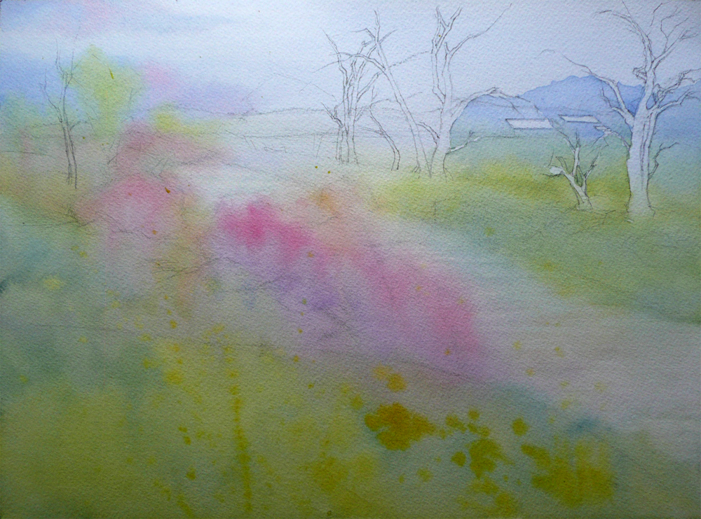
Fire Dance,  Watercolor on Fabriano Artistico #140 Cold Press Paper, 6"h x 6"w, WIP 1

... But, are we really?...

-- What if you allow yourself some time every week to just play with that set up process, substituting familiar and tried items with ones that just does not seem to work, and find out why? What if you try to center the entire composition around that problematic object, using other items with complimentary or analogues colors and patterns, contrasting or similar textures, and try to design shapes that make the problematic object the center piece? What if you try a totally different point of view -- such as setting up the still life above the eye line to emphasize the majestic quality of ordinary, day-to-day objects?...

-- What if you spend a day to just look through the lens of your camera, pointing it at random angles and shooting found objects that you may never intentionally try to take a reference photo of? What if you crop these photos dramatically, using super close-ups to look at only the surface texture, or very small details instead of the entire object? Instead of cropping yet a other head-and-shoulder shot for portrait, what if you cropped off the head and focus on hands, feet, chest with shirts and legs with torn jeans?...


April's Promise,  Watercolor on Fabriano Artistico #140 Cold Press Paper, 6"h x 6"w, WIP 1

-- What if instead of going straightly at that beautiful wash, that light underpainting, that carefully drawn details that you know would lead to a successfully painting in your typical style, give up your normal procedure, and try something new, something different, something that may be way outside your comfort zone? What if instead of painting light to dark, general shapes to details in watercolor, you put in bold darks and wash light colors over them, and let the darks bleed out? (No panicking please!!!) What if you just take out the work (or its photograph, in most cases) of an artist you admire and never has a chance to study with, and imagine how he or she achieved a particular passage in the painting, and try out that method? What if you just try a new type of material, a new surface, a new painting tool and try to redo a painting that you have done and liked, or for that matter, something that you have tried to do and never worked out?...

-- What if you take the photograph, and turn it into black-and-white, instead of painting true to the color of the photo, just choose a color scheme from a painting by another artist that you feel greatly inspiring, and try to design your painting using that particular color scheme? What if you try a limited palette of only primary colors, only warm and cool earth colors? If you are used to painting with a limited palette, what if you try three new colors and add them to this new painting to just see how they work with your old palette, and how they work (or does not work) with each other?...
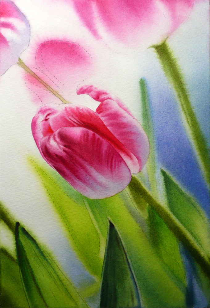

Waiting for Spring,  
Watercolor on Fabriano Artistico #140 Cold Press Paper, 10"h x 7"w, WIP 1

Guaranteed, most of these "experiments", or as I would like to call them, "play time" products may never turn out to be master pieces -- they may never be finished, but I believe they are just as important as the beautiful finished pieces we enter shows, win prizes, sell across the ocean or to the next door neighbors, and post on our blogs, facebook pages and websites to gain all the "wow"s an "ah"s. Because it is for us, for the artist within, for the growth of our paintings and ourselves, and for the wonder of the activity we call "creating" that lured us in the constant ecstasy and agony of being an artist --

... So, maybe today, among all the "serious" work we do daily as artists, we can throw in a little, just a little... "Play Time"?...

(I would love to see your experiments and excursions -- post a comment or a link to your adventure and the fabulous -- they by definition all are -- results of it here, I will share it on my facebook page!)

Sunday, June 10, 2012

Work in Progress: High Summer Dreams II & Petal Light III (Creeping Forward...), and News from A Small Work Show

A very busy day outside studio running around to shop for framing materials and replenish paints, unfortunately without a lot of time dedicated to the two bird of paradise paintings... I did manage to squeeze out a few minutes here and there to (almost!) complete the foliage on both of them. "Petal Light III", which is painted on Fabriano, looks so much darker than "High Summer Dreams II" (on Arches) right now, since I did go for that final dark value on shadow shapes of the leaves for this one, while "High Summer Dreams II" still needs a final wet-in-wet application of juicy darks over it underpaintings of leaves. I really can't wait to put in the flowers of complementary bright orange, but next week is the final week of the trimester at the Golden Gate Atelier where I am studying, I don't think I would be able to squeeze out much time during the weekdays to paint... :-(


High Summer Dreams II, Watercolor on Arches 140# Cold Press Paper, 10"h x 14"w, WIP 3


Petal Light III, 
Watercolor on Fabriano Artistico140# Cold Press Press Paper , 10"h x 14"w, WIP 3

I did get some exciting news in the email today to cheer me on -- two of my small paintings, "Hide and Seek" and "Dancing Tulip IV" are juried into Santa Clara Watercolor Society's Small Work Show, "Think Large, Paint Small" to be held at the Norton Gallery of Pacific Art League in July! The opening reception is during the First Friday Art Walk of Palo Alto, I am really excited to attend it and chat with all of the fabulous artists juried into the show... Well, time for more framing...


Hide and Seek,  
Watercolor on Fabriano Artistico 140# Cold Press Paper , 5"h x 7"w, 2012 #17

Sold!


Dancing Tulip IV,  
Watercolor on Jack Richeson Zoltan Szabo 140# Cold Press Paper , 9"h x 6"w, 2012 #18


Thursday, March 8, 2012

Work in Progress: Winter Mirage (Version 2), & Spring Breeze IV Shipped for WAS-H 35th International Show

This is my second take on the little landscape painting, "Winter Mirage", that I started a while ago. I was not entirely happy about how the colors turned out, and decided to try it again -- this time with the paper taped down on a Gator Board surface to keep it flat. I also used rough instead of cold press paper to facilitate possible granulation of the large amount of Cobalt and Ultramarine Blues used. Rough paper also makes color blending wet-in-wet relatively easy to control. I am much happier with this one compared to the last -- I love how the red and blue fused into each other in the background bushes and tress, yet still kept their own color identities. I also really liked the soft gradation of the foreground. Since this is painted on a smaller sized paper, I may elect not too add any more detail in the foreground, so that viewer's eyes can slide smoothly across it and into the middle ground, which is my center of focus.


Winter Mirage (Version 2),  
Watercolor on Arches #140 Rough Paper , 5"h x 7"w, WIP 1

I've also received confirmation today that "Spring Breeze IV" has safely arrived at Watercolor Art Society - Huston (WAS-H)'s gallery and will be hang tomorrow for viewing. WAS-H's 35th International Exhibition opens March 13th and will remain open until April 20th in their gallery. If you are in the Greater Huston Area, it's a beautiful show to drop by -- lots of amazing work from the catalog I received! The address of the gallery is 1601 West Alabama Street in Huston, and the gallery opens between 10am and 4pm every Tuesday through Saturday. This painting is for sale at the show but you can also buy it from my Daily Paintworks Gallery at a discounted price of $250, and it will be shipped (with mats but not frames) after the show comes down in April.


Spring Breeze IV 
(Juried into Watercolor Art Society - Huston's 35th International Exhibition)
Watercolor on Arches 140# Cold Press Paper , 14"h x 10"w, 2012 #16

Wednesday, March 7, 2012

Dancing Tulip (Finished, Finally!)

I am very happy with the end results of this painting -- I think the dark, colorful backgrounds painted wet-in-wet added the drama to the painting, and the value on the flower pedals, although on the darker side, still appear luminous against the background. I toned down the yellow-green foliage to make the light on the pedals shine and catch maximum attention, and I think it worked!

One thing I learned when painting this little study is how to use natural stopping points as boundaries for wet application, and only wet part of the background area at a time during paint application. Any light shape, such as the green area to the right of the left bud, can be such a stopping point. I painted the left side of it first, using the edge of the long leaf at the bottom left corner as another stopping point when wetting the paper. When this dried, I simply re-wet over the green area and the adjacent areas on the right, and floated in more colors to create a seamless connection. The trick of not forming a hard line is to start and stop at an area with relatively thin pigment density, so that pigments already on the paper would not lift and form a dark line along the edge of the wet area.


Dancing Tulip, 
 
Watercolor on Fabriano Artistico 140# Cold Press Paper , 5"h x 7"w, 2012 #21 

Sold!


Tuesday, March 6, 2012

Work in Progress: Dancing Tulip (Almost Finished, Really...), & Class with Jeanne Vooden

I'm still painting away for the upcoming tulip art festival in Oakland, adding denser pigment wet-in-wet on the leaves to create a glow of spring yellow-green. When finished, the leaves would be the only true light-colored shapes and contrasting with the deep burgundy-purple flower. I am a little worried that they would attract the eye too much and draw the attention away from the main flower, but I do like the reddish purple vs. yellow green color scheme. We'll see how it goes. I also added more of the same color on the upper left corner of background to hint foliage in the distance, and to balance the movement of color throughout the image.

Most work I did was on the flower pedals. I found Fabriano Artistico Cold Press paper very very hard to glaze on -- even the staining colors seem to lift easily. And when the pigment density is too high, it seems that they don't get absorbed into the paper at all, just floating on the surface and being pushed around by the next brush load of pigments. I'm a bit annoyed at this stage, but decided to carry on -- after all, almost all mistakes made on this paper can be corrected easily with lifting! I guess I just have to learn the art of dancing with the devil...


Dancing Tulip,  Watercolor on Fabriano Artistico 140# Cold Press Paper , 5"h x 7"w, WIP 4

What made me super excited today was I got to start my six-week class with the amazing artist Jeannie Vodden! She paints with beautiful, delicate mingled fluid washes of very limited palette -- most often just one red, one yellow and one blue, letting the pigments mixing both on palette and on paper to create a rainbow of hues. Her method involves very patient glazing and our class project this time was a landscape. I am showing my humble efforts here -- it looks so pale and subtle, but it's already three washes on wet paper! -- The first one going down from the sky region and covered almost all paper, changing color from the Cobalt Blue Sky to the light yellow-green of meadows, then to the pink flowering bush, all finished by applying a combination of Permanent Rose, Lemon Yellow and Cobalt Blue on pre-wetted paper. The second wash strengthened colors on the left bank wet-on-dry, and the third partially covered the right bank in the same manner, carefully painted around the tree trunks and distant rooftops. It's very different from my usual painting method, and I can't wait to see how it would turn out... 


Spring Run,  Watercolor on Arches140# Cold Press Paper , 9"h x 12"w, WIP 1

 
Related Posts Plugin for WordPress, Blogger...