Wednesday, February 29, 2012

Winter Light, & Slow Progress in Sun Dance

Oh boy -- I was itching to paint a landscape this week, although I know I already have way too many projects started, and I really shouldn't attempt a new one. But finally, the ADD in me wins -- yet again! I remembered Kara K. Bigda's exercises of one hour painting, and did this little one in one wetting of the paper! It was intense, nerve-wrecking and so much fun!

I began by wetting the little sheet of 5" x 7" piece of Arches Rough paper front and back using my squirrel quill cat's tongue brush, thoroughly -- I mean dripping wet thoroughly. After the water had totally soaked in, I laid the paper flat onto a piece of plexiglass -- a non-absorbent surface that would keep the paper wet longer (you can also add wet paper towels between the watercolor paper and the plexiglass to extend the drying time even longer). I used 1" flat sable brush from Jack Richeson to paint in the sky using French Ultramarine Blue and Burnt Sienna, varying the pigment strength as I go, and forcing myself not going back and try to rectify the bits of unevenness of painted areas. The granulation effect of French Ultramarine created interesting color separations on the rough surface of the paper. As the paper dried a little, I used fast, upward strokes of the flat brush to drop in a strong mixture of the same two colors, letting the blue dominate, to created the distant woods. This instantaneously created some interesting effects -- some of the warm sienna color was pushed to the upper edge of the trees by the heavier blue pigment (French Ultramarine is a heavily sedimentary color with large pigment particle size, and often pushes the more transparent colors away when applied in mixture or dropped in wet-in-wet), creating a warm glow hinting the setting sun. I really liked this effect, and stopped for a second to appreciate it, before to lift the distant, snow-covered roof in the woods. When the paper is just a tad damp, I applied even heavier pigments with brown dominance to create the foreground dried grasses -- in the end, it's almost dry-brushing in some area. I switched to a rigger brush to paint in the calligraphic branches of the small foreground tree (bush?), and felt totally invigorated by the fast-paced action of painting, in contrast of my usual meticulous, extremely time-consuming way of doing it... 


Winter Light,  Watercolor on Arches 140# Rough Paper , 5"h x 7"w, 2012 #19 

Sold!

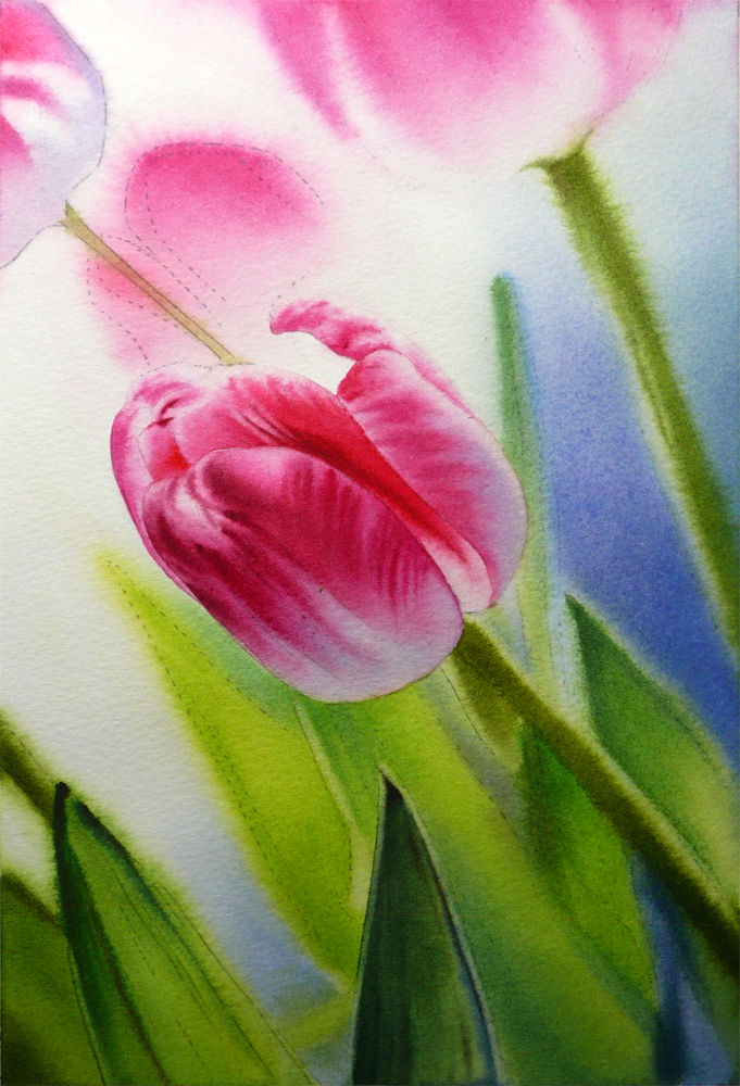
I did go back to the slow motion eventually later into the day, working on the underpainting of the rose painting "Sun Dance" that I started in January (so long ago... :-P). At one point, I felt there is nothing to pin down the values to gauge how dark each passage needs to be, so I selected the lower right corners to do some overpainting using saturated dark pigments (mostly the Thalo colors), carefully letting bits and pieces of the colorful underpainting to shine though to hint undergrowth and dappling sunlight. I am not entirely sure whether I have done that successfully, but decide to move on and paint the lower left side rose leaf stems now that I have something to judge against for how dark they need to be. At this stage, I have the first pass of underpainting on the upper right corner, second and third passes of underpainting on the lower left side, half-finished overpainting in middle bottom, and totally finished overpainting on the lower right corner -- just all over the place! I have the greatest difficulty with this stage since the entire painting just looks piece-meal and incoherent. I guess I just have to put faith in it and believe it would eventually sail-through this ugly stage and emerge as something beautiful (or not)... I am suspicious either Carrie Waller's strategy of finishing one section at a time, or Crystal Cook's way of developing the whole painting to the same stage of finish each time before moving to the next stage is better that what I am usually doing... Time to reflect...


Sun Dance,  Watercolor on Arches 140# Cold Press Paper , 8"h x 8"w, WIP 3 


Tuesday, February 28, 2012

Work in Progress: Edge of Summer, & A Blush of Spring (Continued)

Every year San Francisco hosts a wonderful orchid show at Fort Mason Center, and it was last weekend for this year. I go there ritualistically, purchase some of the potted exotic beauty, take tons of reference photos, in the vain hope that I would be able to paint them all one day... Never once did the orchids I purchase survive, despite of the fact that the weather in San Francisco -- mild and humid with ample indirect, fog-filtered sunlight -- is extraordinarily suitable for orchids to grow, despite my effort in following the instructions sheets for how to care for the flowers, which came with the orchids for free. I have started to believe that I am one of those blessed with "black thumb". This year, I am taking a different approach -- I am acknowledging their inevitable death at some point in the near future, and to commemorate their eternal beauty and liveliness at this moment, I am painting them when they are still healthy and flowering on my window sill...


Edge of Summer,  Watercolor on Arches 140# Cold Press Paper , 5"h x 7"w, WIP 1

I am also trying out a painting technique that's different from my usual approach -- the one I learned by watching the fabulously informative dvd by the amazing master artist Ann Pember. In short, each shape in the painting is wet in advance and the colors are flooded in and mingled in the wet area. Each area is finished in one go with possible minor adjustments by glazing or wetting the area very carefully, and repaint wet-in-wet. There is no road map by underpainting, so it's a bid of a scary game for me, keeping me constantly on my toes. However, it's also greatly exciting... I'm also trying to see and exaggerate color from the most grey shadow shapes of the flower, imaging a harmonic color scheme out of a limited palette of Permanent Rose, New Gamboge and Antwerp Blue.

I also did a bit more work on the tulip painting, "A Blush of Spring", keeping on darkening the background areas and adding more colors wet in wet...


A Blush of Spring,  Watercolor on Arches 140# Rough Paper , 7"h x 5"w, WIP 2

Monday, February 27, 2012

Dancing Tulip IV (Finished)

Sometimes a painting just seems to paint itself -- I am shamelessly in love with this one, and all the stress-free feeling I have experienced painting it...


Dancing Tulip IV,  
Watercolor on Jack Richeson Zoltan Szabo 140# Cold Press Paper , 9"h x 6"w, 2012 #18


Sunday, February 26, 2012

Work in Progress: A Blush of Spring and Summer Wakening

Still in my tulip mode and started a new one. My goal here is to create a light and colorful abstract pattern here behind the tulip, embedded in the overall dark background, hinting the shimmering light through foliage. At this stage the background seems way too "colorful", and I'm trying to control the urge to dull it down too much -- most of the background areas will be very dark upon completion, with hints of colors showing through here and there. You can always dull and darken a passage in watercolor, but it's hard to do the reverse... 


A Blush of Spring,  Watercolor on Arches 140# Rough Paper , 7"h x 5"w, WIP 1

I also did a first pass of base color on some of the pedals, just to remind myself that I want an overall dark blue-green background to contrast with the warm peachy-pink colors in the tulip.

I also did some more work on the rose painting, "Summer Wakening", mostly trying to finish the  underpainting of the blue-green foliage pattern. I'm trying to use a limited palette of Aureolin Yellow, Cobalt Blue, Viridian Green and Permanent Rose here, just to see how much different hues, temperatures and values I can get by mixing these transparent colors. The Cobalt and Viridian also generated interesting granulation effect on paper -- it's a shame that most of them would be covered in the overpainting process...


Summer Wakening,  
Watercolor on Lanaquarelle 140# Cold Press Press Paper , 10"h x 8"w, WIP 3

Saturday, February 25, 2012

Hide and Seek (Finished!)

Some pieces takes much more work than others -- not because of the frustrations you encounter when painting them, but somehow, they just beckon to be put aside after every layer of color, so that they can be looked at with a fresher eye after a while. This is one of them. It started at the beginning of this year, and every time I thought it is close to be finished, something seems to be missing. It was hard to tell exactly what has to be done though, so I had to put it aside and take it out to reevaluate from time to time. For now, I think it is finished. I'm quite happy about the intensity of color and value contrast, and the soft color transitions in most pedals. I will paint a larger version of it and submit it to Illinois Watercolor Society's 24th National Show -- hopefully this time, with the small study as a road map, the progress of the bigger one will be much faster...


Hide and Seek, 
Watercolor on Fabriano Artistico 140# Cold Press Paper , 5"h x 7"w, 2012 #17

Sold!

Friday, February 24, 2012

Work in Progress: Dancing Tulip IV (Continued), & Finishing Work on Hide and Seek

A little more work on what I started yesterday, "Dancing Tulip IV":


Dancing Tulip IV,  
Watercolor on Jack Richeson Zoltan Szabo 140# Cold Press Paper , 9"h x 6"w, WIP 2


I also revisited some older pieces that are still not finished, and decided to experiment with richer reds and oranges on "Hide and Seek":


Hide and Seek,  Watercolor on Fabriano Artistico 140# Cold Press Paper , 5"h x 7"w, WIP 9

Thursday, February 23, 2012

Work in Progress: Dancing Tulip IV

It's been warm and sunny for a few days in San Francisco, and I'm totally caught up in the beautiful mood of spring... So, here's the start of another pink tulip painting, which I am experimenting on Jack Richeson Zoltan Szabo #140 Cold Press watercolor paper. So far, I am totally in love with this paper -- it's pristine white, does not lift easily when glazing, but can lift easy enough when being scrubbed with a synthetic hair brush (not a scrubber), and the surface of the paper does not get easily damaged!


Dancing Tulip IV,  
Watercolor on Jack Richeson Zoltan Szabo 140# Cold Press Paper , 9"h x 6"w, WIP 1

Wednesday, February 22, 2012

Spring Breeze IV (Finished!)

This is officially setting my record of painting -- I managed to finish a 14"h x 10"w painting in less than four days!!! (Ok, I admit this does not look too impressive if we are talking about most other painters, but to me, this feels more than a huge accomplishment...) I am totally exhausted -- three short nights up late painting. At this size, and without larger areas of uniform color, the repeated wetting of each small areas in the attempt of painting the softer, more wet look has caused the paper to buckle a lot -- yes, it is my fault not to stretch the #140 paper before taping it down, but in my defense, buckling is really not a huge problem if you are painting in the size range of 5" x 7", as long as you tape it down. Even if the paper occasionally buckles when they are soaking wet, they usually dry flat. It's not hard to smooth out a painting after it is finished -- take it off the board, wet the back and dry it lying flat underneath weights usually does the trick. However, the uneven surface buckle makes the painting process toward the end rather difficult, since I have to be very carefully not to paint too wet, so that the watercolor on paper surface would not pool in the valleys. Well, next time, I guess I will plan ahead and stretch the paper ahead of time when painting this size, since I usually paint very wet, and wet each area of paper many times before declaring it finished...


Spring Breeze IV, Watercolor on Arches 140# Cold Press Paper , 14"h x 10"w, 2012 #16


Tuesday, February 21, 2012

Work in Progress: Spring Breeze IV (Almost Finished...)

Today is a very very very busy day trying to finished "Spring Breeze IV" so that it can make some submission deadlines that are coming dangerously close... I will be in this hyper-tension state of painting all through March, since there are quite a few shows I want to submit to that have set their deadline in late February through early April. My goal is to submit to 8 - 10 National shows this year across the country, and see how many I could get in. It is time consuming business, and also a bit costly when you add up the application fee, the shipping, the return shipping, the handling fee charged by the show committee, framing, packaging (Art Float Strong Box is incredibly expensive)... So, when I submit to a show, I would try to be careful in choosing the venue of the show -- is it in a city that is art friendly or considered by the collectors as a major art destination? Is the exhibition hosted in a well-located gallery or museum that attracts collectors? Is the time of the show coincide with events such as First Friday Art Walks hosted by the city where the show venue is located?... These are all the factors that could facilitate the sale of artworks in the exhibition. At the end of the day, if I receive an empty return shipping box with a check in the envelop, I would be more than too happy!... :-P


Spring Breeze IV, Watercolor on Arches 140# Cold Press Paper , 10"h x 14"w, WIP 3

Monday, February 20, 2012

Work in Progress: Spring Breeze IV (Continued...)

Compared to the first version of this painting, the 5"h x 7"w "Spring Breeze II", I have tried a different, more controlled approach to created the soft look of out-of-focus flowers and leaves in the background -- to layer all the visible colors one at a time after rewetting each area instead of trying to do them all in one go wet in wet. It's taking longer, but definitely gives more controls of the final color and value of each area. To create a soft transition, I would wet an area slightly larger than what I intend to paint, so that the paints does not stop abruptly at the edge of each shape. So far, I'm happy with this strategy, but slightly worried that with each layer of thicker paints being put on paper surface, eventually they would start to lift off. Let's see how much abuse Arches can afford...


Spring Breeze IV, Watercolor on Arches 140# Cold Press Paper , 10"h x 14"w, WIP 2

Related Posts Plugin for WordPress, Blogger...