Saturday, July 11, 2015

A Little Experiment with Gold Leaf...


California's Gold, 
Watercolor on Aches #140 Cold Press Paper with Gold Leaf, 8"h x 8"w, 2015 #2

Bid in My DPW Auction ( Starting Bid $85)

At school break I experimented a little bit with texture and really enjoyed it -- combining wet-on-dry glazing of very thin washes with wet-in-wet technique to depict feather and fur, as well using gold leaf as background for a watercolor painting. I really love the shimmering gold and thought they are just great in capturing how I feel when seeing this little creature glittering in the morning light as it zipped back and forth around the prickly pear cactus flower in my garden. It's hard to imagine that little body containing enough strength and tenacity to fly a thousand miles every spring and fall, through mountains and across oceans. It is a fierce, exuberant force of life...


In case you want to try your hands on the gold leaf technique (it's really fun! Albeit a little messy...), my friend Carrie Waller -- a fantastic artist -- has a great tutorial here. Enjoy!


California's Gold, Detail of the Little Hummer


California's Gold, Detail of the Prickly Pear Cactus Flower

Tuesday, June 9, 2015

Winter Woods II -- A Limited Palette Watercolor Study


Winter Woods II Study, 
Watercolor on Aches #140 Rough Paper, 7"h x 10"w, 2015 #1

Bid in My DPW Auction ( Starting Bid $65)

I really enjoyed playing with the very limited palette of French Ultramarine, Burnt Sienna and Prussian Blue in this little study, and experimented with combining wet-into-wet and dry-brush to created the texture on the bark of birch trees. I think I might try to play with the composition a bit and make a bigger painting from this little study...

So many things have happened this year! Time really flies... I have just completed the Silicon Valley Open Studio event and it was a blast... And today I learned on the phone that I was chosen as the San Mateo County Fair Artist of the Year again! I am really thrilled to get this award two years in a roll... Yay!

I'm sorry that I haven't been posting as often as I would like to for the past year, since I started painting in oils in the Golden Gate Atelier. This is the first semester of the fourth year I am enrolled at the atelier, and I am making steady progress toward learning the craft of classical methods of drawing and painting from life. I am really grateful for this incredible opportunity, and the fine teaching I've received from my instructors there. I have really struggled very hard to learn how to handling an oil painting brush, as it is very different from painting watercolor (those of you who work in both these media would know :-P). But lately I'm feeling I've finally getting the hang of it -- after a year of almost crying myself to sleep every night thinking it may never work for me. Looking back at my first effort of working in oil (it was truly horrible) I know I've come a long way, although there are way more miles to go ahead of me. I will post a few of my paintings (only in grisaille at this point -- I am not allowed to use color yet) in my next posts and share what I have learned so far. I am finally feeling a bit more relaxed as I am seeing the light at the end of this long black tunnel now...

And nothing better as a celebration than going back to my first love -- watercolor and try out some loose landscapes! Yay! It's like eating candy!...

Saturday, April 18, 2015

Pink Ladies in Progress, and Thoughts on How to Use Reference Materials


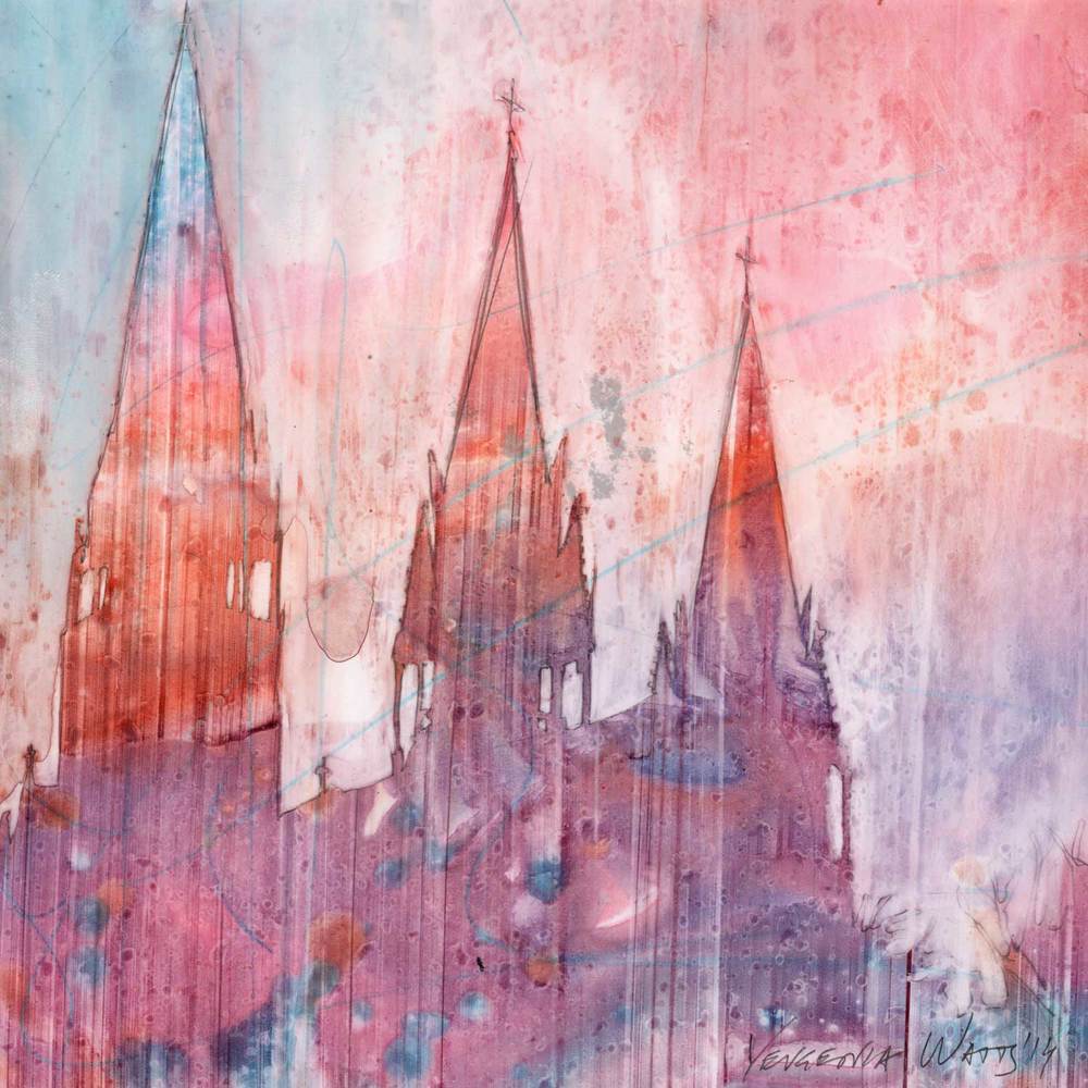
Pink Ladies, Watercolor on Arches #140 Cold Press Paper, 8"h x 8"w, WIP 2

I am trying to ignore the fact that I have not posted here (or on my facebook page, or on my Daily Paintworks gallery... =_=b.....) I used to beat myself up for these artistic "dormancy" periods, and feel like I am being lazy and irresponsible to not turn up one painting after another, or worse still -- not even working on any paintings for an extended period of time. When I am in school doing oil paintings, I feel at least there is a reason (or excuse to forgive myself?...) that I am not producing more watercolor paintings, since I am learning something new and not turning out finished products that can be shown to the world (without shame...) is allowed; but doing the breaks between semesters, I often go through these extensive periods feeling so guilty that I am not working more on my watercolor painting, or painting bigger, more substantial works that I've promised myself so many times I would do...

But, guilt aside, I do start to realize (after fighting with myself so many times) that these dormant periods are essential to my growth as an artist. I almost always come out of them learning something new, and paint a little differently. So, this time I am trying to not feel too guilty about it when it happened, and embrace the time I feel needed to study other artists' wonderful works (both on the amazing web and in museums), watch tutorial videos, read instructional books, and most important of all, think about my own approach to each potential projects that comes my way, trying very hard to analyze what is missing in my paintings at this stage of my artistic development.

Gradually it becomes more and more clear: I am too much of a slave of beautiful reference photos -- for the colors used, for the shapes presented, for the myriad amount of information presented in the photograph. The more time I spent setting up a still life/floral, or walk around trying to find that "perfect view" to take my reference photos, and the more photos I take "just in case" none of the ones I took previously turn out to be just "right", the more I seem to be unwilling to let go of it during my painting process. But can one really learn to run without finally casting away the walking stick that he/she has held on so tight for dear life?... Especially as an artist working in the realistic tradition, how much should one be bound by the information (shapes, colors, values, edges, etc.) provided in the reference material and how much artistic liberty can (or should) one take?

Obviously every artist (even the most photo-realistic painters) takes some liberty editing their reference material to create their art -- without this editing painting simply becomes a mechanical "pixel-by-pixel" copying of the reference photo, and cease to become a window into the artist's soul, therefore cannot hold its own. However, not all alterations from a reference material automatically improves the art piece -- nature often provides us with much more interesting shapes and subtle value shifts, for example, than most of us could come up with if we are given a blank piece of paper and no reference to work from. The hardest thing is how to make all the editing actually add onto, instead of detract from, the final resulted artwork. It's a true test of the aesthetic taste as well as technical skill of the artist, and it's scary as hell.

But maybe, it is time for me to start...

Tuesday, October 14, 2014

Blog Hop!!! -- Around the World in Artist's Blogs...

The new semester in the Atelier has started, and my watercolor painting time has again become few and far between... But I have not fallen into the oblivion! In fact, I have been invited to a great blog party! My dear artist friend, Kara K. Bigda has been kind enough to inviteme to participate in the "Around The World Blog Hop!"  (Thank you, Kara! :) So I'll be answering a few questions she asked regarding my paintings, and then I will be sharing with you links to 3 people I've invited to participate in this online event.

If you are familiar with the website that hosts my online gallery and sells my art works - Daily Paintworks, you are probably already very familiar with Kara's beautiful still life paintings and her whimsical "Little People" series. She was one of the original artist members of Daily Paintworks before they opened their membership for a larger artists' community, and now is a featured artist of DPW. I've been a long time fan of her work. To me, her paintings are best described as visual poetry, and reminds me of the world of Emily Dickinson -- quiet, unassuming, yet filled with beauty that are so often not notices in our daily glance... They are carefully woven tapestries of subtle nostalgia, soft winter light of New England and the passing of time. Her compositions are often simple - a pot, some wild flowers picked from roadside or the backyard, a plate of fresh blueberry on light patterned fabrics, the corner of the living room -- yet they are always very effective, carefully planned, with beautiful layered washes and vivid rendering of the texture of different subjects. Light is the biggest star of her painting, and it works the magic to make the most ordinary object appear glorious, showing the personality of an old, chipped desk, or the playfulness of half-eaten strawberries. She never ceases to amaze me by opening my eyes again and again toward something I have glanced over perhaps a million times in my daily life, but never actually "seen". On top of that, she also does amazing, life-like pet portraits on the (very difficult!) surface of Aquabord, and use her great sense of humor to make me crackle up every time she designs and paints yet another scene of her little Fisher-Price "people" in their tiny desktop community. If you are not familiar with her work, be sure to stop by her blog and website to take a look! And, you can purchase some of the amazing art pieces she creates from her Daily Paintworks Gallery (they make great gifts for the holidays ;-).


Morning Sunby Kara K. Bigda

Ok... Now onto the questions:

1.  What am I working on?

I am actually working on my first every oil painting! (Well, that is not entirely true since I have tried my hands on oils before by taking some classes with a very talented still-life painter, David Chefeitz. But I quickly realized that to be able to paint expressively, one has to be able to draw quite accurately, hence the embark of the whole journey in the classical atelier... And now, two years and many long-pose figure and cast drawing from life later, I am doing my first oil painting in the atelier! It is only in black and white for now, but I will be painting the cast of the ear of Michelangelo's David, and doing a figure from live model (whose name, coincidentally, is also David!), both starting this week! I am still working on the transfer drawing at this stage, so no oils to show yet, but there will be in the coming few days, and I'm so excited to apply all the things I have learned through two year's drawing process to painting!


Morning LightWatercolor on Ampersand Aquabord, 6"h x 6"w, 2014 #21

Sold!

That aside, I am working on two separate series of watercolor paintings -- a series of 6" x 6" sized rose paintings on Aquabord (which has proven a very challenging surface to me, as I have mentioned in previous posts). I really love the brilliance of color you can achieve on this surface, which is great for floral paintings! So I will keep on experimenting with it until I know how it will behave with each wash like the back of my hand... 


Morning Light IIWatercolor on Ampersand Aquabord, 6"h x 6"w, 2014 #18

Bid in My DPW Auction ( Starting Bid $75)

The other series I am working on is "Winter Woods", which will be quater-sheet sized landscape paintings of snowy woodlands. So far I am doing sketches and small studies on different types of paper, trying out various methods of creating the rough bark texture of different kinds of trees, and observing how I can utilize the soft texture of snow and distant woods painted wet-in-wet to contrast with the linear elements of tree branches and twigs to generate pictorial interest. Below are two examples of small studies I am doing for this series:


Studies for "Winter Woods" Series, WIP


2. How does my work differ from others of its genre?

Since most of my paintings have a floral theme (although I have also dabbed in landscape paintings from time to time), I will first answer this question in the floral genre. I think what makes my floral paintings differ from most other painter is that I am interested in not only the painted image, but also the painting process, especially the wet-in-wet process so unique to watercolor. Hence, my flower painting often has a very soft, blurred background with only shapes suggesting distant foliage or flowers contrasting with a center blossom in sharp focus, creating high-drama and a "spot light" effect. To heighten such effect, most of my flowers are painted in very rich, saturated color, with dramatic dark background to contrast with it, creating a sense almost like theater stage lighting. I often only put one blossom in the center stage of a painting, making it the "diva" of my watercolor show. By utilizing these design tools, I hope my watercolor painting of flowers can be read as the portrait of one particular blossom, instead of just a general depiction of yet another rose or tulip.


Fire Dance
Watercolor on Fabriano Artistico #140 Cold Press Paper, 6"h x 6"w, WIP 9

My landscape paintings are often developed from (or simply are) small plein air studies. I am not interested in painting just "the place" or well known landmarks, though, instead I am interested in capture the mood and atmosphere of a particular moment in time. 


Fisherman's Evening II, Watercolor on Arches #140 Hot Press Paper, 7"h x 10"w, 2014 #2

Sold!

I am especially interested in quiet, less busy scenes with barely any "things" in it, when the elements has largely did the editing for me and got rid of the non-essential objects from my view -- such as fog blurring the distant mountains, or snow covering the busy ground. I like the "zen" like feeling of such scenery, and choose to paint them on very wet paper, often finishing each painting in one drying cycle of the paper, letting water doing most of the work for me and create interesting soft gradations and organic shapes. 


Falling Snow (Thoughts of You Fall Quietly upon Me...),  
Watercolor on Arches 140# Rough Paper , 7"h x 8"w, 2012 #30

Sold!

I only use a very limited palette for my landscape painting, mostly just browns and blues, sometimes with a little bit of earthy yellows. I like the harmony created by the restraint of color, and feel these quiet landscapes are good contrasts to my floral work (which is often very high in chroma and energy), providing me necessary meditation time and peace of mind when painting them.


Spring Meadow, Tamalpais 
Watercolor on Winsor Newton 140# Cold Press Paper , 6"h x 10"w2013 #63

Sold!

3.  How does my creating process work?

Most of my flower painting starts when the a glimpse of an image I have taken catches my eye again -- I usually let my reference images sit for a while before painting from them, using this to test whether they will still be interesting enough for me with the text of time, when the intial "wow" effect has faded. Then I will print out the image and play with the composition with old-fashioned corner mats, rotating and cropping the initial image until I am roughly happy with the composition. Next comes photoshop -- I will do my cropping of the digital image in the computer according to what I have done with the mats, and also digitally enhance the images by creating copies with blurred background, increased color saturation, increased contrast and/or luminosity... I work from these multiple reference images generated from the initial photograph: when I paint the background, I paint from the blurred image to take it out of focus; when I paint the flower I often work with the image with increased color saturation, and sometimes with the image with lightened shadows... etc. I am aware of the fact that the camera does not have nearly as large a dynamic range for values as the human eye, so these changes are merely necessary to make the final painting closer to the reality perceived with our eye, instead of through the cold mechanics of a camera lens. 

For the actual painting, I often do multiple glazes wet-in-wet, rewetting each section (larger than the area I am working on to create seamless connections between sections) after the last glaze dries. I usually paint from the background to foreground, and doing a faint-colored underpainting before doing the wet-in-wet application, so that I would have a road map when the paper is dripping wet and everything is in heightened motion. You can see an example of my underpainting and finished painting of "High Summer Dreams" below:


High Summer Dreams II, Finished Underpainting 


High Summer Dreams II, Completed Painting 

To view more of my work, you can visit my website, or my Daily Paintworks gallery.

And now for my invitees who will be blogging next Monday - October 20th.

Taryn Day - is one of my favorite oil painters that blogs. Her works are amazing combination of abstract brushwork and realistic depiction of the plane and forms of subjects, and she has such a great sense of composition, making the most ordinary snapshot morph into great paintings every time. It just makes my jaw drop. On top of that, she curates this other blog - the Art Room - that introduces artworks of other great artists she loves. I just don't know how she does it.


Franz Kline and a Blue Hatby Taryn Day 

Brienne Brown - is an amazing landscape painter in watercolor, and she whips out these atmospheric plein air paintings wherever she goes -- her friends farm, the corner of a street, even the boat dock of a small park. They are filled with interesting shapes and textures as well as vigorous brushwork, yet the big washes unifies everything and her paintings never looks too "busy" with details -- just enough to suggest and intrigue. Did I mention I love how she use colorful and luminous shadow shapes (sometimes invented shadow shapes that are not actually in the reference photos!) to create the coolest compositional designs, and add interest to large boring foreground areas? No wonder she is winning plein-air competitions left and right, and is a staple in Daily Paintworks' monthly competition as the judges' pick. Oh, I forgot to mention that just like me, she has a science background and worked in labs before becoming a full-time artist. How cool is that?


Tagged Againby Brienne Brown

Yevgenia Watts -- She is one of the most creative watercolor painter I have discovered since taking up blog and social media. Known for her loose, vivid portraits with beautiful brushwork, and her quick pen-and-ink watercolor sketches that is both whimsical and charming, now she has embarked a completely different journey, painting half-abstract architecture-themed paintins on Yupo! This latest series of hers just makes my jaw drop -- they are filled with beautiful color and texture, and the imagery just straddles between realism and mystical abstract shapes, filling the viewer the imagination with the wildest dreams.


Unity 21by Yevgenia Watts

Wow! This is such a lengthy blogpost... If you're still with me now, I really owe you a big big thanks! Thanks for stopping by and do check the artists I mentioned in this blog -- all of them have taught me so much about painting!

Enough rambling for now! I should really get back to my watercolor table... In the mean time, if you have an image of a beautiful landscape, or a flower you like, or anything you might want to see painted, please email them to me at arena.shawn@gmail.com. I will paint them and post them here. From every 10 paintings I make from them, there would be a random drawing, and the lucky winner get to take a original back home for free! Interested? Then send me your photo!

You can now buy high quality Giclee prints of many of my sold paintings, both on paper and canvas, as well as some note cards with my paintings here:

Saturday, October 4, 2014

Crystal Springs Sunset -- Color as Value Exercise


Crystal Springs Sunset, 
Watercolor on Aches #140 Cold Press Paper, 10"h x 6"w, 2014 #20

Bid in My DPW Auction ( Starting Bid $40)

"Crystal Springs Sunset" started out as an exercise in Stan Miller's workshop. Using a black-and-white photograph as reference, Stan asked us to use any colors -- arbitrary colors even, like green for the clouds -- to paint each shape, mostly wet on dry, soften edges as we go. The only requirement is to get the shapes painted in color as close in value as the black-and-white reference photo. It was a very valuable exercise, teaching me the importance of value to create a believable illusion of three-dimensions on a two-dimensional surface. As long as the value relationships are right, almost any color can be used to create a believable image. That is such a freeing exercise! 

In the end, the resulted image reminded me of the the evening drives I used to take along Hightway 280, when the glorious last rays of sunlight reflects from the water of the reservoir, the golden shimmers of light are breathtakingly beautiful. Against the setting sun, the silhouettes of the evergreen-and-oak-covered coastal range mountains are in a somber blue-grey color that is hard to describe with language. Not being able to resist the view, I have always pulled over to the roadside to observe and take it by heart. Cameras just don't do it justice -- high-contrast, low luminosity scenes like this are hard to photograph unless you are a pro with all the right gears (which I am certainly not). But today, when finished with this little painting, I am filled with joy that all those roadside stoppings did not go to waste. They have carved the magic hour, the majestic light into my heart...

Enough rambling for now! I should really get back to my watercolor table... In the mean time, if you have an image of a beautiful landscape, or a flower you like, or anything you might want to see painted, please email them to me at arena.shawn@gmail.com. I will paint them and post them here. From every 10 paintings I make from them, there would be a random drawing, and the lucky winner get to take a original back home for free! Interested? Then send me your photo!

You can now buy high quality Giclee prints of many of my sold paintings, both on paper and canvas, as well as some note cards with my paintings here:

Thursday, October 2, 2014

Water's Edge -- Continue with the 30 Paintings in 30 Days Challenge...


Water's EdgeWatercolor on Aches #140 Cold Press Paper, 5"h x 7"w, 2014 #19


Leslie Saeta's "30 Paintings in 30 Days" Challenge for this September is officially closing, and I sort of fell off the wagon again in the past few days due to preparation for the start of my atelier's new semester. I will be starting to paint in oil this coming semester! I am so excited and terrified at the same time... Luckily, I have you guys -- my wonderful artist friends who are veteran oil painters! Well, be prepared... I will be bugging you guys with tons of questions (many of which very silly I'm sure... :-P)

I experimented with this water lily painting on how to most effectively paint shapes that has only very subtle color variations and next to each other -- I tried to paint some petals one at a time, carefully model the roundness of them by adding deeper and deeper reds when I was painting each petal; some other petals are painted as one shape with slight warm/cool variations of reds, then crevice darks are added between petals after the underlying colors are dry. I tried both and wanted to find out how to avoid leaving a very harsh, dark edge at the border between two petals, which is the result of wetting an area then adding dark colors wet-in-wet. I find when I paint one petal at a time, it is easier to clean the edge of each petal buy running a damp stiff nylon brush along where the dark pigment accumulates, then blog the area slightly with tissue. When painting multiple petals at once, the petals painted at the same time have better connections and looks more natural, yet the edge between sections painted at one time and another always looks quite harsh. I am still struggling to find a good method and make the connection of areas painted sequentially more natural... If you have some good tips, please share with me, my friends!

Enough rambling for now! I should really get back to my watercolor table... In the mean time, if you have an image of a beautiful landscape, or a flower you like, or anything you might want to see painted, please email them to me at arena.shawn@gmail.com. I will paint them and post them here. From every 10 paintings I make from them, there would be a random drawing, and the lucky winner get to take a original back home for free! Interested? Then send me your photo!

You can now buy high quality Giclee prints of many of my sold paintings, both on paper and canvas, as well as some note cards with my paintings here:

Saturday, September 27, 2014

Morning Light II -- Continue with the 30 Paintings in 30 Days Challenge...


Morning Light IIWatercolor on Ampersand Aquabord, 6"h x 6"w, 2014 #18

Bid in My DPW Auction ( Starting Bid $75)

Another of my early entries for Leslie Saeta's "30 Paintings in 30 Days" Challenge for this September... I named it "Morning Light II" since I have finished "Morning Light I" a bit earlier -- the first one of my 6" x 6" rose series on Ampersand Aquabord, but haven't got a chance to share it here with you guys yet... (Promise I will do so in the next few days -- I am gradually catching up with my long-lagged-behind blog posts! But since I haven't posted the entire summer, there is so much catching up to do... :-P)

I have really struggled through this one to get the soft transitions in the background where colors are rich, saturated or dark - which according to my opinion is the hardest thing to do on Aquabord. I think it may still benefit from a few changes here and there to model the volume and turn of each petal, but for now I am stopping, as I have worked on it for two days continuously, and losing insight on the subtleties. The great thing about this challenge -- putting a time limit on each project and force me to work more directly, boldly and fearlessly -- also makes it hard for me to do the last 10% of work that I consider makes the difference between a good piece and a mediocre one -- there is no chance to put a piece away and come back to it with a fresh eye with such a tight time frame for completion... Nevertheless, I think I may come back to this one in a few days to do some fine tweaking... :-)

Despite of all its difficulties, I still think my adventures into Ampersand Aquabord is well worth its while, because it is something "new" and "foreign" to me. Personally, I believe that it is very hard for someone who has painted for a while to avoid getting into an "inertia" of painting simply be deliberately trying to change his or her technique, and one surefire way to push yourself out of such painting rut is to try a new subject, or try a new surface. Different painting surfaces have different absorbency for water, different drying time and subtle variation in the same stage of the drying cycle, different surface texture, different resistance to paint application (which determines how easily the same stroke will spread or different surfaces with approximately the same wetness). Hence, painting on an unfamiliar surface would force you to open your eyes, and really observe the behavior the paint you put down on paper again, instead of just blindly going from one painting stage to the next. All of these afore-mentioned characteristics also determines the different visual effect one is able to achieve on various painting surfaces -- on a smooth, non-absorbent surface like hot-press paper or Aquabord, one can utilize the drying edge of a stroke that is laid down and different "water-mark"s to suggest shapes (wet-on-dry); on a very absorbent surface, it is hard (and often not necessary) to maintain the edge of one individual brush-stroke, yet one can rely on the movement of color laid-down across a large area of wet or moist paper to achieve interesting edge effects and soft shapes (wet-in-wet). The final visual effect is often drastically different, creating different signature styles. 

Of course, it is not impossible to use one technique to imitate the other by softening edges with clear water, or wet small areas when painting wet-in-wet to simulate brush strokes, and create similar looks on different painting surfaces using very different techniques -- which is another great exercise. It has taught me that no matter what road is taken, a painting is ultimately judged not first by the techniques used, but by the final visual effects one is able to achieve. A good painting is first and foremost about "what" is being painted, then by "how" it's painted. Technique is an important means to the end, but for me not by itself an end. The image in one's vision and how it is translated onto the painted surface is the uttermost important thing. 

Enough rambling for now! I should really get back to my watercolor table... In the mean time, if you have an image of a beautiful landscape, or a flower you like, or anything you might want to see painted, please email them to me at arena.shawn@gmail.com. I will paint them and post them here. From every 10 paintings I make from them, there would be a random drawing, and the lucky winner get to take a original back home for free! Interested? Then send me your photo!

You can now buy high quality Giclee prints of many of my sold paintings, both on paper and canvas, as well as some note cards with my paintings here:

Thursday, September 25, 2014

Green Bells of Ireland -- Continue with the 30 Paintings in 30 Days Challenge...


Green Bells of Ireland
Watercolor on Arches #140 Cold Press Paper, 6"h x 6"w, 2014 #17

Sold!

With my third butterfly painting for Leslie Saeta's "30 Paintings in 30 Days" Challenge for this September still in the works, I thought I'd share with you one of my previous paintings that I have completed for this challenge. I did it while still in China, therefore haven't got a chance to share it here with you yet, although I have uploaded the image onto my Daily Paintworks Gallery Page. I have started this painting actually in 2012, and at that time my main goal is to explore different variation of greens -- mixed from yellow, blue and brown, or modified from different tube greens. I was a little intimidated by this color, as it is not easy to make it look natural with readily-available tube colors, yet it is so essential to flower (and all nature-related) paintings. I have worked on it on and off many times, and certainly have learned a great deal while working on it! The most interesting fact I have discovered is that you can add a lot of different hue -- blues, yellows, and even reds and brows -- to your painting in different locations at small portions and still have the entire image read as "green", as long as the colors adjacent to green on the color wheel dominate the pictorial space, and colors complimentary to green only occupy small areas -- and these sparsely placed jewels actually decrease the monotony of the whole painting, really making the color "sing".

Paintings in an almost-monochromatic scheme like this one is not easy, as it is relatively hard to place emphasis on the center of interest item without the help of a hint of the complimentary color of the large color field it is placed in. I have to rely on mostly cautiously placed details as well as the contrast of soft and hard edges to reach my goal, and direct the viewers' eyes toward the flower bells in the foreground. I have exaggerated the softness of the background from the reference photo to make the center flowers stand out, and add more atmosphere and movement to the entire image.

In the mean time, if you have an image of a beautiful landscape, or a flower you like, or anything you might want to see painted, please email them to me at arena.shawn@gmail.com. I will paint them and post them here. From every 10 paintings I make from them, there would be a random drawing, and the lucky winner get to take a original back home for free! Interested? Then send me your photo!

You can now buy high quality Giclee prints of many of my sold paintings, both on paper and canvas, as well as some note cards with my paintings here:

Wednesday, September 24, 2014

Sugar Swirl -- Continue with the 30 Paintings in 30 Days Challenge...


Sugar SwirlWatercolor on Arches #140 Cold Press Paper, 8"h x 8"w, 2014 #16

Bid in My DPW Auction ( Starting Bid $85)

My second butterfly painting for Leslie Saeta's "30 Paintings in 30 Days" Challenge for this September. I have painted this butterfly on Ampersand Aquabord and uploaded the image onto my Daily Paintworks Gallery Page, but haven't shared it with you here yet (which I plan to do in the next few days, after the challenge is over). The two surface behaves very different -- Arches are great for wet-in-wet application and colors do not lift from it all that easily, but one has to account for the fact that bright hues dull down quite a bit on this absorbent surface, and compensate for that when laying down colors with stronger intensity when painting; on the other hand, bright colors stay as brilliant as the moment it's laid down on Aquabord, as this surface is not absorbent at all, hence all colors stay on its clay-coated surface and do not sink in. However, this makes glazing a color-covered area extra hard, and its fast-drying surface makes doing thick, juicy wet-in-wet application very difficult. I had fun switching back and forth between the two surfaces, playing with their different properties, which is a great exercise to avoid falling into the crutch of always painting with the same procedure and method... :-)

As I was painting the background greens, I realized that I do have some favorite mixtures that I often go to without thinking, and Hooker's Green + French Ultramarine Blue is just one of them. You can add Quinacridone Gold, Quinacridone Burnt Orange and Undersea Green to vary the hue a little bit and add more warmth or depth, but starting with Hooker's Green + French Ultramarine Blue almost guarantees that you will get that deep, shadowy green you get when looking at dense foliage that is not in direct sunlight. I learned this combination when I just started painting watercolor, and it has been helpful to me ever since. Of course, this does not mean one should reach out for the same color mixture without actually looking at nature -- it's just a starting point, a jump board for you to use and land onto your own color mixture for every possible variation of the rainbow.

In the mean time, if you have an image of a beautiful landscape, or a flower you like, or anything you might want to see painted, please email them to me at arena.shawn@gmail.com. I will paint them and post them here. From every 10 paintings I make from them, there would be a random drawing, and the lucky winner get to take a original back home for free! Interested? Then send me your photo!

You can now buy high quality Giclee prints of many of my sold paintings, both on paper and canvas, as well as some note cards with my paintings here:

Monday, September 22, 2014

Spring Feast -- Continue with the 30 Paintings in 30 Days Challenge...


Spring FeastWatercolor on Arches #140 Cold Press Paper, 8"h x 8"w, 2014 #15

Sold!

Continue with Leslie Saeta's "30 Paintings in 30 Days" Challenge for this September! I am posting the new paintings I am finishing this week and will catch up with the ones I finished earlier in October -- forgive me if it is a little confusing! (The challenge has started when I was still in China, where I have no access to blogger or facebook due to government restrictions on internet there, so I have a few of those piled up, uploaded onto my Daily Paintworks Gallery Page but not here.) 

I am doing a few butterfly paintings this week, among other things. This is the first one I finished. I tried something new in the background -- glazing wet-on-dry but still try to maintain the boundaries of different color-shapes soft and diffused. I found that I can control the shapes and values of each shape better, but multiple glazes do dull the color a bit if I am not super careful. I had some fun with the butterfly, letting the lightest background washes seep into the light shapes of its wings to add a hint of color, thus subtly show the translucency of the wings in sunlight. For its furry body I used very small brush and scumbled with think paint to get the texture of tiny hair, and contrasted that with the smooth, shiny underbelly of the insect. I am quite happy with how it's turned out. Now off to the next one! (Hardly any time to breathe with this challenge! How are you doing my friends?... :-)

In the mean time, if you have an image of a beautiful landscape, or a flower you like, or anything you might want to see painted, please email them to me at arena.shawn@gmail.com. I will paint them and post them here. From every 10 paintings I make from them, there would be a random drawing, and the lucky winner get to take a original back home for free! Interested? Then send me your photo!

You can now buy high quality Giclee prints of many of my sold paintings, both on paper and canvas, as well as some note cards with my paintings here:

Related Posts Plugin for WordPress, Blogger...