Tuesday, April 30, 2013

Jungle Fire (Finished!)


Jungle Fire,  Watercolor on Arches 140# Cold Press Paper, 8"h x 10"w, 2013 #40

Sold!

Just a very quick update on this piece which I have dragged along for almost a year, and finally finished during this weekend. No, I have actually not procrastinated on it -- some pieces come easier than the others, but this is not one of them. I would layer another wash on it every now and then, and look at it after a couple of days, feeling it still needed something -- slight adjustment of color temperatures, a little detail to modify the jagged edges left by masking fluid, etc. And finally, when I am looking at it today, I realized IT IS DONE. 

When I first started painting I never thought finish a piece is this much work and involves this much pondering -- I would select a good reference photo and when the painting looks quite like the photo I know it is done. But the more I paint, the more I realize it is the artist's aesthetics instead of the snap of a camera should dictate when and how a particular painting is finished. It can be as sketch or realistically detailed as you, the artist, is happy for it to be. The line between a finished painting and one not quite yet suddenly becomes much more blurred.

Sometimes I only realized a painting has passed its finishing point after I have put a couple more strokes and realized I just overworked it. ("An artist knows an awful lot -- but he only knows it afterwards", says the all-wise Paul Klee.) Sometimes I think it is done and frame the painting, only to take it out later for further adjustments. There is not an iron-cast standard, but more of a feeling that different layers and strokes are finally coming together into a beautiful, coherent whole, a melody instead of a collection of music notes.

Hopefully, as I continue working, one day the blurred line would become clear again...

How do you, my artist friends, decide that a painting you have labored over is done?

You can now buy high quality Giclee prints of many of my sold paintings, both on paper and canvas, as well as some note cards with my paintings here:


Monday, April 22, 2013

When in Doubt, Take a Workshop... (Really?!...)

Recently I had the chance to take a workshop with master artist Barbara Nechis, whose work I greatly admire, and whose style could not be more different from that of my own. The long commute daily across the wine countries of California provided scene upon scene of beautiful rolling great hills of pasture land and foggy estuaries, decorated with old, gnarly valley oak tress with personality of their own; it also gave me some quiet reflection time for the directions of my own artistic growth -- first and foremost, why do I take workshops, and what do I expect to accomplish in them?


Barbara Nechis Workshop Day 1, 
Watercolor on Arches #140 Cold Press Paper, 11"h x 15"w, WIP 1

As beginner artists we all take workshops in one form or another, -- physically in the classroom with a master artist, or watch a dvd/video tutorials. We all yearn to learn. I used to be a workshop junkie and take a dozen each year, yet never reserve time in between to really digest, practice and incorporate what I have learned in each workshop. Sometimes I would not even have time to paint in between workshops, and as a result my improvement is sporadic to say the best. I would jump from trying to imitate one style I learned from artist A to another I saw in another workshop conducted by artist B, and the only thing I have picked up in this haphazard process is a variety of pallets filled with different brand watercolors, and some specialty, name-brand brushes of all odd shapes that I never use again after the workshop. (Sound familiar?... I guess this is the growing pains for beginning artists...)


Barbara Nechis Workshop Day 2, 
Watercolor on Arches #140 Cold Press Paper, 11"h x 15"w, WIP 1

As I paint more regularly after leaving my day job, and most importantly, after I started attending the classical drawing and painting atelier last year, I gradually come to the realization that one's growth as an artist is not dependent on how many workshops one manage to attend, but on how much one tries to practice the important things learned in such experiences. Every minute spent in a workshop under the tutorage of a master artist must be accompanied by fifty, or a hundred times of working-alone-in-your-studio hours thinking, digesting, and practicing the things learned, otherwise the time in workshop are more than likely to be totally wasted. Long hours spent in one's studio working out the problems exposed under the guidance of a teacher, comparing your own work with the example of the master, reflecting on what is successful and what leaves more to be desired is a must for any taught material to be absorbed as one's own...


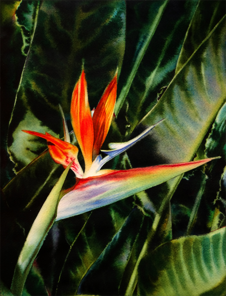
Barbara Nechis Workshop Day 3, 
Watercolor on Arches #140 Cold Press Paper, 11"h x 15"w, WIP 1

The motivation to take a workshop could be many different ones, but largely they can be summarized into three different categories: to study the specific technique an artist use for his or her work, that you would like to utilize -- how to do the wet-in-wet blending? How to paint negatively around shapes? How to achieve rough texture on the barn? In Barbara's workshop I have learned how to paint shapes with clear water then drop in liquid color to create extraordinarily fluid shapes that has a life of their own, as well as paint from one section to another to assemble the painting, or paint with very stiff paints on soaking wet paper to achieve soft but more definite shapes that suggest flowers and foliage. I learned how to rewet the entire painting without disturbing pigments already on the surface, as well as glazing over thick pigments with big brushes. These are techniques I will be practicing in the coming days. Then there are concerns of interpretation of reference materials, and the question of how the master artist sees the same reference in their minds' eye differently from us, how they would translate a mundane photo or object into a poetic interpretation. What they would add to the picture, and what they would leave out, or take liberty to alter, and why they make those decisions. In the case of Barbara, she so often would just absorb the various color and shapes of the photos or other people's artwork that she finds inspirational, and then paint her own work with such influence in mind but without literal reference at all. Last and most difficultly, one could learn from a master about the design of one's work -- what are the utter most concerns regarding making a picture? How does a master artist go about tackle the problems of shape, value, color and what do they emphasize at each stage of the painting's development? Often in a successful workshop one would realize there is a definite reason for each artistic decision to be made -- the reason a curving petal is inserted here is to create a please curvlinear shape to echo another shape put down previously, and a leaflet is painted behind it not because it is accompanying the flower in the reference photo, but because a dark shape is needed to create the sense of luminosity of the light petal just painted... One decision leads to another and the painting energies from white paper based on such decisions -- the biggest mystery is hidden behind them. A good teacher does not only explain the "how"s of doing it but also the "why"s, and it is from these "why"s that we can learn how to not just paint things, but to compose a painting.


Sunkissed, Watercolor on Fabriano Artistico #140 Cold Press Paper, 5"h x 7"w, WIP 1

I've absorbed as much as I could like a sponge in the three-day workshop and realized that I probably need to return next year to gain a better understanding of some of the design concepts taught in the class -- one can only absorb as much as one's currently level allows. I never thought myself to be an abstract painter, but after this workshop, I am starting to realize that all paintings are essentially abstract paintings, and what makes a realistic painting successful in the end, is not the painter's skill to copy the blue water or pink petals as vividly and intricately as they appear in nature, but in his/her ability to assemble the abstract shapes of color and value into a pleasant design. Applying such principles in my own project, I have noticed that I became much more liberal with the usage of color, getting more concerned with how the interaction of various colors on the paper and less with how accurately they reflect the color in the reference photo. I am also getting more comfortable painting wet on dry, knowing difference shapes put down can be modified by the shapes put next to them and glazed on top of them, thus if they are not immediately successful, it is not an absolute disaster...

It will take many months for me to finally evaluate whether I have gained as much as I should from this workshop, but for now, I will say, it is an great inspirational experience that has brought much needed sense of jubilation into my art life... 

You can now buy high quality Giclee prints of many of my sold paintings, both on paper and canvas, as well as some note cards with my paintings here:


Thursday, March 28, 2013

Fields of Gold (Private Commission)


Fields of Gold, Watercolor on Arches #140 Cold Press Paper, 8"h x 8"w, 2013 #36

(Private Commission)

I realized the lacking of updates on this blog for the past few weeks -- no, I have not been slacking off; rather opposite, I was very busy trying to catch up with deadlines of all sorts -- a set of paintings as gifts to friends for their birthdays, and some private commission pieces, as well as preparing for some local spring themes shows. I had quite a few exciting news from juried show circles as well as in the sales department, which I will share with you in the next few days' posts. It's rather late now and I just finished this commissioned piece of yellow tulip, which is for a very sweet guy who commissioned it for his wife -- as a gift for their wedding anniversaries! Isn't that something? She is dutch so tulip is a must -- and I tried my best to convey the sense of a sea of golden tulips with only one clearly painted in the center stage, the rest just hinted through various blurred shapes. I must say doing glazings of yellow is hard -- they lift so easily and you can't really paint them thickly on, for they will appear chalky and dead-looking! But I had fun combining the flower in one reference photo with leaves in another, and background from yet another different photo! and painting the leaves gradually from in focus to out of focus and blurred across the page is a lot of fun too...

You can purchase my 2013 wall and desk calendars here:

Wednesday, March 6, 2013

Island Beauty - White Plumeria - Framed - Available at $125


Island Beauty - White Plumeria 
Watercolor on Fabriano #140 Cold Press Paper, 6"h x 6"w Framed to 10" x 10", Front View

Sold!


Island Beauty - White Plumeria 
Watercolor on Fabriano #140 Cold Press Paper, 6"h x 6"w Framed to 10" x 10", Back View

Back in December I entered two paintings in the Randy Higbee Gallery's 6" Squared Show and I have just received this one back in the mail today -- I have to say that I am very very impressed with how beautiful they framed and presented the painting. It is framed with their signature Catalina Black Wood Frame with Gold Lips, which beautifully showcases the golden center of this white plumeria flower. I am offering it for sale with the fame at a lower price of $125 for anyone interested, so that it will find a permanent loving home...

Here's the image of the painting without frame:


Island Beauty - White Plumeria 
Watercolor on Fabriano #140 Cold Press Paper, 6"h x 6"w, 2012 #12

Sold!

You can purchase my 2013 wall and desk calendars here:

Sunday, March 3, 2013

Fire Bird Completed!


Fire Bird, Watercolor on Arches #140 Cold Press Paper, 5"h x 7"w, 2013 #35

Bid at My DPW Auction (Starting Bid $50)

After taking the good advice I got on facebook regarding this one, I gathered my courage and put in a near black mixture of French Ultramarine and Hematite to darken the background value, and put in the shadow shapes on the leaf behind the flower in approximately the same value. Now the yellow of the flower is really popping out! Thank you all who gave the much needed feedback, my artists friends!....


Jungle Fire, Watercolor on Arches #140 Cold Press Paper, 8"h x 10"w, WIP 7

After a couple more glazes I have now taken the masking fluid off this one -- as usual the resulted white shapes appear to be quite harsh. Now for the finishing touches the challenge is to tone down and refine the edge of these masked shapes using thin glazes which does not disturb the thick, saturated pigments which are already on the paper... I started with the petal on the right most side, using squirrel quill brush to gently lay in a warm yellow glaze on the right side of the petal, then changing to a No. 2 Kolinsky Sable brush to put in all the thin red lines suggesting the reflective pattern on this very shiny petal with a very stiff mixture of pigments. The previous washes for most part stayed unmoved -- which is great. Now I just need to repeat it for the left side petals... Fingers crossed!

You can purchase my 2013 wall and desk calendars here:

Wednesday, February 27, 2013

Petal Light IV (Finished!)


Petal Light IV, Watercolor on Arches #140 Cold Press Paper, 14"h x 10"w, 2013 #34


Finished this one just in time for the submission to Illinois Watercolor Society's National Juried Exhibition this year -- we will see how that turns out! Compared to the 10" x 8" version, this one has more sober and muted colors which are closer to nature. I also experimented with painting larger area wet in wet in one go, and combining several leaf shapes as a group to be painted together. I'm happy with the result, now it's time to put it aside for a little bit and see in a couple of days whether any final adjustment is needed...  


Fire Bird, Watercolor on Arches #140 Cold Press Paper, 5"h x 7"w, WIP 2

This one is coming very close to its finish. I will need to put some darker blues on the stamen to make it really pop, and maybe add another pass on the background to make it darker -- I am not sure at the point yet, but I don't want to go all the way to black to lose the color interaction between the yellow orange flower and the blue of the background -- this set of complementary works well, but I do feel the value of the background is a bit too light and therefore distract the viewer's eye from the center flower. What do you think? Please let me know -- I think I do need a pair of more objective eyes than mine at this point...

You can purchase my 2013 wall and desk calendars here:

Sunday, February 24, 2013

More Birds on Fire...


Jungle Fire, Watercolor on Arches #140 Cold Press Paper, 8"h x 10"w, WIP 6

I can't believe I have put this one off for so long! Sometimes you know a painting is just lacking that final touch but you like what has been put down on paper so far and worry you will screw it up, so you just keep on putting off those final strokes indefinitely... No more! I am resuming this one and laying down the juicy saturated reds and oranges on this bird. Hopefully it will be completed within the week... 


Fire Bird, Watercolor on Arches #140 Cold Press Paper, 5"h x 7"w, WIP 1

I've also started this little one in the hopes that it will be completed with a day or two's work so that I can post it for auction on Daily Paintworks. I have realized that I like to have several paintings utilizing the same color palette going on in the same time -- hence all the greens in my last blog post and all the firey reds and oranges in this one! Yes, I've started both of these birds when I was painting the center flower of "Petal Light #4"... By doing this I can switch back and forth while waiting for the paintings to dry, and do not have to clean my palette too often and lose some lovely mixtures that has formed on it! ;-) See, I'm a conservationist at heart... lol...

You can purchase my 2013 wall and desk calendars here:


Tuesday, January 22, 2013

In Full Sunshine (30 Paintings in 30 Days Challenge: Day 21)


In Full Sunshine,
 Watercolor on Fabriano Artistico #140 Cold Press Paper, 6"h x 6"w, 2012 #23

Bid at My DPW Auction (Starting Bid $35)

Continuing with my 6" x 6" plumeria series today... These projects are manageable after a full day of class, and the possibility of watching granulating pigments gradually settling into the groves of the paper just brings me such joy after a long day of focus-intense drawing. This aspect of watercolor is almost meditative... At stressful times it allows my mind to slowly quiet down. 

You can purchase my 2013 wall and desk calendars here:


Thursday, January 17, 2013

Aloha (30 Paintings in 30 Days Challenge: Day 16)


AlohaWatercolor on Ampersand Aquabord, 6"h x 6"w, 2012 #18

Bid at My DPW Auction (Starting Bid $45)

I had quite a bit of difficulties with this painting -- the reference photo has these juicy dark leaves surrounding the center flower, which is ideal to be treated with wet-into-wet applications to create the movement and out-of-focus effect; the center flower itself is radiant with saturated colors -- reds, oranges and radiant magentas, with beautiful Cobalt Blue shadows. I have painted the image multiple times in my brain before executing it on Aquabord, and came to the realization that getting smooth, saturated soft edge shapes of the flower is not easy, and its almost impossible to create specific soft-edged dark shapes of the background leaves -- to make them very recognizable shapes of leaves, yet not so hard-edged that they are competing for focus with the center flower. I ended up experimenting with dry-brush hatching on the background, which is painstakingly slow, but it did give me the rich, dark, and slightly blurred shapes. I am not sure this is the way I want to go for my next painting on Aquabord -- the adventure and discovery continues and the learning process is the most intriguing... But for now, I think I am ready for a change to paint on my beloved Arches paper again!

You can purchase my 2013 wall and desk calendars here:


Wednesday, January 16, 2013

Remembering June (30 Paintings in 30 Days Challenge: Day 15)


Remembering JuneWatercolor on Ampersand Aquabord, 6"h x 6"w, 2012 #17

Bid at My DPW Auction (Starting Bid $65)

This piece is my experimentation with painting details and layering light glazes on Aquabord, the former of which proven to be quite manageable on this surface, while the latter turned out to be quite difficult on segments where dense pigment has already been laid down -- more difficult than even the smooth hot press papers, that is. I was thrilled to have pulled it off on the lower right corner where the underwater stem of the water lily is -- I've painted the dark and light shapes of this section separately, and they appeared lacking of unity to the point that I was really frustrated, and just took out my squirrel quill brush, mixed a milk-consistency of Permanent Sap Green and Quinacridone Gold, and glazed the entire section with this mix. Some of the dark pigments lifted a little and the boundary blurred, for sure, but it actually turned out to enhance the illusion of "under water". 

On a different note -- the beginning of a year is normally the busy season for entering juried exhibitions, and I am pulling some late nights trying to finish some larger pieces, as well as trying to get a couple of small paintings done for a group show in the Main Gallery. With class at the atelier resuming, the pressure of finishing one small painting a day seems to be gradually taking its tolls. There are days that it just seems an impossible task to finish, or nothing I put my brush on turns out right. However, like a beginning marathon runner, I know I am just hitting this wall of my own limit and I will need to push through. The great thing about this challenge is that I have discovered many awesome artists through it, and I have read about their struggle with it along the way. The comradeship and encouragements from my peers and you, my dear readers, has kept me going this far. Thank you all so much... 

You can purchase my 2013 wall and desk calendars here:


Related Posts Plugin for WordPress, Blogger...